Vancouver, I am sorry, but I will die a thousand times on the hill that these are the tackiest jersey’s in league history. I’m in the massive minority, but I think most people like them for nostalgia.
ididntwantsalmon19
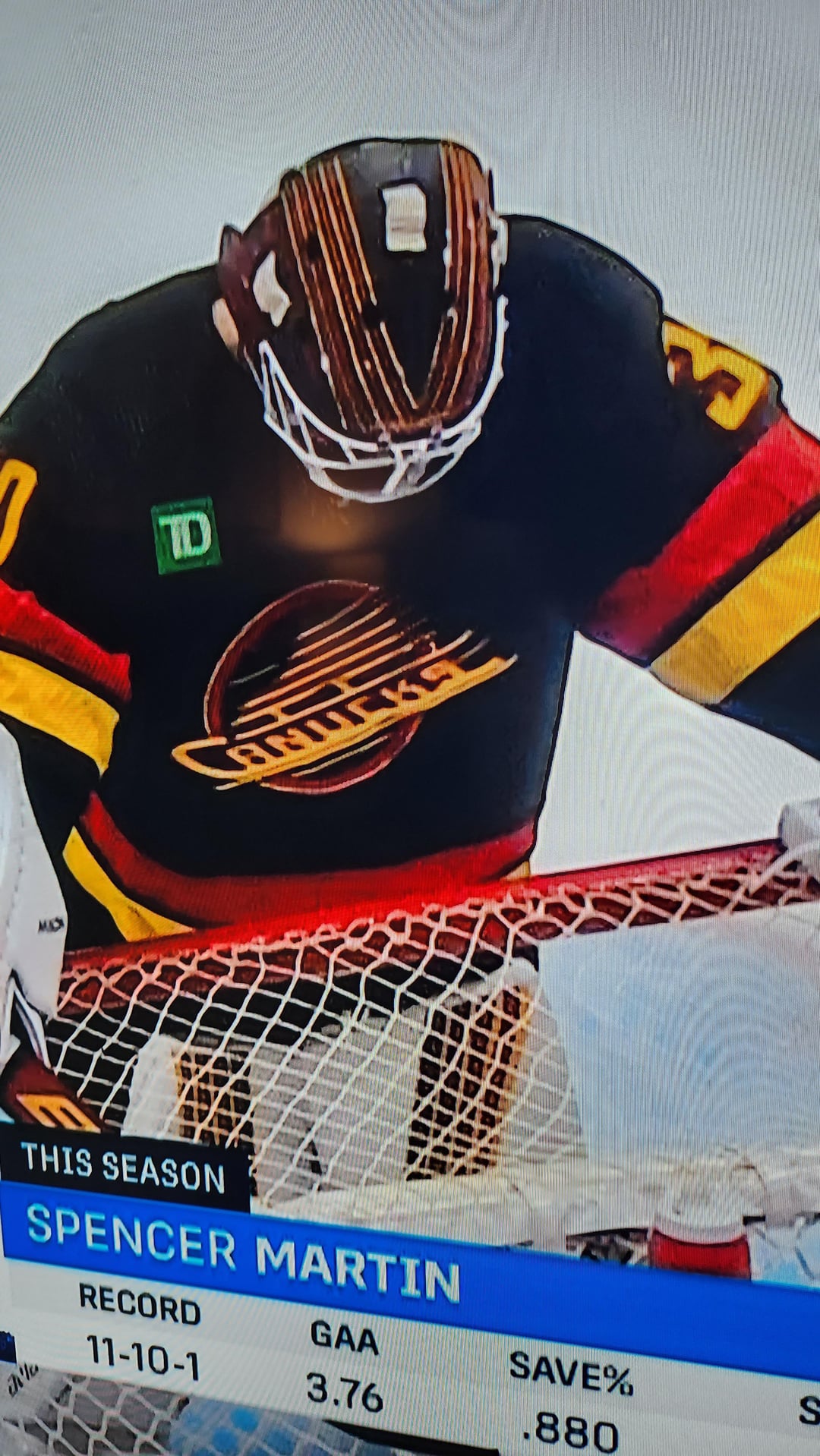
That green td patch ruins the entire jersey. Good job. Might as well add some gambling promos too.
INAC_Kramerica
So did they just make the Flying Skate sweater the official third jersey or is this different than the throwback sweaters in some way? (Other than the ad patch.)
blueschooler
Didn’t need to mess with it. Pure cash grab.
Fit_Aardvark_8811
Pretty sure they have waaaay bigger problems then their jersey switch up.
Balance47x
Seems pointless to give a minor change to an already iconic jersey.
If I didn’t know it was new I wouldn’t know it’s different. Just promote the throwback to the alternate.
DJP-MTL
My favourite Canucks logo and uniforms by far.
flowstuff
these are perfect. straight up villainous.
lawnb0y
They just wore this and they redesigned it and made it worse for some reason
Toiletboy4
Baller jerseys but advertising logos can F off
StoneColdSteveAss316
Pavel Burr
MaxRockatanskyBronze
What’s with the German flag theme?
Well at least these sweaters look clean and don’t have the annoying tampon string.
kayl_the_red
I remember these!
Now I feel old.
LSAjerseys
PSA: If you like this jersey and want to get it (I personally recommend the superior ‘94 throwback), please wait. As a Canucks fan sick of this team’s constant failure, I ask you to not give our slumlord owner Aquilini more money, as well as a reason not to change things. Thank you.
KevDaddy2112
Old Kings fan here, but love seeing this as the 3rd jersey for Vancouver!
NefCanuck
Flying skate logo is a close second to the Darth VaderV uniforms in best Canucks uniform design
hall_bot
i told all my non hockey friends pre-ad jerseys were going to be worth an arm and a leg while ago lmao.
DastardlyRidleylash
They really had to keep fucking Agency around, huh? Couldn’t even stick to the throwback theme and just use block.
beenburnedbutable
I like it.
I like it a lot.
DeIicious_fishStick
Oh fuck that’s so awesome with that add on it, I can’t wait to do business with TD bank!
Scout-CM
I think I read somewhere that you can purchase jerseys without sponsor patches??
ilikehockeyandguitar
I came here to dog on some jerseys, but those are actually pretty fucking sweet.
bigdadE420
I think it looks good 🤷🏻♂️
OberonsTitan
Best sports jersey of all time
king_mahalo
“Canucks set NHL record for shortest time between a jersey’s release and having it thrown on the ice.”
crstnhk
Team Germanys New Jerseys look fantastic
UnlikelyQtip
The jersey looks like we’re sliding down a hill, how fitting
AssRubbies
Would be cool if they didn’t ruin it with an ad. Ruins the whole thing.
FarSightXR-20
everyone looks miserable in that photo.
Deraj2004
I have a friend that works at Tittie Bank.
BillMcCrearysStache
Have they not worn this recently? I swear they have
MGM-Wonder
Black collar and the TD logo make it look like a knockoff replica imo
oddspellingofPhreid
Can’t believe they ripped off the Vegas reverse retros.
BuckleJoe
Damn that shit is hot
haz000
Nice jersey! Awful ad.
Waiting for uBlock to implement jersey adblock.
ziggyjoe212
Does anyone else hate them?
Legit the ugliest uniforms in the league.
Sideof305
Looks like a cover from an album by The Strokes.
leflur
Those look amazing!
Tjo-Piri-Sko-Dojja
At first glance I thought it was Brynäs IF hahah, my favourite Swedish team when I was a kid
montrealcowboyx
1) TD Green can go suck an egg.
2) I don’t like black hockey uniforms. The Bruins are the exception, but ever since the Kings went black, that 90’s esthetic ruined everything.
3) That being said, the Canucks should never have changed colours. Black Red and Gold always rocks for them. I prefer the Gold, but this one is still great.
4) Seriously NHL, the ads suck. Banks suck, All of this greed sucks.
arvy_p
People in here are going on about how they changed it…. I had to go look it up… the old one had white highlights in the logo and around the numbers, and this one removes the white.
It’s a subtle change, and I like the way it puts more focus on the red and yellow in the logo, though I do miss the white outline on the numbers because the white actually helped the red pop better there.
Either way, I’m glad to see these…. they were this team’s best in my opinion. The colours were more dynamic and garish than the bland blue and green.
CaptGunpowder
What the fuck is that colour scheme
BackhandQ
The 90’s jersey’s were the best – the more we see of them, the better. SIGN ME UP!


46 Comments
Collar is the only thing ruining it for me
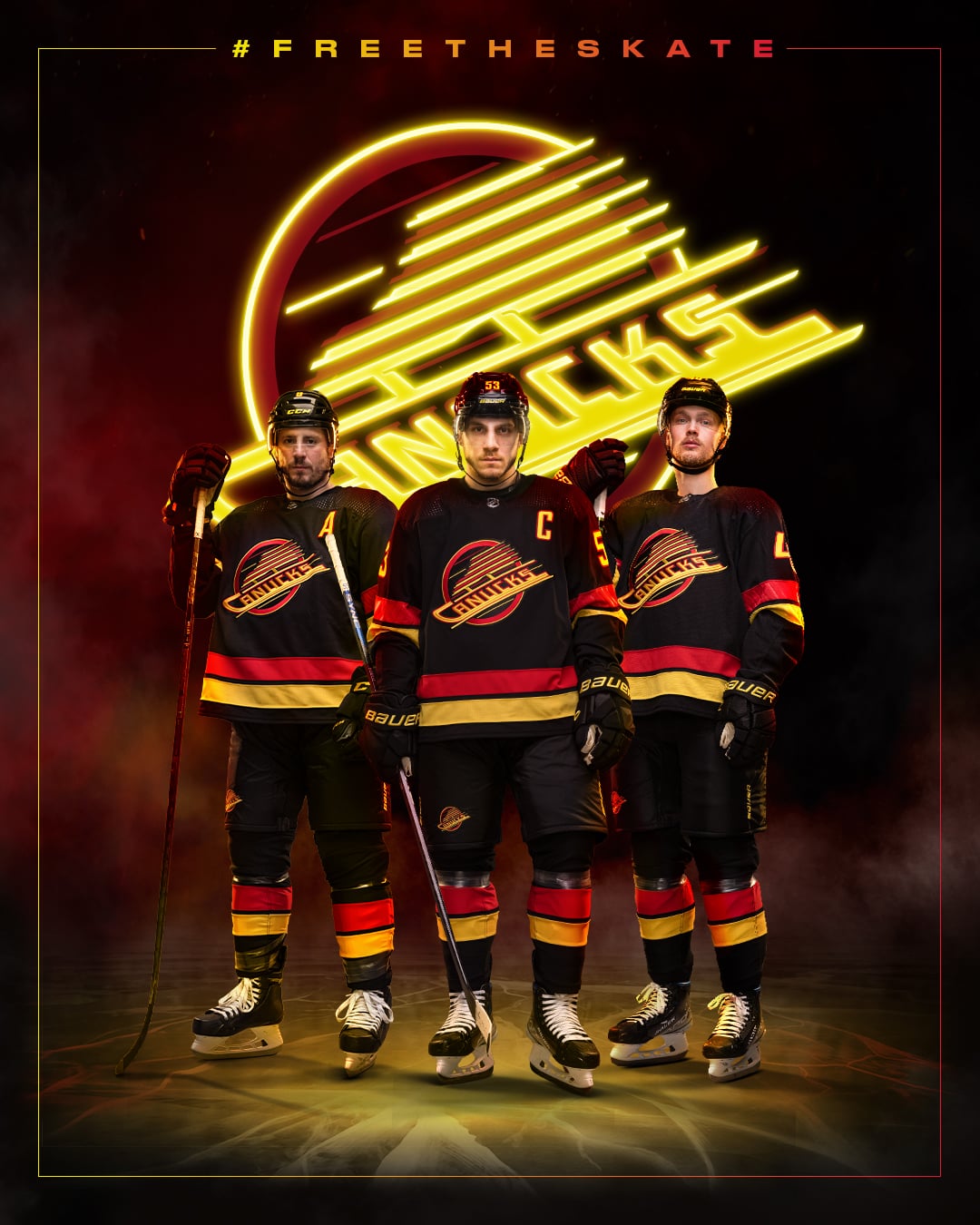
The official tweet here
[We’ve been planning all season to FreeTheSkate tonight. Debuting the jersey now has even more significance given the passing of our beloved Gino Odjick who wore it with pride for seven seasons. Introducing our official third jersey, The Skate.](https://twitter.com/Canucks/status/1615907600784293888?t=g4FOLujs6gX3I-y1I-neqQ&s=19)
Sadly they’ve fucked it with the green TD patch.
🔥🔥🔥
Vancouver, I am sorry, but I will die a thousand times on the hill that these are the tackiest jersey’s in league history. I’m in the massive minority, but I think most people like them for nostalgia.
That green td patch ruins the entire jersey. Good job. Might as well add some gambling promos too.
So did they just make the Flying Skate sweater the official third jersey or is this different than the throwback sweaters in some way? (Other than the ad patch.)
Didn’t need to mess with it. Pure cash grab.
Pretty sure they have waaaay bigger problems then their jersey switch up.
Seems pointless to give a minor change to an already iconic jersey.
If I didn’t know it was new I wouldn’t know it’s different. Just promote the throwback to the alternate.
My favourite Canucks logo and uniforms by far.
these are perfect. straight up villainous.
They just wore this and they redesigned it and made it worse for some reason
Baller jerseys but advertising logos can F off
Pavel Burr
What’s with the German flag theme?
Well at least these sweaters look clean and don’t have the annoying tampon string.
I remember these!
Now I feel old.
PSA: If you like this jersey and want to get it (I personally recommend the superior ‘94 throwback), please wait. As a Canucks fan sick of this team’s constant failure, I ask you to not give our slumlord owner Aquilini more money, as well as a reason not to change things. Thank you.
Old Kings fan here, but love seeing this as the 3rd jersey for Vancouver!
Flying skate logo is a close second to the Darth VaderV uniforms in best Canucks uniform design
i told all my non hockey friends pre-ad jerseys were going to be worth an arm and a leg while ago lmao.
They really had to keep fucking Agency around, huh? Couldn’t even stick to the throwback theme and just use block.
I like it.
I like it a lot.
Oh fuck that’s so awesome with that add on it, I can’t wait to do business with TD bank!
I think I read somewhere that you can purchase jerseys without sponsor patches??
I came here to dog on some jerseys, but those are actually pretty fucking sweet.
I think it looks good 🤷🏻♂️
Best sports jersey of all time
“Canucks set NHL record for shortest time between a jersey’s release and having it thrown on the ice.”
Team Germanys New Jerseys look fantastic
The jersey looks like we’re sliding down a hill, how fitting
Would be cool if they didn’t ruin it with an ad. Ruins the whole thing.
everyone looks miserable in that photo.
I have a friend that works at Tittie Bank.
Have they not worn this recently? I swear they have
Black collar and the TD logo make it look like a knockoff replica imo
Can’t believe they ripped off the Vegas reverse retros.
Damn that shit is hot
Nice jersey! Awful ad.
Waiting for uBlock to implement jersey adblock.
Does anyone else hate them?
Legit the ugliest uniforms in the league.
Looks like a cover from an album by The Strokes.
Those look amazing!
At first glance I thought it was Brynäs IF hahah, my favourite Swedish team when I was a kid
1) TD Green can go suck an egg.
2) I don’t like black hockey uniforms. The Bruins are the exception, but ever since the Kings went black, that 90’s esthetic ruined everything.
3) That being said, the Canucks should never have changed colours. Black Red and Gold always rocks for them. I prefer the Gold, but this one is still great.
4) Seriously NHL, the ads suck. Banks suck, All of this greed sucks.
People in here are going on about how they changed it…. I had to go look it up… the old one had white highlights in the logo and around the numbers, and this one removes the white.
It’s a subtle change, and I like the way it puts more focus on the red and yellow in the logo, though I do miss the white outline on the numbers because the white actually helped the red pop better there.
Either way, I’m glad to see these…. they were this team’s best in my opinion. The colours were more dynamic and garish than the bland blue and green.
What the fuck is that colour scheme
The 90’s jersey’s were the best – the more we see of them, the better. SIGN ME UP!