The pure « RED » scheme and the plain Arizona text just…does nothing. I hate to harp on it, but I’m seriously blown away that we hired a « street artist » or whatever to design a new third and we got…red with Arizona written on it. Zero artistry or design behind it.
If I were XG or whoever was in charge of final approval, I would’ve said, « Try again », but I honestly think they were so sold on having this artist involved that they would’ve approved whatever he showed them.
chill191
I think it would be super dope if there was more of that tan sand color on it
mosinzach
Now that’s a step in the right direction
SHAWKLAN27
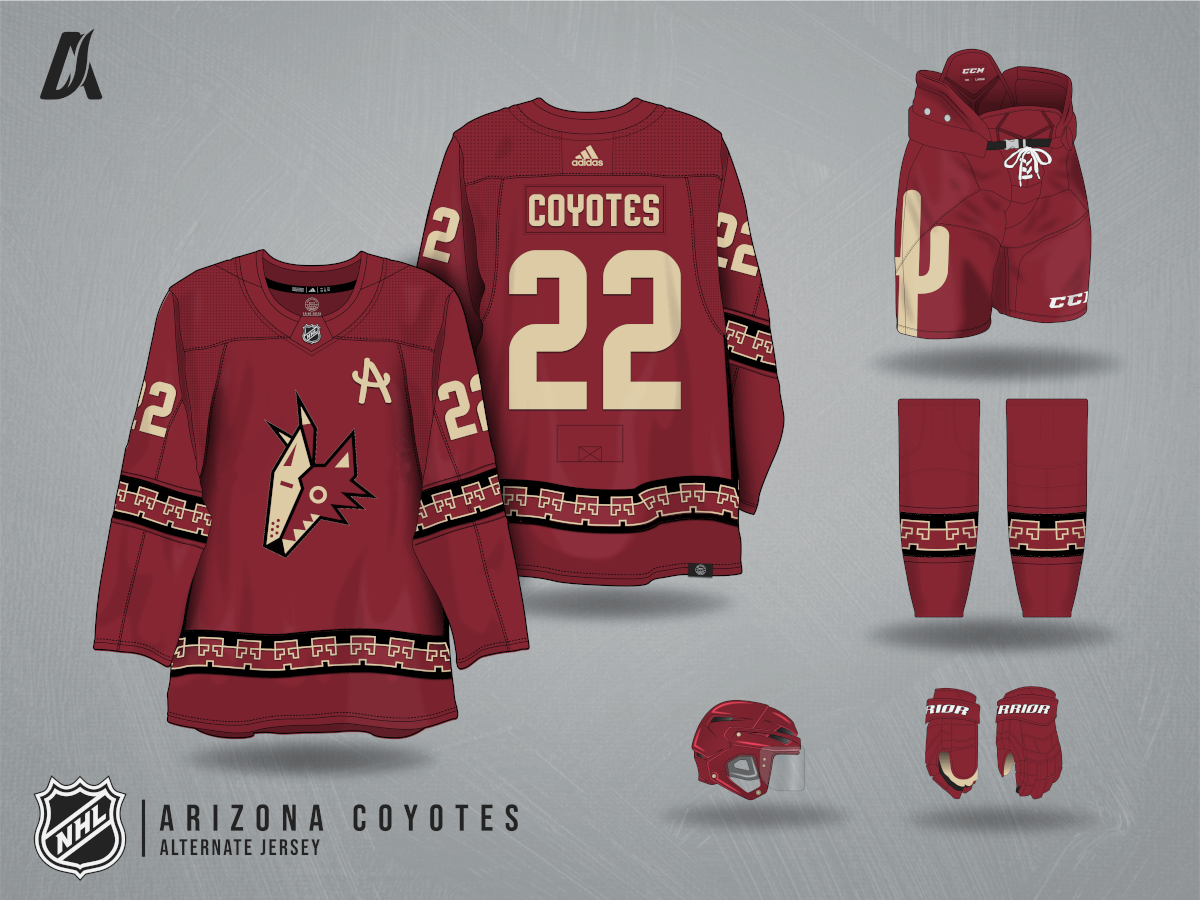
I wouldn’t mind if they put the howling head or running yote logo instead
troyboy75
All i wanted was a red kachina head jersey 🙄
omgthrowaway2020
LMAO. OP this is just a recycled logo in a new color.
Get over it haters, there’s something different! OH MY GOD!
If you don’t like the jerseys, don’t buy them! Just like if you don’t like the team, don’t go!
Lisa Simpson once said « Why would someone come to our concert just to boo us?!? »
tylergoldenberg
I want this jersey with the A in the Paw logo instead of Kachina head. And invert the pants to tan with a red cactus.
ChefChiefy
Way better, good job
Rattttttttttt
I like the third jersey as is and I won’t be shamed.
Wareagle69
Much better.
truemt1
I’m fine with no Coyote head or anything. We already have that. I’m fine with no running coyote, not everything can be nostalgic.
I’m just bias against wordmark/script logos, and would have liked to see a cactus crest or something. Or the crescent moon being the crest of we wanted to use existing imagery.
AppleZen36
This is nice, but can we be done with brick red as a color scheme in Arizona please?
Zuiller
Pass on the logo change, the wordmark looks good to me.
Adding some black is a good idea though.
buddachickentml
There. Was that so hard? Looks great!
domo808
Ok, I will definitely buy that one
mercenaryofwar
This is fantastic
P2T7
Yotes should definitely hire u/Troggie81 and get rid of that Luigi guy 😂
10x better than what we got.
OrangeJulius16
It’s so much better. In terms of color balance especially
A streetwear designer with no feel for what makes up a quality hockey jersey is likely not going to create a great hockey jersey.


18 Comments
Already a huge step in the right direction.
The pure « RED » scheme and the plain Arizona text just…does nothing. I hate to harp on it, but I’m seriously blown away that we hired a « street artist » or whatever to design a new third and we got…red with Arizona written on it. Zero artistry or design behind it.
If I were XG or whoever was in charge of final approval, I would’ve said, « Try again », but I honestly think they were so sold on having this artist involved that they would’ve approved whatever he showed them.
I think it would be super dope if there was more of that tan sand color on it
Now that’s a step in the right direction
I wouldn’t mind if they put the howling head or running yote logo instead
All i wanted was a red kachina head jersey 🙄
LMAO. OP this is just a recycled logo in a new color.
Get over it haters, there’s something different! OH MY GOD!
If you don’t like the jerseys, don’t buy them! Just like if you don’t like the team, don’t go!
Lisa Simpson once said « Why would someone come to our concert just to boo us?!? »
I want this jersey with the A in the Paw logo instead of Kachina head. And invert the pants to tan with a red cactus.
Way better, good job
I like the third jersey as is and I won’t be shamed.
Much better.
I’m fine with no Coyote head or anything. We already have that. I’m fine with no running coyote, not everything can be nostalgic.
I’m just bias against wordmark/script logos, and would have liked to see a cactus crest or something. Or the crescent moon being the crest of we wanted to use existing imagery.
This is nice, but can we be done with brick red as a color scheme in Arizona please?
Pass on the logo change, the wordmark looks good to me.
Adding some black is a good idea though.
There. Was that so hard? Looks great!
Ok, I will definitely buy that one
This is fantastic
Yotes should definitely hire u/Troggie81 and get rid of that Luigi guy 😂
10x better than what we got.
It’s so much better. In terms of color balance especially
A streetwear designer with no feel for what makes up a quality hockey jersey is likely not going to create a great hockey jersey.