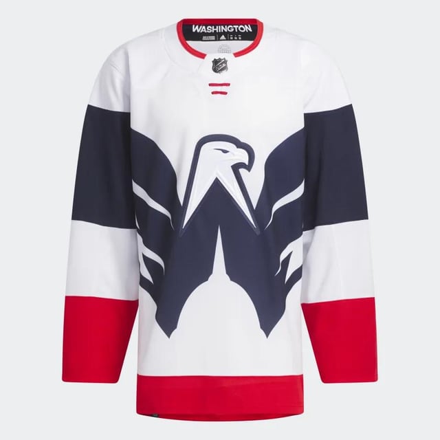
I’m not a fan of white jerseys, so I’ll pass. But if they were to flip the color scheme (white Eagle on a blue body) I’d be down for one.
MyReallyCoolUsername
The USPS Capitals
miner88
People have been begging for the Weagle on a jersey for years and this is what they finally get lmao
Kuseltaja
me likey
mansock18
Love em. You’ll be able to see the caps logo from the nosebleeds.
Eggbertoh
I think it looks pretty dope tbh. Clever design with the shape of the white house in the bottom and bald eagle with wings spread above it. Overall I like it more than the canes jerseys
XGuiltyofBeingMikeX
The Philadelphington Capiwings of the National Lacrockey League.
ebillian
Kinda like it tbh
beardyman22
I wouldn’t like these being our normal jerseys, but as a one-off? I kinda like them.
Prison-Date-Mike
Adidas is terrible at jersey designs. Unpopular opinion around these parts but they have *at most* a handful of unique designs that work
FretlessChibson
Wow! One of the best yet
jamaicancovfefe
The jersey striping is sick. But that logo is absurdly big lmao
bucksfromthegulag
It just seems so…plain? Boring? There’s something missing
glasscaseofemojis
I’m surprised the general sentiment here seems to be negative. I dig it
I’m surprised that the reception is so positive… We’ve been wanting the Weagle as the primary logo for a long time and this just feels like we annoyed Dad too much and he shoved it back in our faces like * » Here’s your fucking primary Weagle logo… »*
merp_mcderp9459
Weagle logo best logo. I wish the caps would replace their current logo with it, it’s way too well-designed to just be on their shoulders
OldStuff1909
One of the best designs I’ve ever seen
47rohin
Honestly? I kinda love it
leqonaut
God do I hate the capitals. But I love this one.
boltswinagain
When Caps fans asked for the Weagle on the front of a jersey, **THIS IS NOT WHAT THEY MEANT**.
liljegrenfenwick
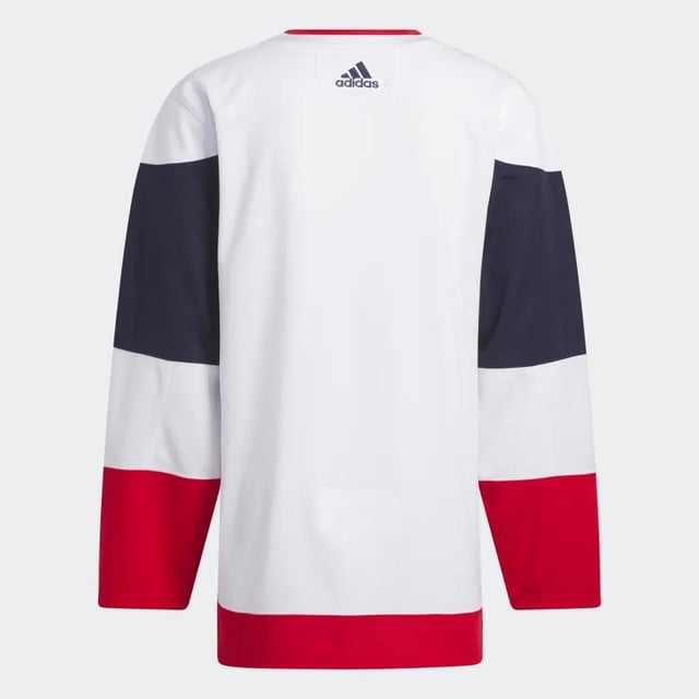
As far as the Stadium Series theme goes I think this accomplishes it nicely. The way the wings spread out into the sleeves which have gorgeous striping. I feel like is gonna look even better on ice, especially with numbers names and patches.
Overall refreshing and a little different which I feel like people are less receptive to than they think they are (I’m more receptive to minimalism than most are but not when its uninspired). I do think the Capitals should do the weagle some justice and do a more standard alternate some day but this is a nice jersey for what it is.
LeCharb
Looks awesome
hockey17jp
I’m surprised this jersey is getting as much hate as it is.
For an outdoor game jersey it’s pretty cool
Dice7
It’s unique. 🦅
wolfpackrider
I think they look good.
Have they release what color pants, gloves, helmets, etc that they’re doing? Has the potential to be a really clean sharp look overall.
DrSeuss19
Looks like a roller hockey Jersey
HappyHapless
Washington’s flying ~~V~~ W.
jfstompers
I like it
GltyUntlPrvnInncnt
I’m liking these a lot
Jazzy_Josh
Major L
fartswhenhappy
This is such a departure from a typical hockey sweater that I reserve judgement until seeing the full uni on the ice. But I*think* I like it.
silencedshout
Needs more America on the sleeves but otherwise I think it looks good
Taqtix27
Terrible
savethepangolins90
I really like it, although that appears to be the minority opinion here 🤷🏻♀️
NoNotMii
It kinda has a roller hockey jersey vibe. I like it
dsjunior1388
Why when they’re debuting these jerseys do they not include things like the number, captains designator and name format?
eddywouldgo
Seriously makes me think the NHL makes more money on jerseys than on hockey.
See also: rink ads.
Cjlaw72
Fuck. I actually like this stupid lame ass Caps jersey.
STLDoggfather
I would gladly trade a truckload of Blues “reverse retro” (whatever the fuck that means) for 1 of these.
Several-Age5631
make that logo smaller and there’s your new primaries
Sufficient-Cookie404
I really like this jersey, much more than the regular ones they wear. It looks naked without the numbers though lol
mollymuppet78
I can smell the freedom all the way here in Canada.
HockeyRigger
Yea let’s pay $250 for a white long sleeve that my Mail man wears. Aight.


45 Comments
I’m not a fan of white jerseys, so I’ll pass. But if they were to flip the color scheme (white Eagle on a blue body) I’d be down for one.
The USPS Capitals
People have been begging for the Weagle on a jersey for years and this is what they finally get lmao
me likey
Love em. You’ll be able to see the caps logo from the nosebleeds.
I think it looks pretty dope tbh. Clever design with the shape of the white house in the bottom and bald eagle with wings spread above it. Overall I like it more than the canes jerseys
The Philadelphington Capiwings of the National Lacrockey League.
Kinda like it tbh
I wouldn’t like these being our normal jerseys, but as a one-off? I kinda like them.
Adidas is terrible at jersey designs. Unpopular opinion around these parts but they have *at most* a handful of unique designs that work
Wow! One of the best yet
The jersey striping is sick. But that logo is absurdly big lmao
It just seems so…plain? Boring? There’s something missing
I’m surprised the general sentiment here seems to be negative. I dig it
Can buy it today it looks like (Canes one too):
https://www.adidas.com/us/search?q=stadium%20series
I’m surprised that the reception is so positive… We’ve been wanting the Weagle as the primary logo for a long time and this just feels like we annoyed Dad too much and he shoved it back in our faces like * » Here’s your fucking primary Weagle logo… »*
Weagle logo best logo. I wish the caps would replace their current logo with it, it’s way too well-designed to just be on their shoulders
One of the best designs I’ve ever seen
Honestly? I kinda love it
God do I hate the capitals. But I love this one.
When Caps fans asked for the Weagle on the front of a jersey, **THIS IS NOT WHAT THEY MEANT**.
As far as the Stadium Series theme goes I think this accomplishes it nicely. The way the wings spread out into the sleeves which have gorgeous striping. I feel like is gonna look even better on ice, especially with numbers names and patches.
Overall refreshing and a little different which I feel like people are less receptive to than they think they are (I’m more receptive to minimalism than most are but not when its uninspired). I do think the Capitals should do the weagle some justice and do a more standard alternate some day but this is a nice jersey for what it is.
Looks awesome
I’m surprised this jersey is getting as much hate as it is.
For an outdoor game jersey it’s pretty cool
It’s unique. 🦅
I think they look good.
Have they release what color pants, gloves, helmets, etc that they’re doing? Has the potential to be a really clean sharp look overall.
Looks like a roller hockey Jersey
Washington’s flying ~~V~~ W.
I like it
I’m liking these a lot
Major L
This is such a departure from a typical hockey sweater that I reserve judgement until seeing the full uni on the ice. But I*think* I like it.
Needs more America on the sleeves but otherwise I think it looks good
Terrible
I really like it, although that appears to be the minority opinion here 🤷🏻♀️
It kinda has a roller hockey jersey vibe. I like it
Why when they’re debuting these jerseys do they not include things like the number, captains designator and name format?
Seriously makes me think the NHL makes more money on jerseys than on hockey.
See also: rink ads.
Fuck. I actually like this stupid lame ass Caps jersey.
I would gladly trade a truckload of Blues “reverse retro” (whatever the fuck that means) for 1 of these.
make that logo smaller and there’s your new primaries
I really like this jersey, much more than the regular ones they wear. It looks naked without the numbers though lol
I can smell the freedom all the way here in Canada.
Yea let’s pay $250 for a white long sleeve that my Mail man wears. Aight.
The definition of mid.