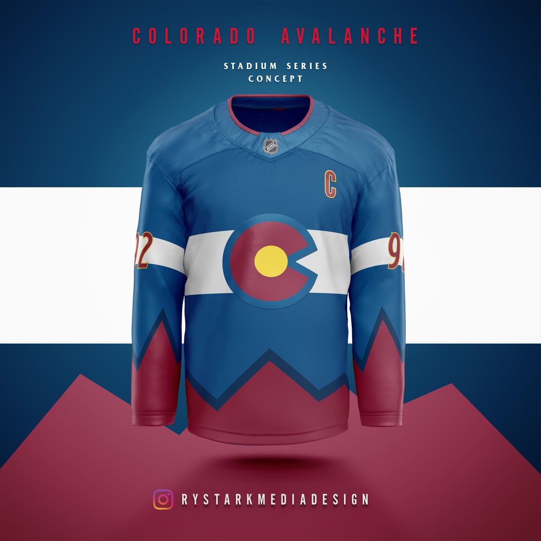
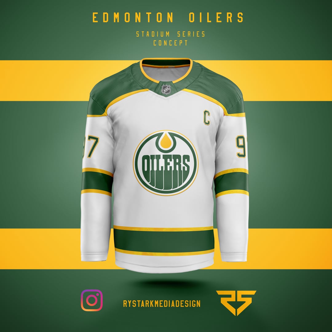
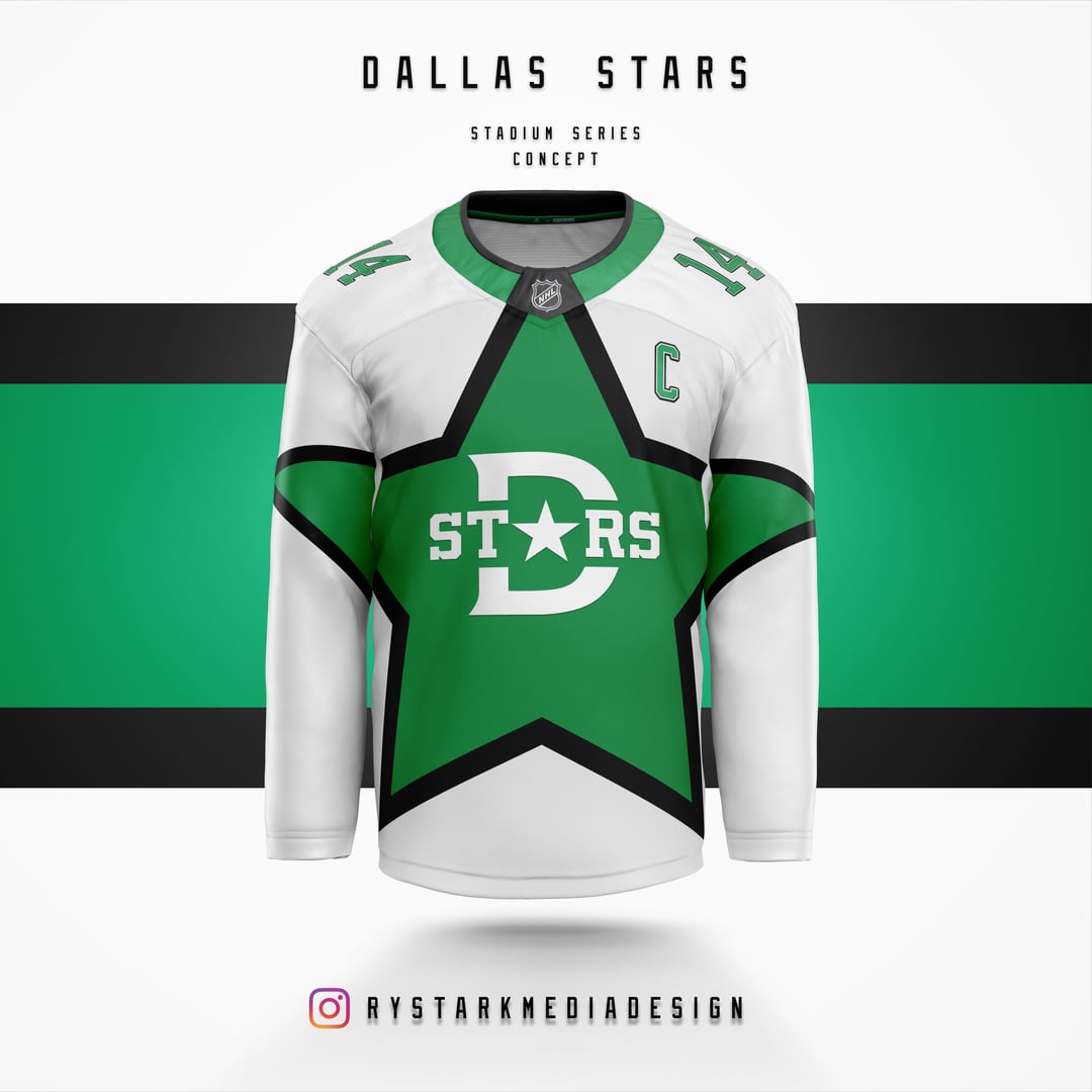
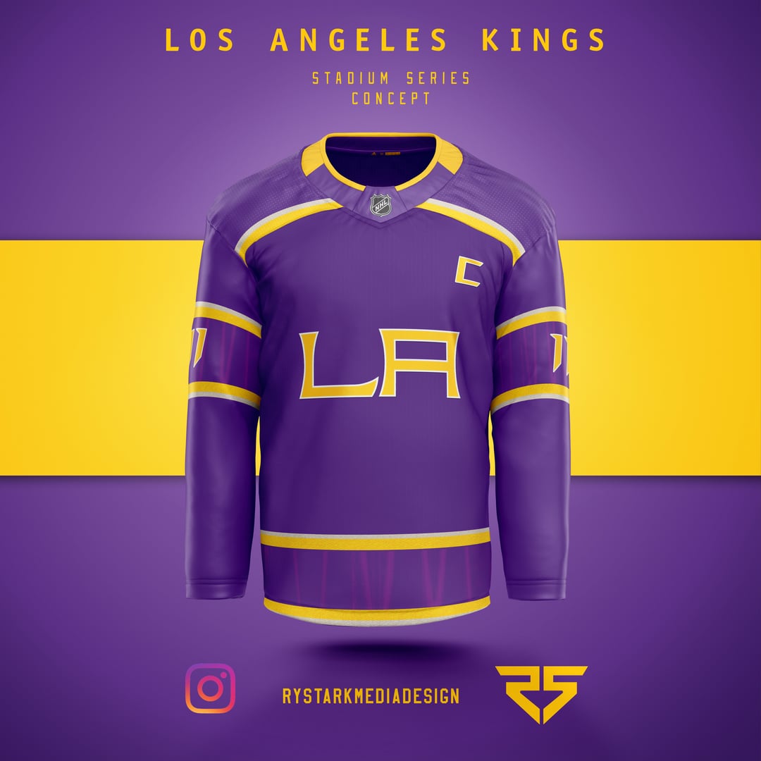
Étant donné que la série Stadium a eu lieu ce week-end, j’ai pensé que je montrerais quelques concepts de série de stades que j’ai créés pour le plaisir. (Conférence Ouest)
—
Shocklatecola

Étant donné que la série Stadium a eu lieu ce week-end, j’ai pensé que je montrerais quelques concepts de série de stades que j’ai créés pour le plaisir. (Conférence Ouest)
—
Shocklatecola
 invité par Flyers/Torts à assister à la séance de patinage matinale")

")


23 Comments
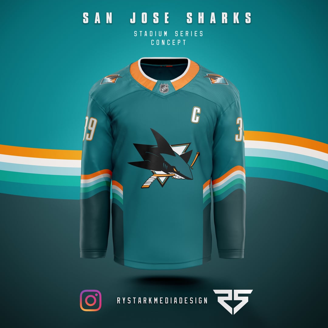
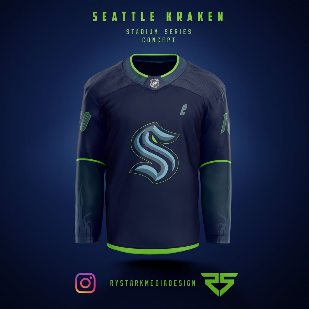
Oilers and Sharks are killer. Nice job
Really dig the Av’s, Oilers, & Sharks!
Some killer ones in here. Great work
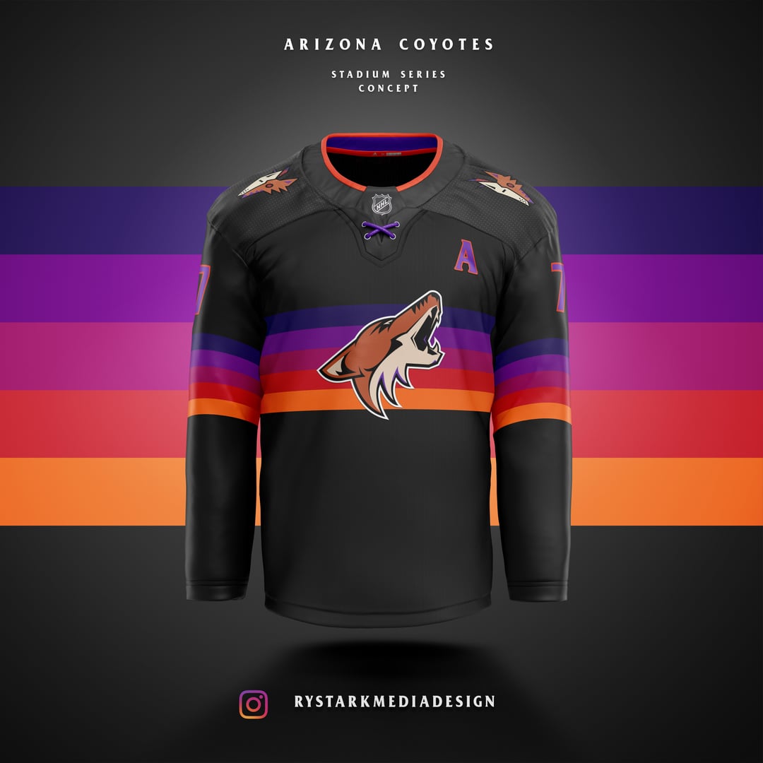
Arizona Seattle and Vegas are my favs
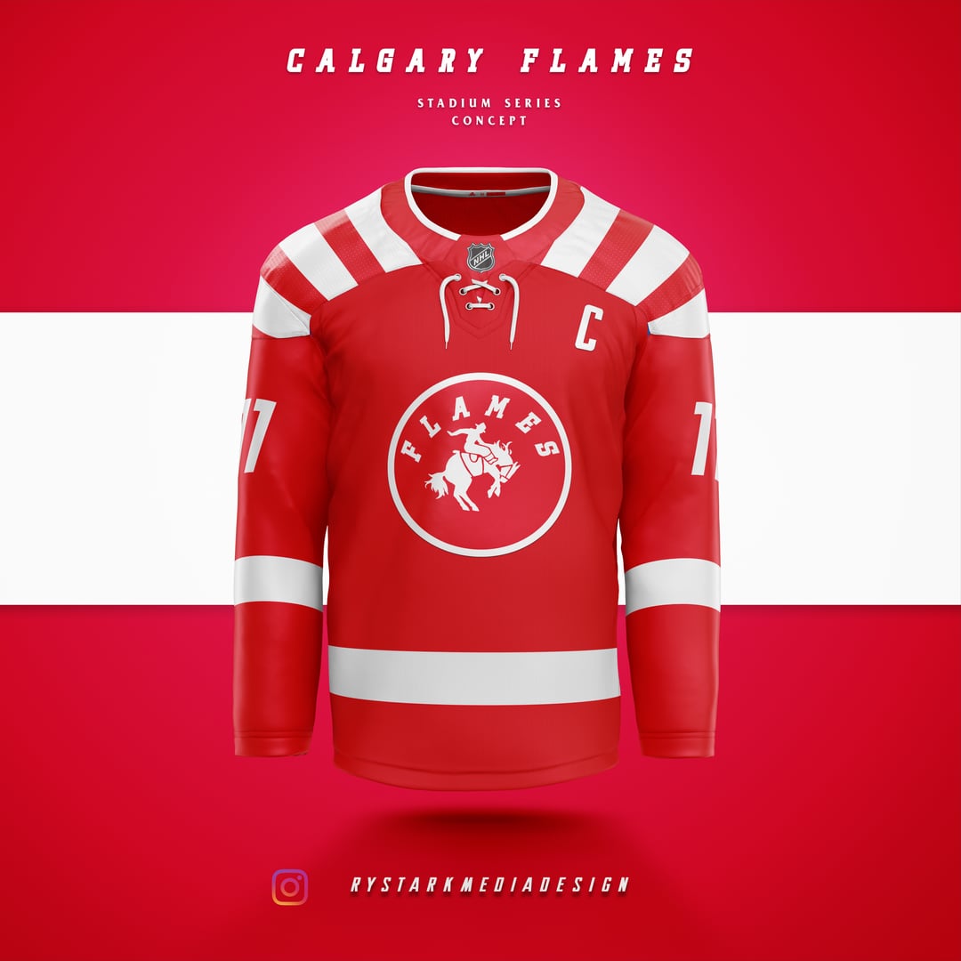
Not a flames fan, but those are on fire!
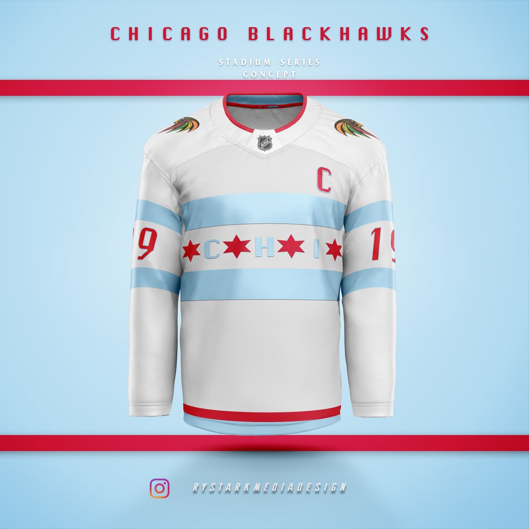
I’d cop that Blackhawks jersey if it was real. Love seeing our city’s flag
Please stop. Get some help
Flames one is 🔥🔥🔥🔥 👍🏻👍🏻
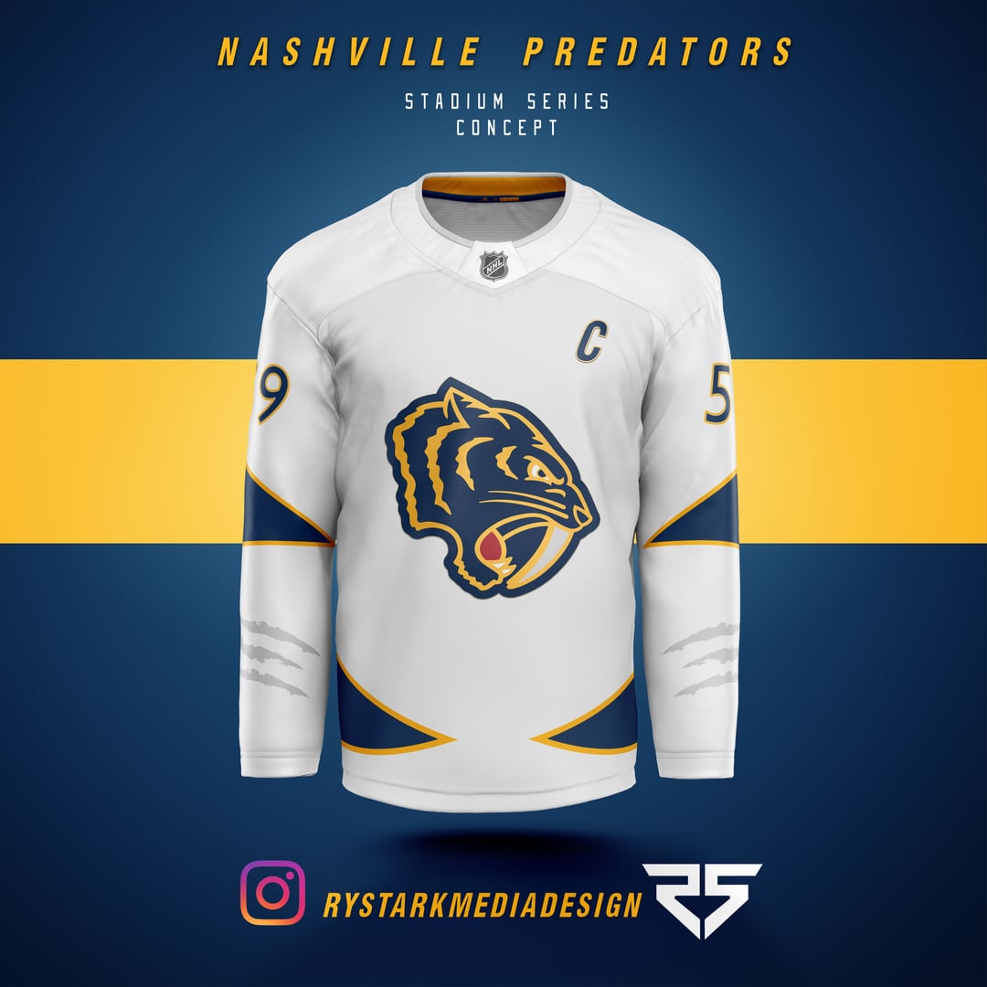
Nashville really needs to make that logo its logo. It has such a classic look to it, such a college vibe to it, i feel it would get eaten up.
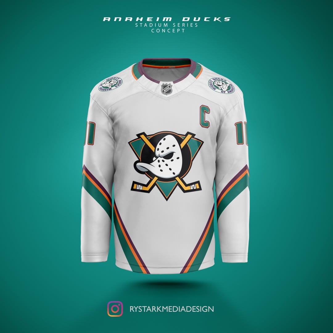
Ooohhhh that Mighty Ducks one is 🔥🔥🔥
Really like how you incorporated the CFL to Cal, Edm, and Win 🏈
All of these are quite dope I gotta say
I mean no disrespect, because these are super cool, but, a lot of these feel more like RRs or Winter Classic jerseys than Stadium Series to me. I feel like RRs and Winter Classics are supposed to feel nostalgic, and Stadium Series jerseys are supposed to feel bold and exciting. Some of them also seem like the main logo is a little too small. Again, just being nitpicky. These are super cool.
I want you to have my children
These are kinda better than some of the reverse rewind out now
By god. Some of those are 11/10.
I usually fucking HATE what they do to the Sharks ones, HOWEVER… what you’ve done is fucking brilliant, and I demand it to be a thing.
I’m there for that Seattle jersey. Seahawks colors.
Love every concept, especially LA, Dallas and St. Louis. Don’t get the color scheme for Edmonton though
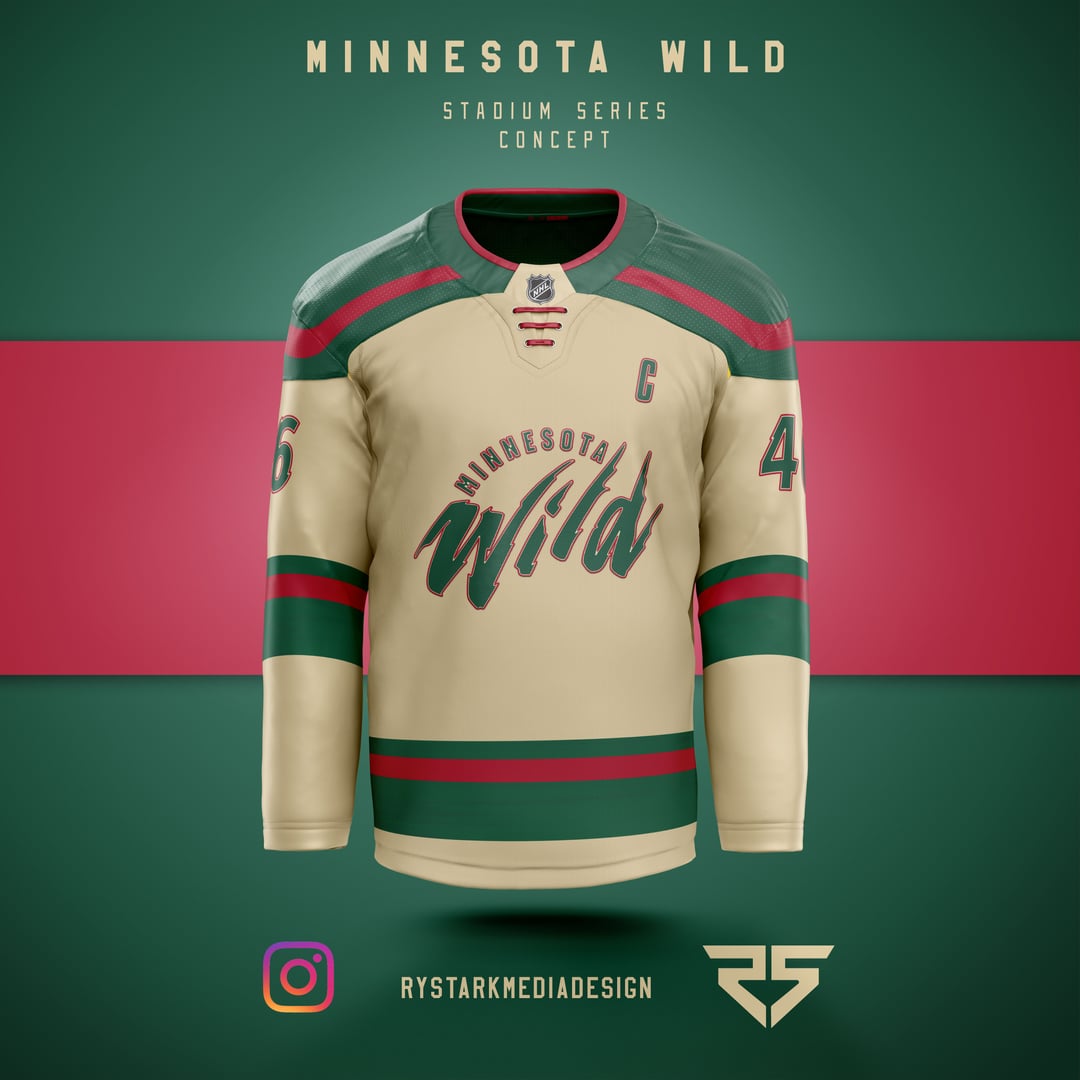
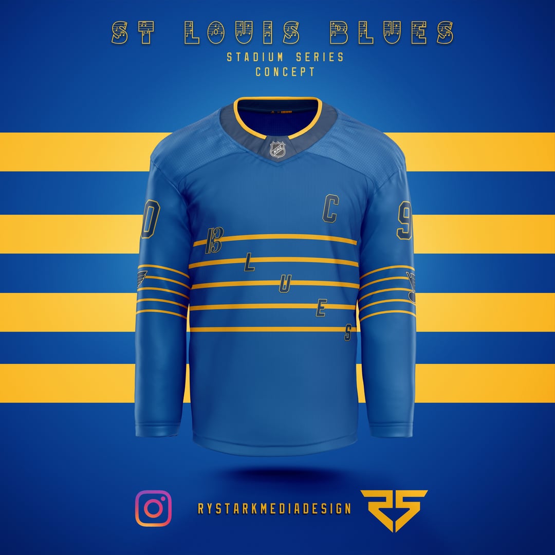
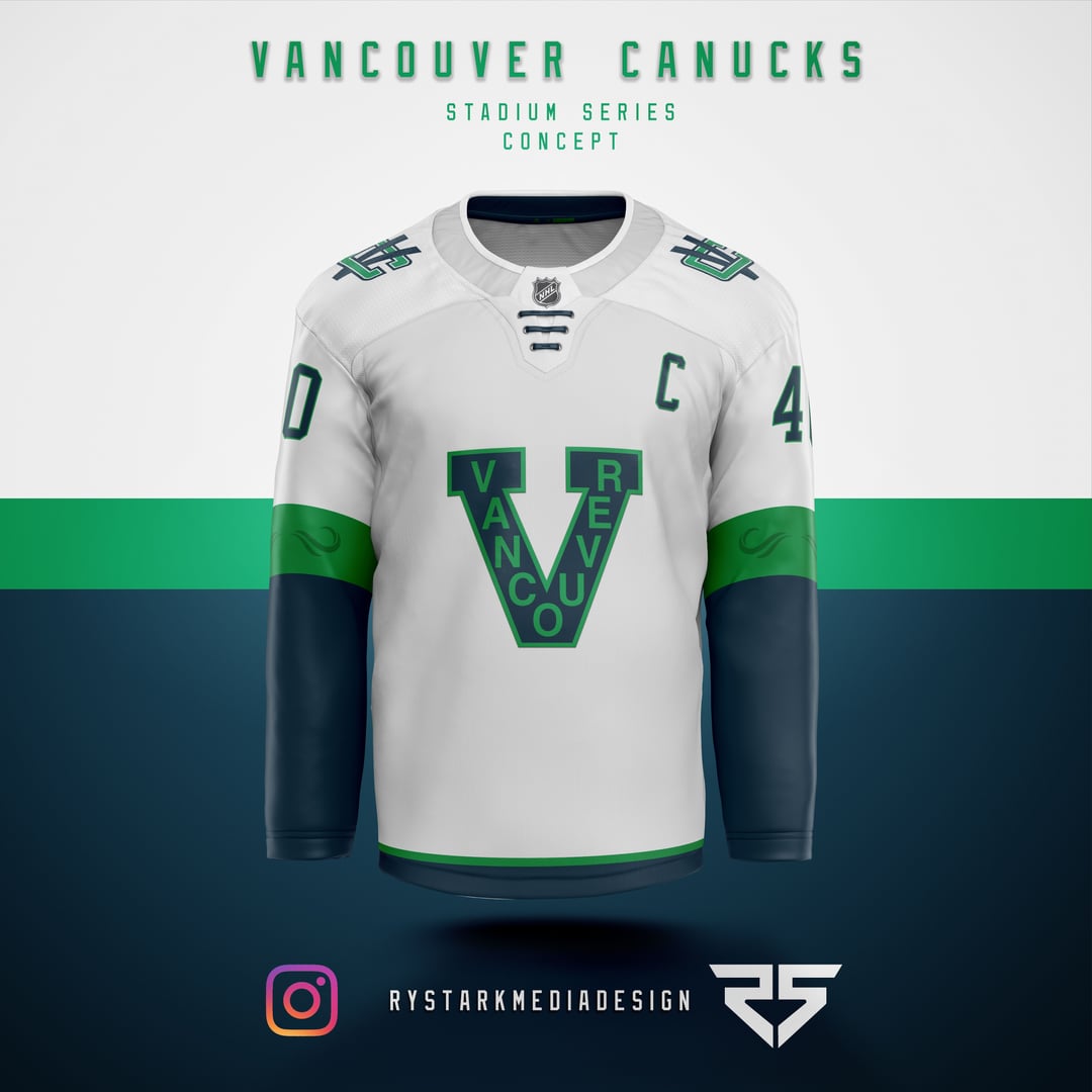
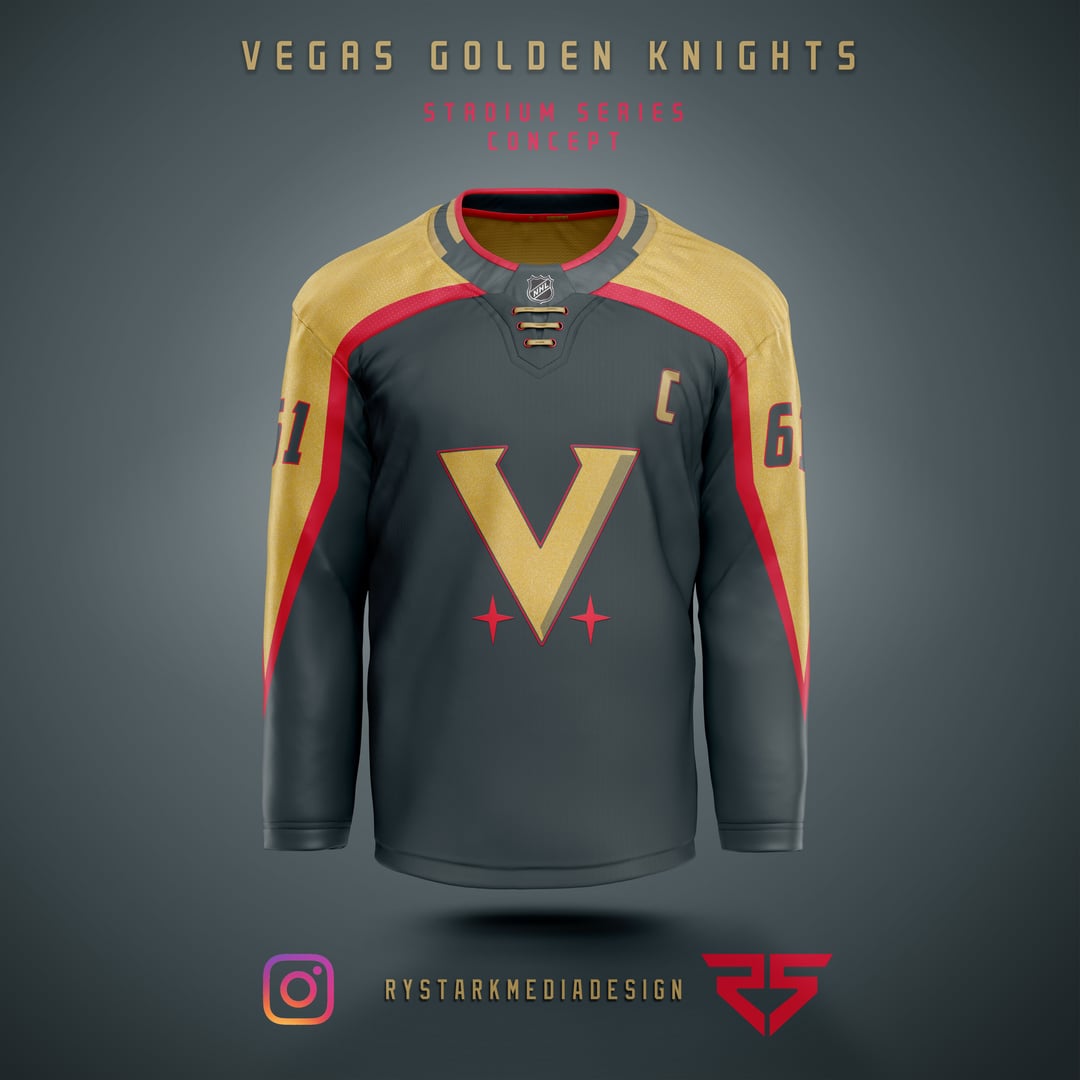
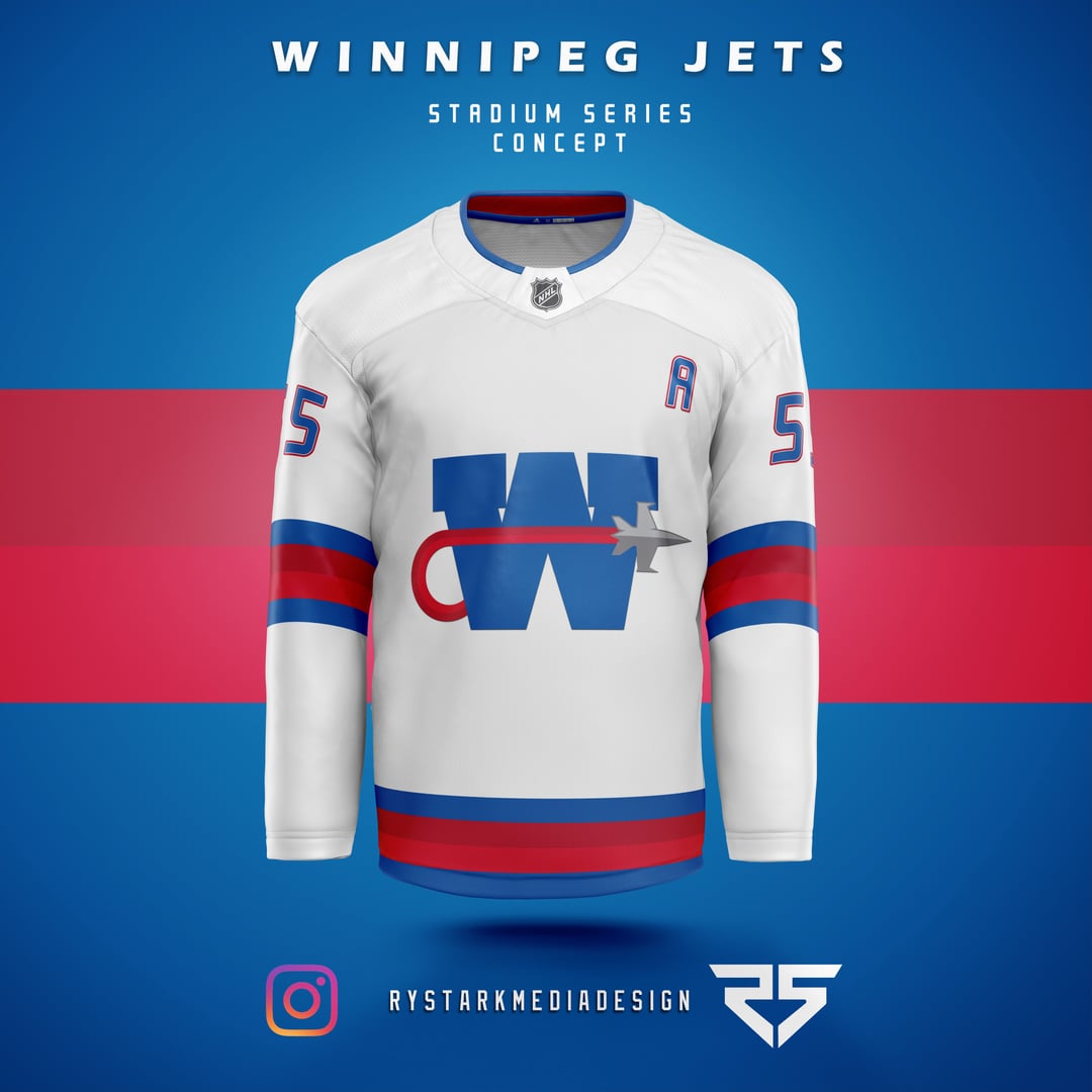
ANA is nice, even if the mighty ducks concept is well trodden ground, ARI has a nice gradient, CGY is very nice, loving the cfl call back here, CHI is good, love the plumes on the shoulders, COL is good, reminds me of a better version of their stadium series jerseys (the one against LA), EDM is alright, still loving the cfl callback, DAL, loving the star design in the jersey itself and using my personal favorite stars logo, LA is alright, MIN has the old font that’s unironically great and the cream color is nice, NSH, loving the logo and the claw marks near the wrist, SJS has very nice striping and makes good use of the colors the team uses, SEA has a nice touch in the form of those tentacles on the wrist, STL is good, the blues on the front is a bit too dark though, kinda hard to read, VAN is nice, love the vc logo on the shoulder and the accenting in the sleeve stripes, VGK feels more like a special warmup night jersey, like, it’s good, but doesn’t scream stadium series to me, and WPG is fucking perfect, no notes on that
Arizona, Colorado, Calgary, Seattle, Minnesota, San Jose, St Louis, Anaheim are my faves! Hell, they’re all great.
The ducks one with those colors is what they should’ve done for retro reverse 2.0
Petition for the NHL to hire this dude.