À la lumière du gars qui a trouvé un V dans le logo des Golden Knights… vous voyez tous la Caroline du Nord ici, n’est-ce pas ?
—
Eillris

À la lumière du gars qui a trouvé un V dans le logo des Golden Knights… vous voyez tous la Caroline du Nord ici, n’est-ce pas ?
—
Eillris


33 Comments
O yes. Clear as mud!
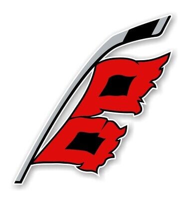
whats this logo even supposed to be? whats the relevance of of the red flags? i always just see it as flags in the wind making an obscure B.
I just realized the flag pole is a hockey stick.
All teams add some kind of symbolism to their logos. The eye of the penguin is a lower case h for hockey.
A red square shaped flag with a black square on the inside is used to
warn of hurricanes. If one flag is used, it indicates a storm warning,
while two flags indicate a hurricane warning.
This logo is one of the best in all of sports, but people just don’t seem to get it.
The kraken alt log has the space needle at the top of the anchor but there’s a lot of killer logo designs in sports
Not sure you all know this but the Boston bruins logo is a B, which stands for Boston and bruins. Wild right?
« In light of the guy finding a V in the Golden Knights logo… »
Wait, someone had to point that out? Literally noticed the giant V the day they introduced the logo.
…holy shit
The Maple Leafs logo is a Maple Leaf
I see a North Carolina but no South. It ain’t the North Carolina Hurricanes…
I have no idea what I’m looking for
If you look closely at the Rangers logo you can see New York spelled across the top and Rangers diagonally. It’s very subtle but if you focus your eyes the right way you’ll see it
The “I” in the Islanders logo points to the spot of the old Nassau Coliseum on the Long Island silhouette
Just happy they’re using two flags (Hurricane) now rather than the one flag (Tropical storm) they were using for years. State outline if just a bonus.
Nice logo.
Yep, right in between the 2 flags
The flags being horizontal gives the illusion of strong winds; similar to winds that you would have in a hurricane.
Oh damn that’s very good
Rangers play in NYC. Nuts.
I still cannot find the star in the Dallas Stars logo. Send help plz.
Someone said there’s an “LA” in the Kings logo
That’s a hockey stick with a hurricane warning attached. Duh.
Burricanes
Where is the North Carolina in this i dont see it?
Can anyone please crack the Calgary flames logo next? There’s one I just don’t get. Like what part of that logo has anything to do with Calgary or flames?
NY Rangers logo…simply says Rangers. In case anyone was wondering
I heard one of the Florida teams has a panther in its logo too, apparently the animal is making a come back also on trail cameras n such which is actually neat.
I just saw it!
I’m curious, how many *South* Carolina fans are there? Does anyone know? I’d be shocked to hear that many South Carolinians come to PNC for games.
interesting, here’s a real deep one: if you squint hard enough at the new york rangers logo, it actually spells out new york rangers
Am I the only one that never noticed that