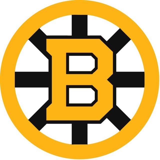

Je n’aimais pas l’apparence des logos lorsque je les ai publiés à l’origine, j’ai donc supprimé le message et j’envoie maintenant des versions meilleures et plus précises de ce à quoi ressemblerait le Spoked B moderne s’ils s’inspiraient des années 1980.
—
AkiraleTorimaki


14 Comments
Love these.
Awesome
This should 1000% be the logo.
I really dig this. Would love to see this logo used.
Wow this is incredible. Takes my favorite elements from the current logo and the older logo and combines them. Fantastic job 👍
So good. I miss the old B logo
I’d go closer to the lighter yellow of the 80’s logo but these look great. Big mistake not having a gold b on the black ones since the fleet center jerseys
Looks good, but you gotta layer the outer ring on top of the spokes. Those flat spots where they meet are all I can focus on for some reason 😬
Awesome work. I’m hoping with the change in jersey manufacturers we get a decent overhaul, something like this on the 80s style jersey would be awesome.
Both look like absolute shit.
RR 3.0 baby! too bad fanatics is going to stop me from buying a jersey for the next decade plus.
Soooo much better than the current logo. If they don’t want to go back to the original block B then this would be an amazing change.
I’ll allow it
Love it