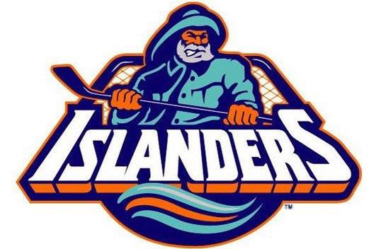
Yes, it is an unpopular opinion because nobody wants to have the Gorton’s fisherman as their mascot.
blackhawks-fan
I agree. That is one the great hockey logos.
pistilpeet
I immediately hear The Salty Sea Captain from The Simpsons whenever I see this.
mikesquared_
This unpopular opinion has been reposted atleast 900 times
TheIncredibleHork
*Trust the Gorton’s Fisherman!*
this_name_not_that
I want fish sticks.
seanofkelley
We need to keep saying this until they bring this dude back.
GrandpaMofo
No.
lostmyusernameAGA1N
unpopular opinion: I agree
unbannedagain1976
Oh shit let me grab my popcorn.
Grimmer026
I always actually like this logo. Just the 90s wavy piping was what threw it off. If it just had normal piping in traditional islanders colors, it would’ve been awesome
Shiny_Mew76
As Bobby Fish would say,
“Where’s the lie?”
JiveChicken00
I don’t know about best ever, but it’s definitely grown on me a bit. When it first appeared back when, I thought it was terrible. Now it’s like the cult movie of team logos.
gentleman_bronco
I love the fisherman. I
SnappyDresser212
That is a very unpopular opinion.
komputernik
It is perfect except in color.
Mosloth
Not unpopular
Remarkable-Motor7705
They used this design as their retro jersey last season. It was pretty cool seeing guys like Barzal, Nelson, Horvat and Sorokin wearing the fisherman jersey.
Have no idea why they aren’t using it again this year.
AccountantAlarmed982
Couldn’t agree more!
minos157
The majority of people that hate it, myself included, are simply fans old enough to remember the 90s Millbury years.
The logo is fine, the memories it stirs are not so I hate it.
Fuck Mike Millbury.
Abolton12
*so* unpopular
kaeji
Looks like one of those fictitious teams from NHL Hitz 2003 where the team is dressed up as sailors instead of wearing hockey gear.
Ilkley_dipper
One of the best ones in all North American sports I would argue
rj_rj1
Old man salt lost his rain slicker and fishing gear?
MiccioC
Absolutely not. It’s trash.
StolenFace367
Agreed
cams0400
Rob Di Fiore’s anecdote about a kid bullying him when dressed as Nyles is hilarious.
Capt_Pickhard
I find it’s a little bit AHL, and I don’t particularly like the overall shape of it.
It’s also quite fishticks.
REDitor_31
A more unpopular opinion, I LOVED the BuffaSlug era of the Sabers
SnooChickens3871
Meh
Half_moon_die
As good as this is. This more a dis on the actual logo then a celebration.
KodiakUrsa
I don’t mind the wave motifs and extra cyan color that came with those jerseys, but Fish Sticks is awful imho. He was extremely unpopular at the time, and outside of a specific demographic I don’t think that perception has changed much within the fanbase.
The lighthouse shoulder patch that went along with Fish Sticks was great, though! I wish they would use that as the main logo. It does a great job of representing Long Island without looking, uh, crusty.
tiggertom66
It’s a great logo, it’s just associated with some very bad years.
I love It.
Jolly_Job_9852
I agree and I’m a fan of a rival team
waterontheknee
Yup.
ThatMikeGuy429
I don’t mind the fisherman as an isles fan, I prefer the lighthouse logo, but the area it stands for, the r/fuckmikemilbury area, is what gives me a bad taste in my mouth.
Internet_Normal
It’s strange that Brett Lindros is the first name that pops into my head when I see this logo, considering how short and uneventful his career was.
Sven_Longfellow
WE WANT FISHSTICKS!
JealousMeringue6674
Couldn’t agree more, i hope Islanders stay stuck in mediocrity till they bring this back.
Wild-Piece-8000
Captin hindgrinder…. Yes bis
Cbjfan99
I prefer the lighthouse
TheJQN
This is too 10 logos of all time for me. I actually have the #33 Ken Belanger jersey.
1nstantHuman
Yarrr
SINY10306
You would be banned for posting such a thing 28 years ago.
kingchonger
I agree that’s a heater!
rangermetz241
best if you’re a rangers fan. I enjoyed the lulz.
Stinky_Toes12
Theres no way this is unpopular, the current logo sucks ass
MIDImunk
Sorry to be a killjoy, but I think it’s pretty bad. It feels verrrrrry late-90s and not in a charming way. However, I could agree with OP on the technicality that the Islanders logo amongst the most blah, neither-here-nor-there logos in the league and they’ve also rarely changed it.


")


48 Comments
Yes, it is an unpopular opinion because nobody wants to have the Gorton’s fisherman as their mascot.
I agree. That is one the great hockey logos.
I immediately hear The Salty Sea Captain from The Simpsons whenever I see this.
This unpopular opinion has been reposted atleast 900 times
*Trust the Gorton’s Fisherman!*
I want fish sticks.
We need to keep saying this until they bring this dude back.
No.
unpopular opinion: I agree
Oh shit let me grab my popcorn.
I always actually like this logo. Just the 90s wavy piping was what threw it off. If it just had normal piping in traditional islanders colors, it would’ve been awesome
As Bobby Fish would say,
“Where’s the lie?”
I don’t know about best ever, but it’s definitely grown on me a bit. When it first appeared back when, I thought it was terrible. Now it’s like the cult movie of team logos.
I love the fisherman. I
That is a very unpopular opinion.
It is perfect except in color.
Not unpopular
They used this design as their retro jersey last season. It was pretty cool seeing guys like Barzal, Nelson, Horvat and Sorokin wearing the fisherman jersey.
Have no idea why they aren’t using it again this year.
Couldn’t agree more!
The majority of people that hate it, myself included, are simply fans old enough to remember the 90s Millbury years.
The logo is fine, the memories it stirs are not so I hate it.
Fuck Mike Millbury.
*so* unpopular
Looks like one of those fictitious teams from NHL Hitz 2003 where the team is dressed up as sailors instead of wearing hockey gear.
One of the best ones in all North American sports I would argue
Old man salt lost his rain slicker and fishing gear?
Absolutely not. It’s trash.
Agreed
Rob Di Fiore’s anecdote about a kid bullying him when dressed as Nyles is hilarious.
I find it’s a little bit AHL, and I don’t particularly like the overall shape of it.
It’s also quite fishticks.
A more unpopular opinion, I LOVED the BuffaSlug era of the Sabers
Meh
As good as this is. This more a dis on the actual logo then a celebration.
I don’t mind the wave motifs and extra cyan color that came with those jerseys, but Fish Sticks is awful imho. He was extremely unpopular at the time, and outside of a specific demographic I don’t think that perception has changed much within the fanbase.
The lighthouse shoulder patch that went along with Fish Sticks was great, though! I wish they would use that as the main logo. It does a great job of representing Long Island without looking, uh, crusty.
It’s a great logo, it’s just associated with some very bad years.
I love It.
I agree and I’m a fan of a rival team
Yup.
I don’t mind the fisherman as an isles fan, I prefer the lighthouse logo, but the area it stands for, the r/fuckmikemilbury area, is what gives me a bad taste in my mouth.
It’s strange that Brett Lindros is the first name that pops into my head when I see this logo, considering how short and uneventful his career was.
WE WANT FISHSTICKS!
Couldn’t agree more, i hope Islanders stay stuck in mediocrity till they bring this back.
Captin hindgrinder…. Yes bis
I prefer the lighthouse
This is too 10 logos of all time for me. I actually have the #33 Ken Belanger jersey.
Yarrr
You would be banned for posting such a thing 28 years ago.
I agree that’s a heater!
best if you’re a rangers fan. I enjoyed the lulz.
Theres no way this is unpopular, the current logo sucks ass
Sorry to be a killjoy, but I think it’s pretty bad. It feels verrrrrry late-90s and not in a charming way. However, I could agree with OP on the technicality that the Islanders logo amongst the most blah, neither-here-nor-there logos in the league and they’ve also rarely changed it.