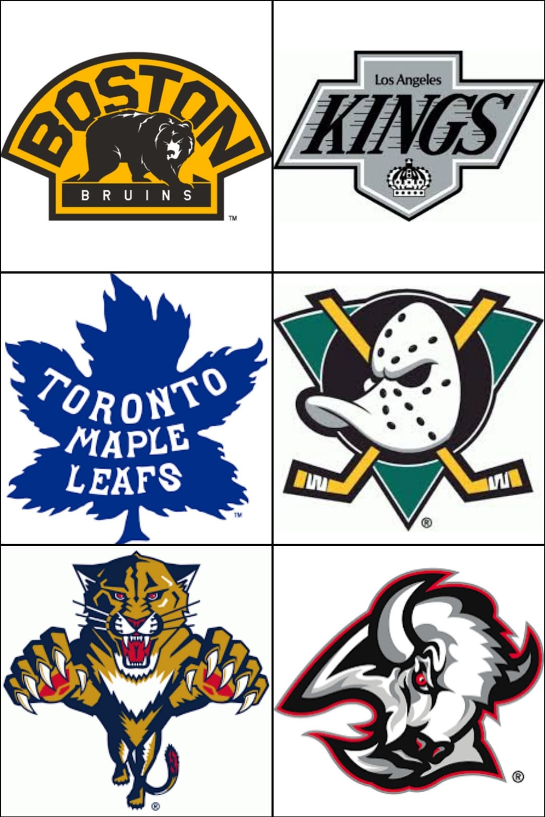
Honestly I want the old Canucks logo with the yellow/red ice skate outline, that shit was so hard.
Philhughes_85
Ducks and Yotes
NickyShore
Old school Ducks and Sabres logos are some of my all-time favorites
GoldMonk44
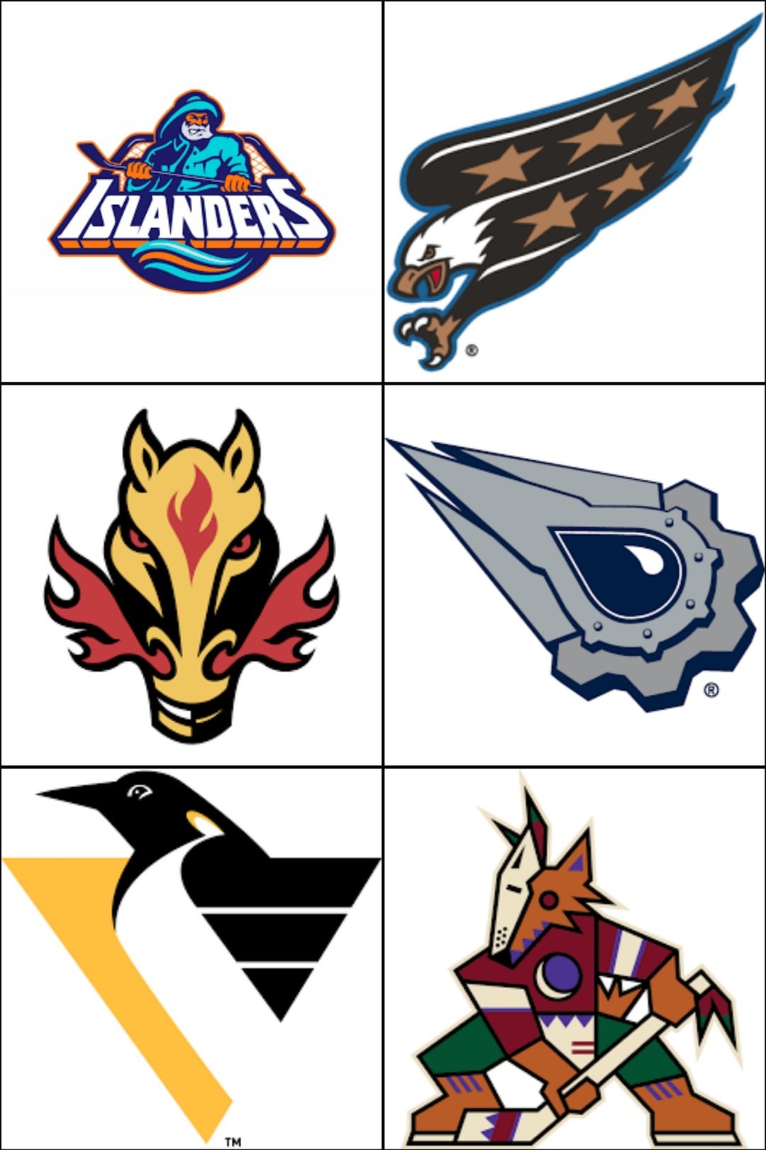
Boston, LA, Sabres (with that colour scheme), islanders, capitals, penguins 🐧 and coyotes
AD_910
All of them
wodanishere
Didn’t the yotes wear these last night?
supernovae__
Panthers. The new one looks like a kitten
Positive_Leopard_968
Islanders !!!
kremedelakrym
Ducks logo forsure, and their old colors. The aesthetic is 1000% more pleasing. I’m a sharks fan and even I almost want to get a throwback style ducks hoodie. Also the Kings in the 60’s should be the logo up there. That yellow and purple would be sick to match the lakers idk
GreatGamer64000
Penguins
JayTee245
There’s only one right answer and it’s the mighty wing!
saryphx
Quack! Quack! Quack!
ElGooodHombre
Leaping Panther, and it ain’t even close
99titan
Please, just say no to Leprosy Horse.
SpoonWarmer
Buffalo and mighty ducks
DistributionSilly597
Ducks the top priority
brownietownington
100% ducks
NY-Black-Dragon
1) Mighty Ducks
2) Buffalo (but the current colors)
3) LA Kings, though a modernized version would be great as well. Also, if the Ducks don’t bring back Eggplant (something I myself am ambivalent on. I’d personally prefer Jade, Gold, and Orange.), then the Kings should definitely bring back purple.
4) Florida Panthers (the new leaping Panther isn’t bad, it’s just lacks character compared to the classic one.)
Capital-Purple-4610
DUCKS ABD THE CAPS
DirtyDangles94
Anaheim 100% whoever chose a duck foot D over this as a logo needs to be drawn and quartered
cmrn631
Kings and Ducks need to be primaries
Jolly_Job_9852
#RoboPenguin!
FunImprovement166
The Screagle needs to make a return. Those reverse retros were sick.
Maxpowerrrrrrrrr
Fisherman!
Main_Goon
All of them. Nostalgia rules. (Well maybe the Leafs one is wack. The geometrical Leaf from 90s was the best.)
Tnenforcer
Ducks, Islanders, and Panthers
Maleficent-Comfort-2
Kings and Ducks are very cool
SteelCityChamp1
The jets original needs to be their full time logo. I think the caps should bring back the eagle but use their current colors
B-Rossboss
Thankfully, the Coyotes logo has already been back for a few years now
CallMeTeff
Panthers and the Mighty Ducks. Both of their current logos don’t have any personality.
ETA : I forgot about the Capitals. The eagle is so cool!
BuzzOff2011
Man why did Florida move on from the flying panther
aim_for_the_middle
I’ll say Coyotes since Ducks seems unanimous. The native art-inspired Coyotes logo is one of the best in the league.
SweetWithHeat
Panther with the snapped stick
hockey_enjoyer03
Anaheim, Buffalo and Florida
highangle1124
What, no mooterus?
ElectricForester
All of them!!!
scumbagstaceysEx
None. Not a single one. They’re all bad. If you held a gun to my head then I’d say the Kings.
Buff716917
The Sabres are wearing that tonight
Charming-Equipment16
Ducks of course.. panthers and Pens
slimacedia
Shoulda had the yotes throwback vs the blasty last night.


46 Comments
Mighty Ducks needs to be back!!!!!!!
Ducks
Ducks, Kings, Panthers, Sabres and Pens.
We Want Fish-Sticks!!!
lol islander logo
Honestly all of them except the leafs
Pens, caps, ducks and kings
Honestly I want the old Canucks logo with the yellow/red ice skate outline, that shit was so hard.
Ducks and Yotes
Old school Ducks and Sabres logos are some of my all-time favorites
Boston, LA, Sabres (with that colour scheme), islanders, capitals, penguins 🐧 and coyotes
All of them
Didn’t the yotes wear these last night?
Panthers. The new one looks like a kitten
Islanders !!!
Ducks logo forsure, and their old colors. The aesthetic is 1000% more pleasing. I’m a sharks fan and even I almost want to get a throwback style ducks hoodie. Also the Kings in the 60’s should be the logo up there. That yellow and purple would be sick to match the lakers idk
Penguins
There’s only one right answer and it’s the mighty wing!
Quack! Quack! Quack!
Leaping Panther, and it ain’t even close
Please, just say no to Leprosy Horse.
Buffalo and mighty ducks
Ducks the top priority
100% ducks
1) Mighty Ducks
2) Buffalo (but the current colors)
3) LA Kings, though a modernized version would be great as well. Also, if the Ducks don’t bring back Eggplant (something I myself am ambivalent on. I’d personally prefer Jade, Gold, and Orange.), then the Kings should definitely bring back purple.
4) Florida Panthers (the new leaping Panther isn’t bad, it’s just lacks character compared to the classic one.)
DUCKS ABD THE CAPS
Anaheim 100% whoever chose a duck foot D over this as a logo needs to be drawn and quartered
Kings and Ducks need to be primaries
#RoboPenguin!
The Screagle needs to make a return. Those reverse retros were sick.
Fisherman!
All of them. Nostalgia rules. (Well maybe the Leafs one is wack. The geometrical Leaf from 90s was the best.)
Ducks, Islanders, and Panthers
Kings and Ducks are very cool
The jets original needs to be their full time logo. I think the caps should bring back the eagle but use their current colors
Thankfully, the Coyotes logo has already been back for a few years now
Panthers and the Mighty Ducks. Both of their current logos don’t have any personality.
ETA : I forgot about the Capitals. The eagle is so cool!
Man why did Florida move on from the flying panther
I’ll say Coyotes since Ducks seems unanimous. The native art-inspired Coyotes logo is one of the best in the league.
Panther with the snapped stick
Anaheim, Buffalo and Florida
What, no mooterus?
All of them!!!
None. Not a single one. They’re all bad. If you held a gun to my head then I’d say the Kings.
The Sabres are wearing that tonight
Ducks of course.. panthers and Pens
Shoulda had the yotes throwback vs the blasty last night.