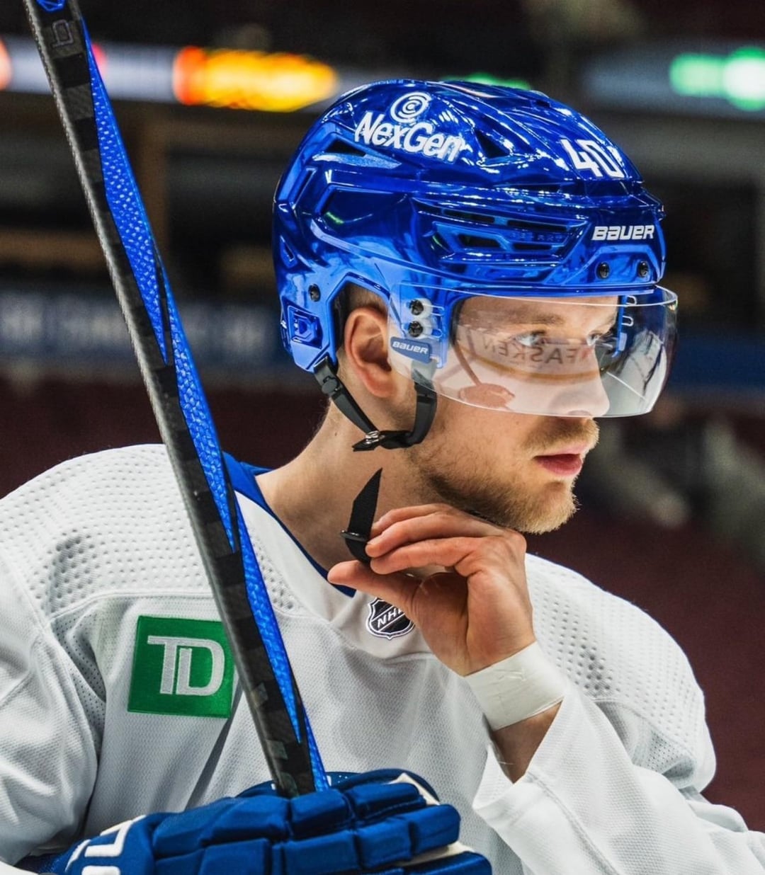
These aren’t as bad as silver and gold ones, but still unnecessary
grooverocker
Matte black hats are classy af. These chrome domes looked bad in Vegas and LA, they look even worse in Vancouver.
SpaceMtnMan3127
Blue Steel.
LAKingsFan17
My Chrome Domes (Yes LA) aren’t bad. But I’m also biased. Vegas gold chrome helmets are worse than these
therealgoat1212
I like em
Anishinabeg
Thanks. I hate it.
xizrtilhh
Should be flat black plasti-dip all the time. Plasti-dip the Zamboni too.
JealousMeringue6674
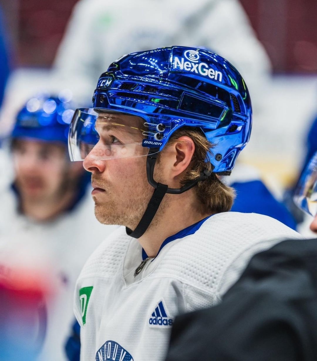
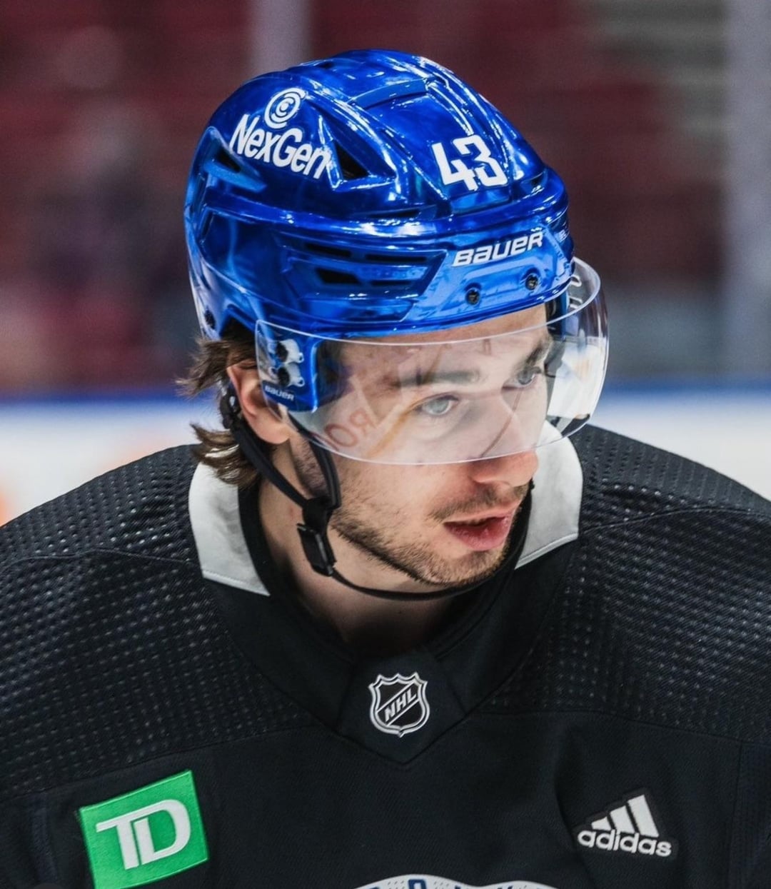
I’m liking the blue ones more every time i see them, and i absolutely hate the Kings and Vegas chrome helmets.
DragLongjumping3714
Just ugly. All of the chrome. Go flat.
Dear-Roll-670
Sexy af
PhilosophyMundane825
If the Oilers eventually do this, will they make the helmet multicolour « oil slick » shiny?
VGFin
The matte black is amazing. These…aren’t terrible? I might even like them.
TiredReader87
I like them 🤷♂️. They’re the best of the 3 by far.
I don’t mind LA’s, but I don’t like Vegas’ gaudy gold chrome (or their gold jerseys)
cam_huskers
These aren’t terrible. But it’s very 2004 Need 4 Speed: Underground. Which, in fairness to the chrome helmets, was the best of the Need 4 Speed installments.
canuck_in_the_alps
*swipes left*
NotTheATF1993
Chrome nuts
werzcaseontario
Absolutely garbage. There needs to be more stringent rules on uniform characteristics.
redditguyinthehouse
Am I wrong in thinking only super confident teams have these? Boston should be getting one soon lol
Matte is better, these aren’t as bad as I expected, maybe they’ll grow on me, all in all could be worst
2min4roughing
Okay, they’re sick
Venetian_chachi
This looks silly. I wish it would end not spread.
cantbelievethename
These are somehow less obnoxious than the gold and silver ones.
KohlWeld50
I hate the “chrome domes” but these ones actually look alright. The shiny blue is quite likable
gabbyspapadaddy
Absolutely love the matte black. I dunno about these.
Reasonable_Net3244
I’m so hard right now
N-E-B
Chrome helmets are probably my least favourite NHL uniform trend right now.
DonCorlealt
This trend sucks. Theyre ugly bro
Hoof_Hearted12
They remind me of my CCM bucket circa 2002
piantissimofan00
By far better than both the gold and silver. Still not great
vanyel196
Looks trashy
Future_Gohst
The chrome helmets look dumb and cheap. I’m a fan of the matte colors though
archasaurus
This ain’t it for me. Reminds me of a cheap plastic toy.
Knights_Up
Love it. I love the chrome buckets regardless of team.
skinnypantsNsomevans
I want the flyers to do this with a chrome orange so bad.
EndOrganDamage
Not boring anyway, also like the idea for oil slick oilers ones for edmonton with the rainbow sheen that u/philosophymundane825 had–would be cool.
ldssggrdssgds
Garbage
shania69
That’s some NexGen shit…
toxicvegeta08
This is beautiful
CoolOpotamus
I think this should be a league-wide style. Haters be damned, I think the chrome domes are the best.


40 Comments
I hate this trend
These aren’t as bad as silver and gold ones, but still unnecessary
Matte black hats are classy af. These chrome domes looked bad in Vegas and LA, they look even worse in Vancouver.
Blue Steel.
My Chrome Domes (Yes LA) aren’t bad. But I’m also biased. Vegas gold chrome helmets are worse than these
I like em
Thanks. I hate it.
Should be flat black plasti-dip all the time. Plasti-dip the Zamboni too.
I’m liking the blue ones more every time i see them, and i absolutely hate the Kings and Vegas chrome helmets.
Just ugly. All of the chrome. Go flat.
Sexy af
If the Oilers eventually do this, will they make the helmet multicolour « oil slick » shiny?
The matte black is amazing. These…aren’t terrible? I might even like them.
I like them 🤷♂️. They’re the best of the 3 by far.
I don’t mind LA’s, but I don’t like Vegas’ gaudy gold chrome (or their gold jerseys)
These aren’t terrible. But it’s very 2004 Need 4 Speed: Underground. Which, in fairness to the chrome helmets, was the best of the Need 4 Speed installments.
*swipes left*
Chrome nuts
Absolutely garbage. There needs to be more stringent rules on uniform characteristics.
Am I wrong in thinking only super confident teams have these? Boston should be getting one soon lol
Matte is better, these aren’t as bad as I expected, maybe they’ll grow on me, all in all could be worst
Okay, they’re sick
This looks silly. I wish it would end not spread.
These are somehow less obnoxious than the gold and silver ones.
I hate the “chrome domes” but these ones actually look alright. The shiny blue is quite likable
Absolutely love the matte black. I dunno about these.
I’m so hard right now
Chrome helmets are probably my least favourite NHL uniform trend right now.
This trend sucks. Theyre ugly bro
They remind me of my CCM bucket circa 2002
By far better than both the gold and silver. Still not great
Looks trashy
The chrome helmets look dumb and cheap. I’m a fan of the matte colors though
This ain’t it for me. Reminds me of a cheap plastic toy.
Love it. I love the chrome buckets regardless of team.
I want the flyers to do this with a chrome orange so bad.
Not boring anyway, also like the idea for oil slick oilers ones for edmonton with the rainbow sheen that u/philosophymundane825 had–would be cool.
Garbage
That’s some NexGen shit…
This is beautiful
I think this should be a league-wide style. Haters be damned, I think the chrome domes are the best.
I love ’em.