I like it. Of course everyone on r/hockey is trashing it.
XgogurtX
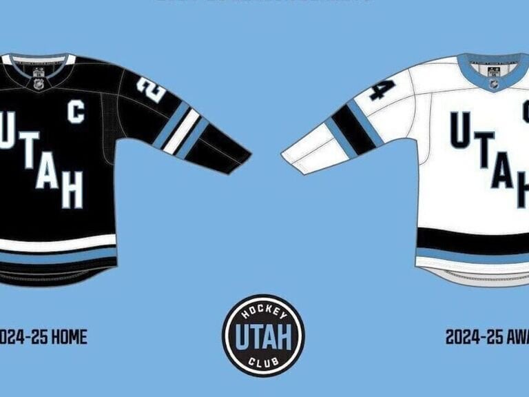
I honestly like the name. The jerseys are pretty boring though in my opinion.
Packhammer24
Why can’t they just pick a nickname?
rideronthestorm29
Tampa Lightning called they want their jerseys back
BombPopCaper
Seems fine but it’ll be better when they can establish their own brand. I personally am rooting for Yeti so that the Kraken vs Yeti is a thing (I’m sure that that’s the first time that joke has been made).
Graycat23
Fanatics would have needed time they didn’t have to execute and produce a sweater design. It’s not as simple as just picking something. It’s reasonable to expect that the colors will be permanent but as to a nickname/permanent branding/sweater/crest design, probably by the time Four Nations takes place in 2025.
NotOnHerb5
I like them.
Long-Movie4889
Booooooring. Perfectly in line for a bunch of bible thumpers lol
MMmhmmmmmmmmmm
Still think they should be called the Utah SL,UTs
JLR-
Meh. Reminds me of the Early 2010s Avs alt jersey.
Could be far worse like the L.A Burger King jersey or any of the Atlanta jersey
joey_1324
I love the color scheme
rlc327
God I am such a sucker for a diagonal name on a jersey
Throw_away91251952
As a Utahn, I’m not a fan of the jerseys or the name being so bland going into the 1st season, but I can’t say I totally blame them. Seems like the owner, Ryan Smith, saw the chance to get the team and did so before another owner did.
This essentially left the owners a couple months to figure out the players, scouting staff, management staff, coaching staff, and the rest of the staff. Add to that the issues of ensuring Delta Center can be converted to an ice rink on a regular basis instead of once a year for a preseason game. So I get why branding may come last.
So all that to say that I’m not that upset about this team having a crappy name and jerseys in year 1.
fanofsports44
The kachinas died for this…
GoldenKnights1023
We all know they are going to wear khaki pants. These really aren’t much to write home about. Rock black, salt white:

Wafflemonster2
Love the colours, especially that “mountain blue” but an actual team name and logo would be nice lol, guess we’ll see after next season…
mograe
No love for the Utah Phoenix after the Smith Group brought them back to life?
Seriously though, I hope they go with Yeti after they have a chance to get their designs and branding done. They jerseys are fine, I’m not blown away but they’re not bad.
jkurtz007
This is the biggest debacle on all of hockey. Marketing nightmare.@NHL you really screwed up with this one.


22 Comments
Honestly, jerseys look kinda clean imo
I like it. Of course everyone on r/hockey is trashing it.
I honestly like the name. The jerseys are pretty boring though in my opinion.
Why can’t they just pick a nickname?
Tampa Lightning called they want their jerseys back
Seems fine but it’ll be better when they can establish their own brand. I personally am rooting for Yeti so that the Kraken vs Yeti is a thing (I’m sure that that’s the first time that joke has been made).
Fanatics would have needed time they didn’t have to execute and produce a sweater design. It’s not as simple as just picking something. It’s reasonable to expect that the colors will be permanent but as to a nickname/permanent branding/sweater/crest design, probably by the time Four Nations takes place in 2025.
I like them.
Booooooring. Perfectly in line for a bunch of bible thumpers lol
Still think they should be called the Utah SL,UTs
Meh. Reminds me of the Early 2010s Avs alt jersey.
Could be far worse like the L.A Burger King jersey or any of the Atlanta jersey
I love the color scheme
God I am such a sucker for a diagonal name on a jersey
As a Utahn, I’m not a fan of the jerseys or the name being so bland going into the 1st season, but I can’t say I totally blame them. Seems like the owner, Ryan Smith, saw the chance to get the team and did so before another owner did.
This essentially left the owners a couple months to figure out the players, scouting staff, management staff, coaching staff, and the rest of the staff. Add to that the issues of ensuring Delta Center can be converted to an ice rink on a regular basis instead of once a year for a preseason game. So I get why branding may come last.
So all that to say that I’m not that upset about this team having a crappy name and jerseys in year 1.
The kachinas died for this…
We all know they are going to wear khaki pants. These really aren’t much to write home about. Rock black, salt white:

Love the colours, especially that “mountain blue” but an actual team name and logo would be nice lol, guess we’ll see after next season…
No love for the Utah Phoenix after the Smith Group brought them back to life?
Seriously though, I hope they go with Yeti after they have a chance to get their designs and branding done. They jerseys are fine, I’m not blown away but they’re not bad.
This is the biggest debacle on all of hockey. Marketing nightmare.@NHL you really screwed up with this one.
https://preview.redd.it/3lhflweypg6d1.png?width=1024&format=png&auto=webp&s=ed823cce7d3ec7374ccb1891dd61090a190b52d3
They look nice
About as uninspired as it gets. Don’t expect any team identity half the fun is the logo and the team name