I like this look. That logo and the stripe on the bottom keep it really clean.
StarHockeyProd
Those away jersey’s are fire
astovertop
I like the stripe on the bottom half of the torso but I just wish it was a bit smaller.
Kinda looks like a cummerbund lol
parfourtothefloor
Chevrolet Kings.
Separate_Pound_753
These are fuckin awesome. Couldnt stand LA unis anymore, primarily cause of the logo and it was too boring imo
Venaixis94
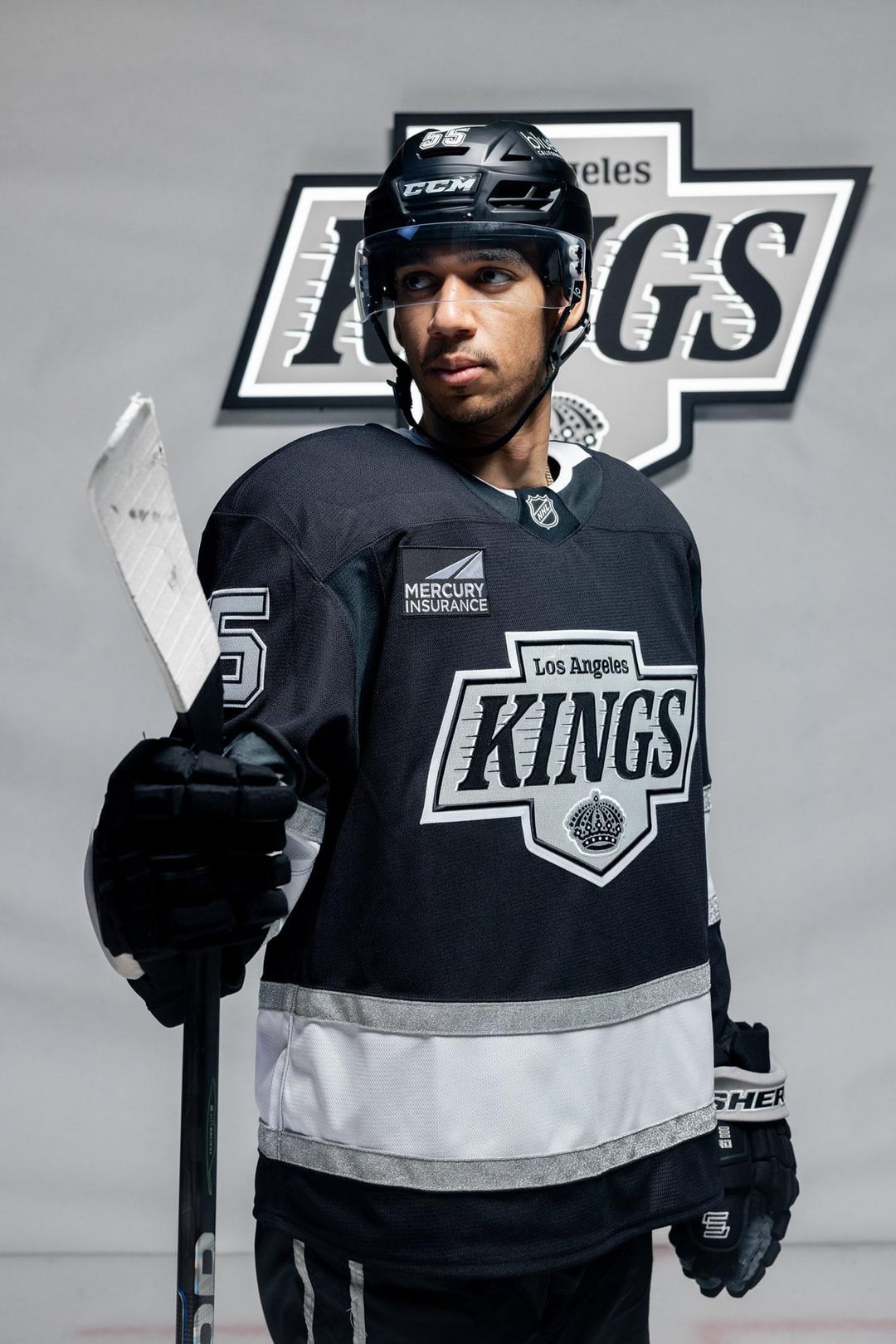
Are the black helmets a matte material?
ThunderGoalie35
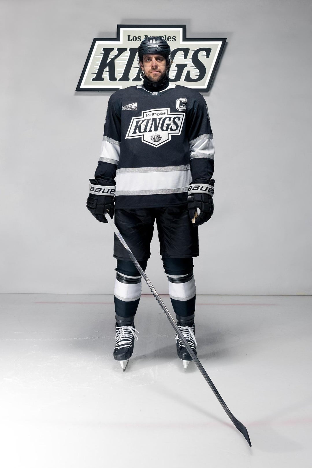
The waist stripes are ridiculous lol
carry-on_replacement
Matte helmets look sick though. the Canucks have had them last year and it just completed the look of the third jersey. Coyotes had it on their arizona jersey and it looked fantastic. Here it looks just at home
aessae
Ad, 0/10
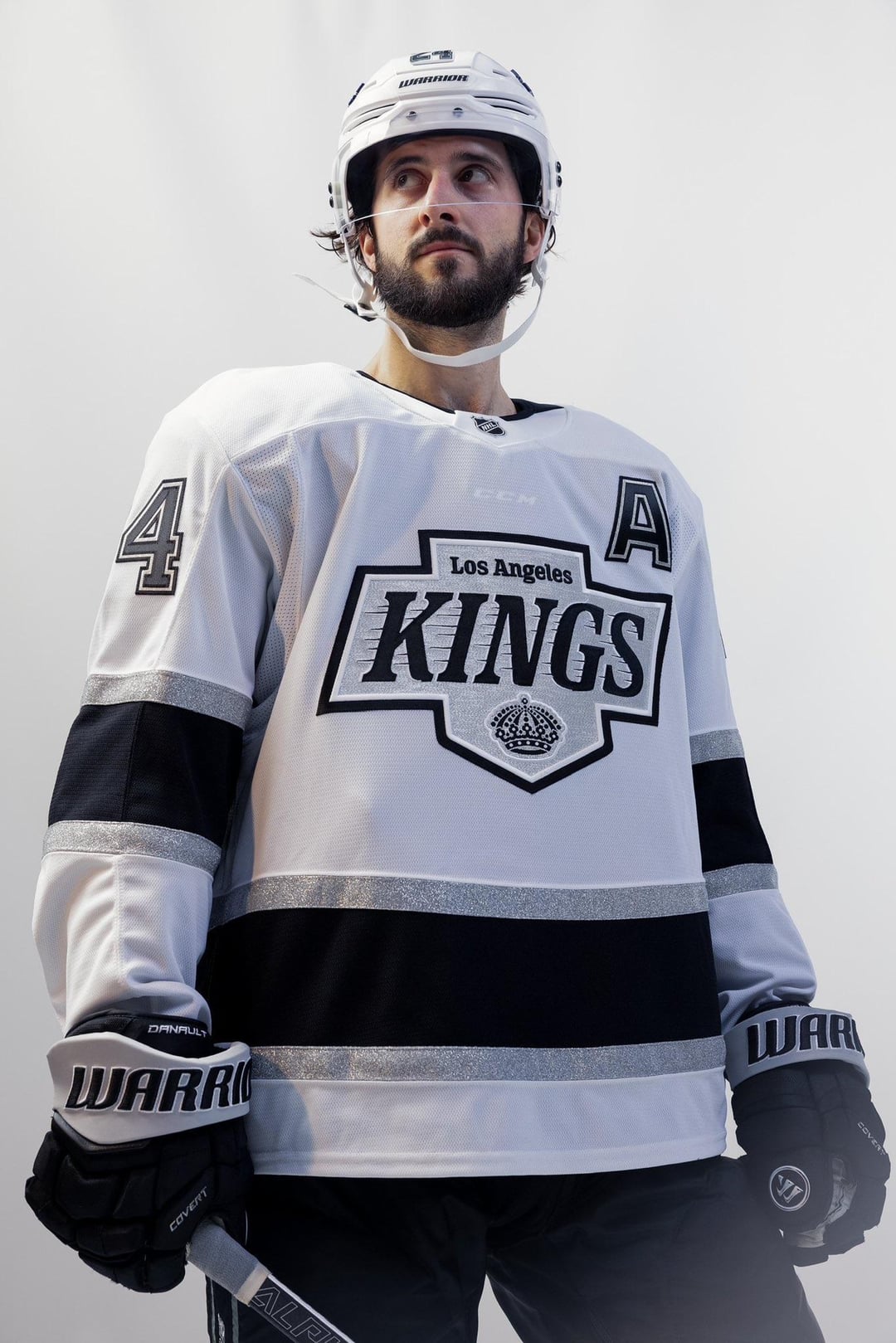
Away kit is a 10/10 …but is the jersey translucent? Could you read the logo off the shoulder pads through the jersey on an Adidas?
Scrubosaurus13
New logo looks sick, also respect for Kopitar wearing a neckguard just for this photo shoot.
Radjage
Damn that white strip is soooooo thick on the black jersey. Just cut it off and make it a croptop /s. Makes it Looks kinda cheap but I can tell they are going for a minimalist look, will look better on the ice.
The logo is a definite improvement, not a huge fan of having 3-4 different fonts on the jersey. It wouldn’t be nearly as egregious if not for that ad logo, but at least it’s the same colors.
Fanvsant
Man I liked the old ones a lot more
Otherwise-Contest7
The waist strip is comically big, and the ‘KINGS’ font should’ve just been the same font that it was on the original Gretzky era jerseys. Every org always over-tinkers to add something new or modern just for the sake of adding something new or modern.
Other than that, this is a big upgrade overall. Both SoCal teams will be looking better on the ice in ’24/’25.
MollysYes
Admittedly I’m biased, but that’s not much of a “new” look imo.
Smellbinder
I love the new Mercury Insurance patch.
arbordianae
god i wish they’d just wear purple that would be sick
jakestephenlacroix
Cool but my god the waist stripe is too big
DrDrangleBrungis
Beautiful. The ads are killing me tho.
Unsound_Science
I like the aways a lot
Red_Maple
That is a King-sized stripe across the waist of the jersey, wow
weschester
I hate matte black helmets but at least they’re not chrome lol
bwoah07_gp2
Those jerseys are incredible.
A concern I’ve seen on Instagram comments is people are disappointed the CCM logo on the gear is so visible through the white jersey. People are already making Fanatics jokes about it.
Oranana69
Missed opportunity to go back to the purple jerseys with the crown


36 Comments
I like this look. That logo and the stripe on the bottom keep it really clean.
Those away jersey’s are fire
I like the stripe on the bottom half of the torso but I just wish it was a bit smaller.
Kinda looks like a cummerbund lol
Chevrolet Kings.
These are fuckin awesome. Couldnt stand LA unis anymore, primarily cause of the logo and it was too boring imo
Are the black helmets a matte material?
The waist stripes are ridiculous lol
Matte helmets look sick though. the Canucks have had them last year and it just completed the look of the third jersey. Coyotes had it on their arizona jersey and it looked fantastic. Here it looks just at home
Ad, 0/10
Away kit is a 10/10 …but is the jersey translucent? Could you read the logo off the shoulder pads through the jersey on an Adidas?
New logo looks sick, also respect for Kopitar wearing a neckguard just for this photo shoot.
Damn that white strip is soooooo thick on the black jersey. Just cut it off and make it a croptop /s. Makes it Looks kinda cheap but I can tell they are going for a minimalist look, will look better on the ice.
The logo is a definite improvement, not a huge fan of having 3-4 different fonts on the jersey. It wouldn’t be nearly as egregious if not for that ad logo, but at least it’s the same colors.
Man I liked the old ones a lot more
The waist strip is comically big, and the ‘KINGS’ font should’ve just been the same font that it was on the original Gretzky era jerseys. Every org always over-tinkers to add something new or modern just for the sake of adding something new or modern.
Other than that, this is a big upgrade overall. Both SoCal teams will be looking better on the ice in ’24/’25.
Admittedly I’m biased, but that’s not much of a “new” look imo.
I love the new Mercury Insurance patch.
god i wish they’d just wear purple that would be sick
Cool but my god the waist stripe is too big
Beautiful. The ads are killing me tho.
I like the aways a lot
That is a King-sized stripe across the waist of the jersey, wow
I hate matte black helmets but at least they’re not chrome lol
Those jerseys are incredible.
A concern I’ve seen on Instagram comments is people are disappointed the CCM logo on the gear is so visible through the white jersey. People are already making Fanatics jokes about it.
Missed opportunity to go back to the purple jerseys with the crown
Idk it looks kinda weird, like the logo is too big. [Rather have the new crown as the primary logo](https://preview.redd.it/0c76zelr3y8d1.jpeg?width=556&format=pjpg&auto=webp&s=5dc3ef679693cc598b180aba2c8b1085198be91c), that thing is fire.
👎
https://preview.redd.it/o3wh5mpeqy8d1.jpeg?width=1242&format=pjpg&auto=webp&s=155bdafac500e6d01c2a837f2a26e24bd72caea5
Those black helmets are fire
The trim striping along the bottom needs to be a bit thinner but that’s about it
MERCURY INSURANCE
They look vaguely familiar, but I can’t recall where I’ve seen them before.
Ugly af
When they have the dope ass purple and yellow crown jerseys, why tf would they use boring black and grey?
Am I the only one who thinks these look AI generated or something you’d see in a uniform select menu on a PS5?
Would love to see them go back to yellow and purple. People seem to dig their colors but man do I find them boring looking.
I am underwhelmed. Is the persistence of the black and white theme supposed to evoke a freeway or something?
See y’all in April
The Mercury insurance kings. These adds are so bad it’s not even funny.