

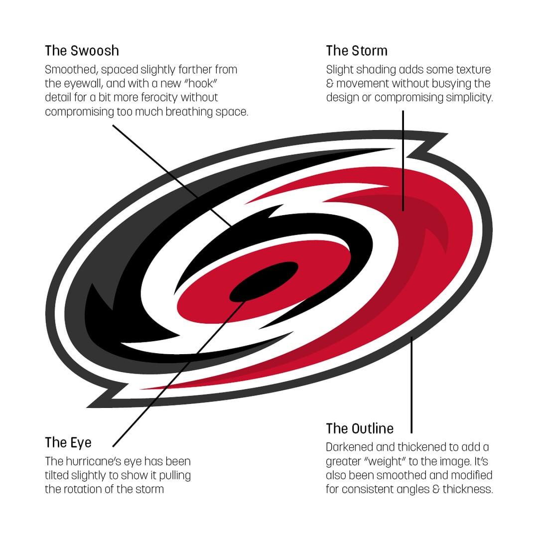
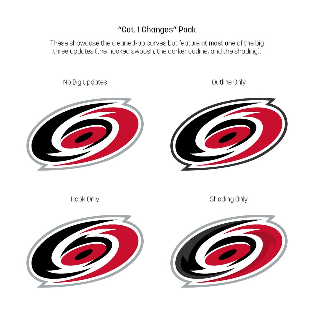
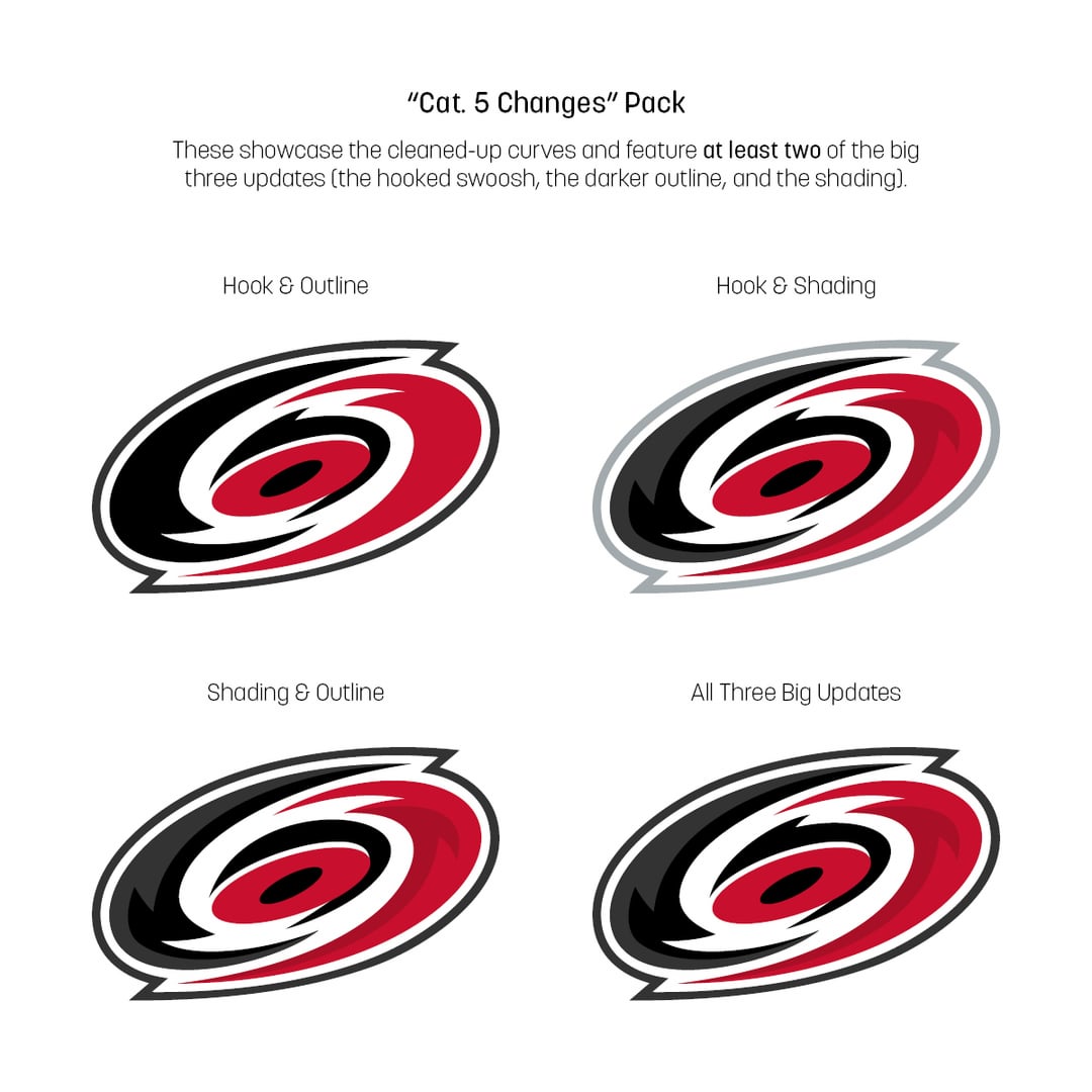
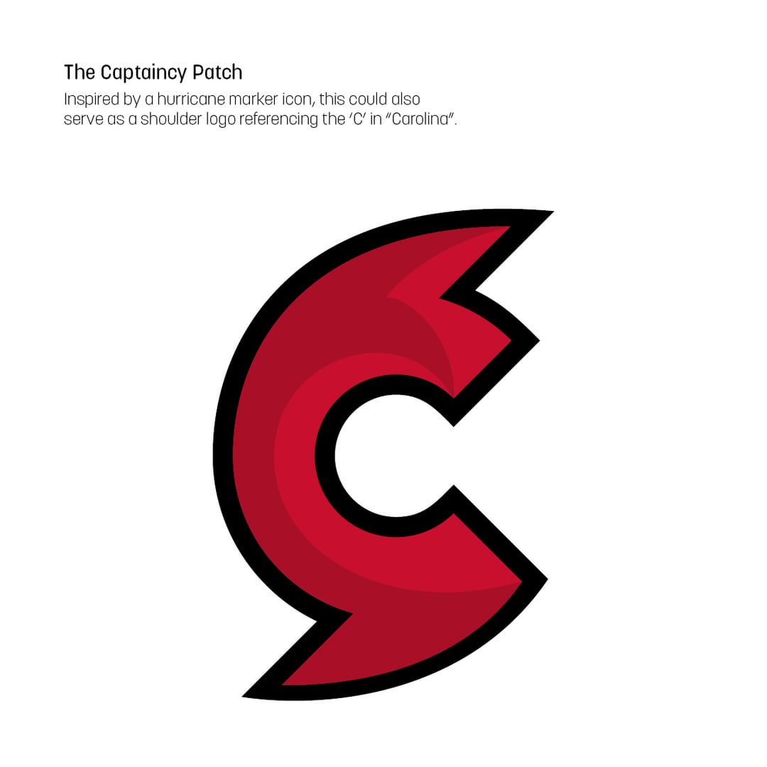

J’ai essayé de rafraîchir le logo des Hurricanes de la Caroline. Il contient une liste des principaux changements, quelques variations classées par différence par rapport à l’original et une comparaison directe à la fin. Il y a aussi une idée de patch de capitaine/logo d’épaule. Dites-moi ce que vous en pensez !
—
markkaschak


13 Comments
Not bad, still the worst logo in the league 🚽
Subtle, but makes a big difference.
Edit:👍
I like it a lot!
Maybe something with a whaletail and an H works better.
Dope. I still prefer the flags though.
I like the depth you gave it. The C logo is similar to the Cincinnati Cyclones logo too (ECHL)
I like the depth you gave it. The C logo is similar to the Cincinnati Cyclones logo too (ECHL)
Too busy for me tbh
I would’ve kept the eye at its angle, but stretch the logo vertically slightly. This looks very good.
I think they should make the warning flag their primary and add a 3rd color like grey or use more white.
They’re the worst uniforms in the league.
You should contact the company cyclone trucking. They are real creative at changing that logo. /s
Hook and shading looks the best to me
I love different captain patches. Make them different. Loved when Flyers used the [keystone logo](https://www.icethetics.co/blog/2014/9/20/flyers-adopt-2012-winter-classic-jersey-as-new-third)