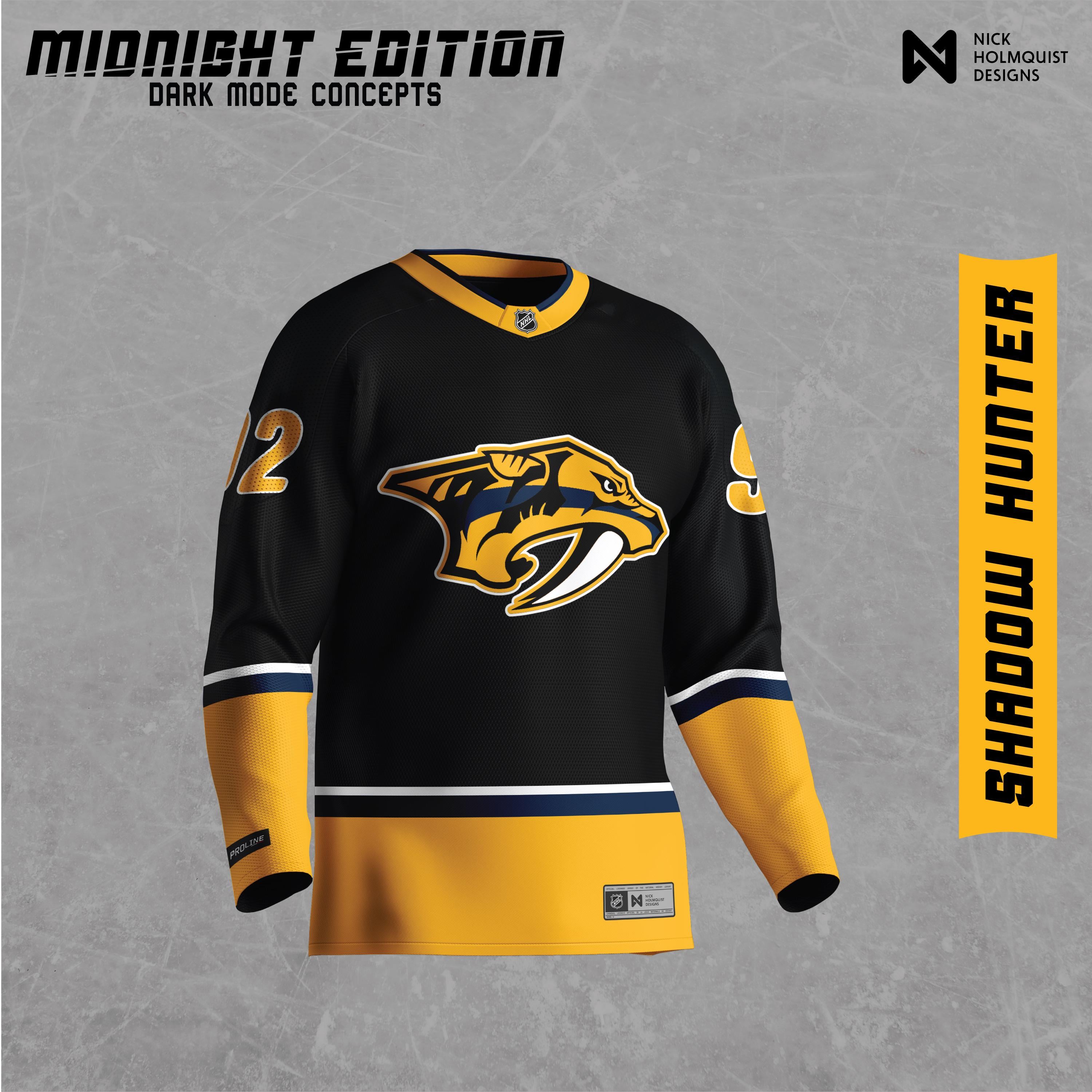
Si ce n’est pas autorisé, veuillez supprimer ! Je m’amuse juste
J’ai décidé de faire un "mode sombre" maillot pour toutes les équipes de la LNH.
Je fais cela principalement pour mon bénéfice en tant que designer pour en apprendre davantage sur la façon dont les équipes ont construit leurs maillots, leurs logos et leurs couleurs. C’était très amusant et j’espère que vous apprécierez tous !
—
IslandTwig


23 Comments
Not a bad look, I do like having less gold/yellow than the standard home.
Make it Navy Blue and I’m in. Won’t stomach Pens colors until I’m in my grave.
Kinda want to see this but with the old Preds skull logo in gold/yellow color like this.
Make it navy and I’ll empty my bank account buying the roster.
Too much like penguins for me.
I’m really tired of the yellow.
Seconds all around for everyone that said use navy instead of black but my own twist would be to use the midnight cat from the winter classic. *That* would be straight fire.
This looks like a Blue Lives Matter jersey.
Midnight blue instead of ‘fuck-the-pens’ black and ill pay double the asking price
If we wore these in the SCF, maybe the whistle wouldn’t have blown so fuckin’ quick
Love it.
Penguins called…
Bring back the UNH jersey
Looks fucking sick. I’d buy one in a heartbeat.
Good looking penguins uniform!
Too much like Pittsburg
Yes. Anything but “gold” (really just mustard yellow) at this point. Uncommon opinion, don’t care.
It’s funny to think that before jerseys they just wore sweaters. I’d wear this as a sweater or hoddie. It’s stylish.
Looks great, but a little too close to the penguins
I’ve always liked the idea of a black alt jersey with a blackout in the crowd to go with it
Nope. Black looks too much like the penguins.
Yeah I wouldn’t want to make them look closer to the pens jerseys.
Quite literally switch all the Gold for white/ silver and you have a killer design.