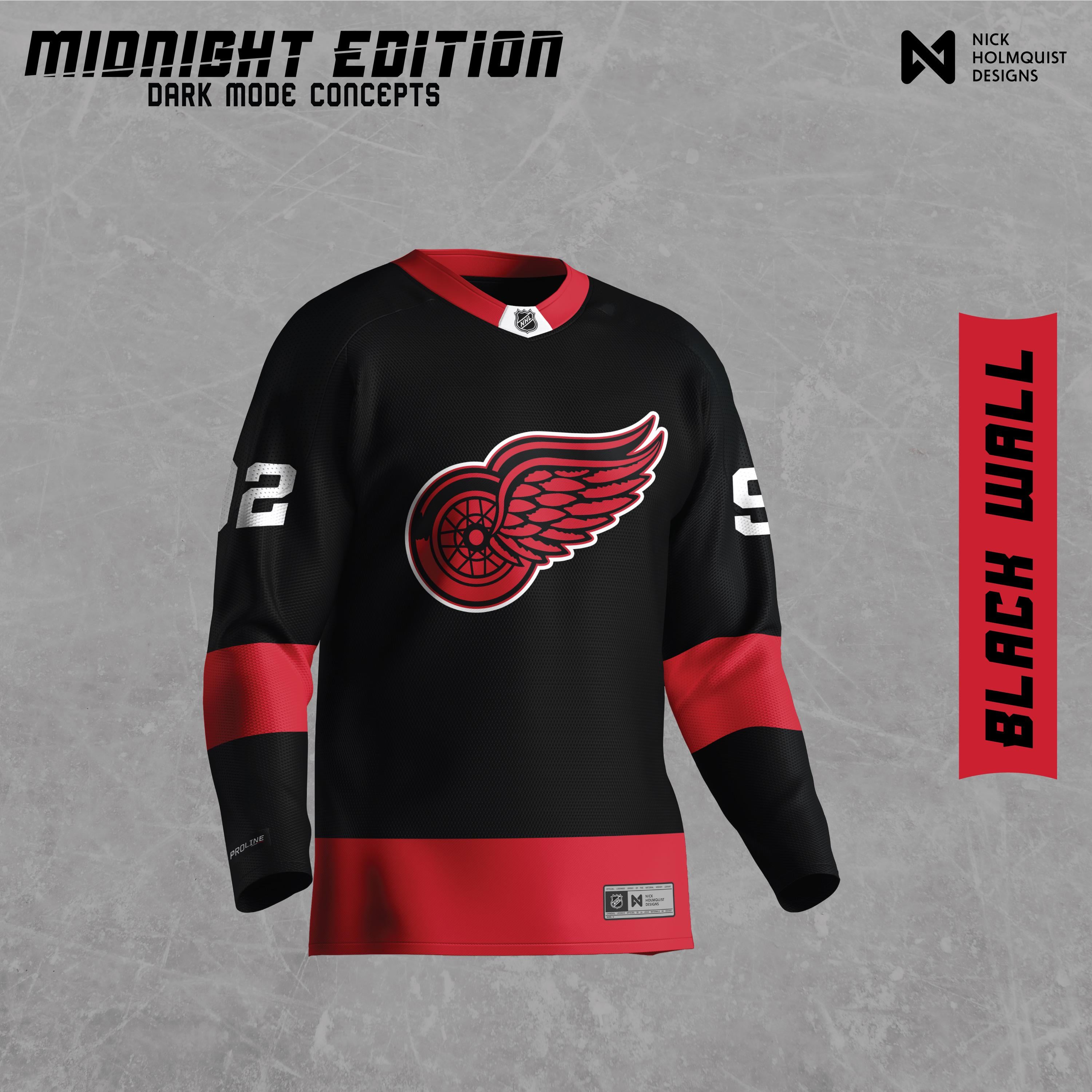
Si ce n’est pas autorisé, merci de supprimer ! Je viens en paix
J’ai décidé de faire un "mode sombre" maillot pour toutes les équipes de la LNH.
Je fais cela principalement pour mon bénéfice en tant que designer pour en apprendre davantage sur la façon dont les équipes ont construit leurs maillots, leurs logos et leurs couleurs. C’était très amusant et j’espère que vous apprécierez tous !
—
IslandTwig


26 Comments
Creative!
I love it, great job
Might put a little more white in the logo, but I’d buy it.
Edit: OR black out the logo and outline it in red, with some red and/or silver/white accents.
Okay, I’ll stop now.
Certainly a cool concept! I think it looks too similar to a Canes jersey to use though
Maybe add some white trim on the sleeves between the red and black. But I dig it overall.
Definite old black Starter jersey vibes, I have a Fedorov one laying around here somewhere…
Cool concept.
Still a no. Red and white only in my mind. But a creative concept!
fine, take my money
Interesting exercise, but hell no! Looks like Carolina.
Red and white should be the only colors Detroit ever wears.
I need to see the priority patch on it….
good work but i cannot stand black in any detroit team color scheme
Jesus Christ those are heinous
Very cyberpunk
Unreal
It’s a cool design. But I’m one of those fans that doesn’t want black on a wings jersey ever again. Ref and white!
I really dislike this! But the execution is great!
No

Great concept! Definitely one of the better ones I’ve seen
As far as conceptualizing alternate Wings jerseys, I’d say this is a good design. Personally, I’m just not a fan of black Wings jerseys.
I agree with another commenter that it could use a little more white. Horizontal white lines on the sleeve would be an easy, but expected addition. I’m wondering if some white accent designs that resemble feathers (like in the Wing) or the spokes of the wheel could be added somehow to spice it up.
Been dying for this team to have a legit black/red jersey
Love this, looks really cool. Wanna see it with white wheel spokes and a thin white line between red and black transition on the body and arms.
Love the effort! Let’s stop trying to make black a thing for the wings tho lol. If anything purple for Al or silver/gray but even those are meh
Applaud the creativity, but absolutely not!
I don’t see a garbage logo.
Looks amazing. Love the constructive criticism in this thread but as a concept I think it’s perfect.