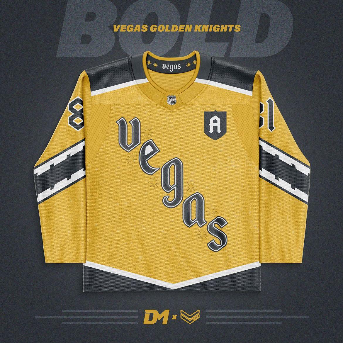
Réalisé par Drew Martin Design sur Instagram
https://www.instagram.com/dm.graphic.design.co?igsh=MW05OWFleGh1azZhNQ==
—
andyknapp003

Réalisé par Drew Martin Design sur Instagram
https://www.instagram.com/dm.graphic.design.co?igsh=MW05OWFleGh1azZhNQ==
—
andyknapp003
15 Comments
Would be kind of surprised to see a gold third
As the only other comment at the time of me writing, this said, one jersey made out of Brillo pad is enough, I’m not in a rush to have another.
Also, I think either 9 or maybe 61 would have been a better number to utilize. Now I’m triggered.
Preferably 9. Remember: The A stands for Aces.
With all that said, I think diagonal text jerseys might be the best weird little hockey specific thing. I love it. Every time. I love it for the Rangers, I love it for Pittsburgh, I love it for the Canes, I love it for us, I love it for whoever I’m forgetting. I just love it. I would very much be in favor of us having a full-time diagonal text jersey, be it RR2 or a different one.
I hope not. I’d still buy it, but, let’s get another black jersey first.
That’s going to be a « no » from me, dawg.

I hate it
Damn istg every time I see a jersey concept I like all the comments are like “🤢🤢🤮🤮”
Not a fan of the striping on the sleeves or the font. I agree with the others, we don’t need another gold jersey. Black or red third that won’t disappear after a year.
Unfortunate number choice
Looks better without the Machy on it. 🤣🤣
No
Shit these are only someone’s take. Not even close to a legit jersey. Don’t mean a thing doesn’t matter if we like it or not. It’s fantasy.
The sleeve design is weak.
i think overall it’s kinda cute and i love the font, but idk im not a fan of the sleeve design
Meh, it looks neat but I rather a third be black or something.