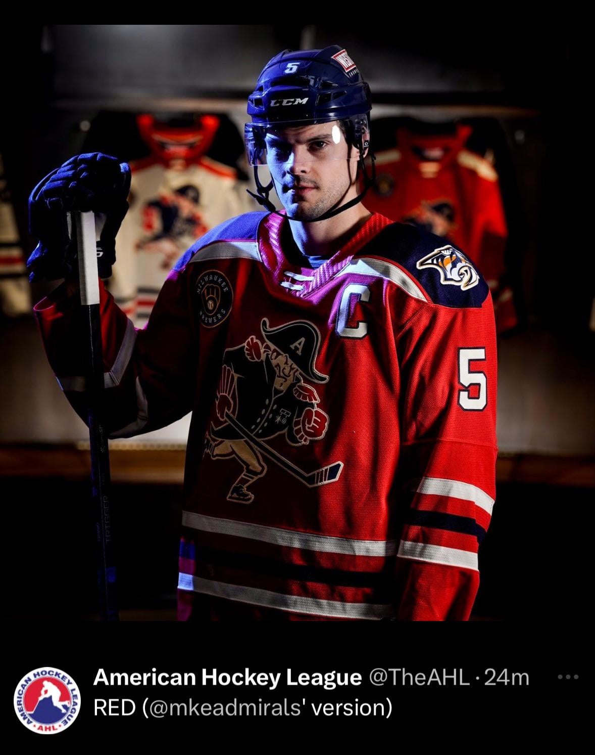
Just noticed the shoulders, that’s an odd place to stop with the blue 🧐
Birdhawk
I love the old Ad’s logo man. Thats awesome. Probably not the best lighting for a jersey reveal but still. Also like that theres a similarity between the vintage Ads logos and the vintage Sounds logos.
oshoney
Bring back the goofy Pirate
RlyRlyBigMan
Skelly is back!
BenjaminMStocks
I grew up with the logo being just the face and the Admiral’s hat, loved it. Never really got into the pirate design.
I dig this, they’re selling items with this color scheme at the Wisconsin State Fair this weekend if there other likeminded thinkers here.
Bluecricket5
One of the ugliest I’ve ever seen 🤢
BarcaJeremy4Gov
awwww Clark, she’s a beaut! I will absolutely be getting a Happy in this color.


")

7 Comments
Just noticed the shoulders, that’s an odd place to stop with the blue 🧐
I love the old Ad’s logo man. Thats awesome. Probably not the best lighting for a jersey reveal but still. Also like that theres a similarity between the vintage Ads logos and the vintage Sounds logos.
Bring back the goofy Pirate
Skelly is back!
I grew up with the logo being just the face and the Admiral’s hat, loved it. Never really got into the pirate design.
I dig this, they’re selling items with this color scheme at the Wisconsin State Fair this weekend if there other likeminded thinkers here.
One of the ugliest I’ve ever seen 🤢
awwww Clark, she’s a beaut! I will absolutely be getting a Happy in this color.