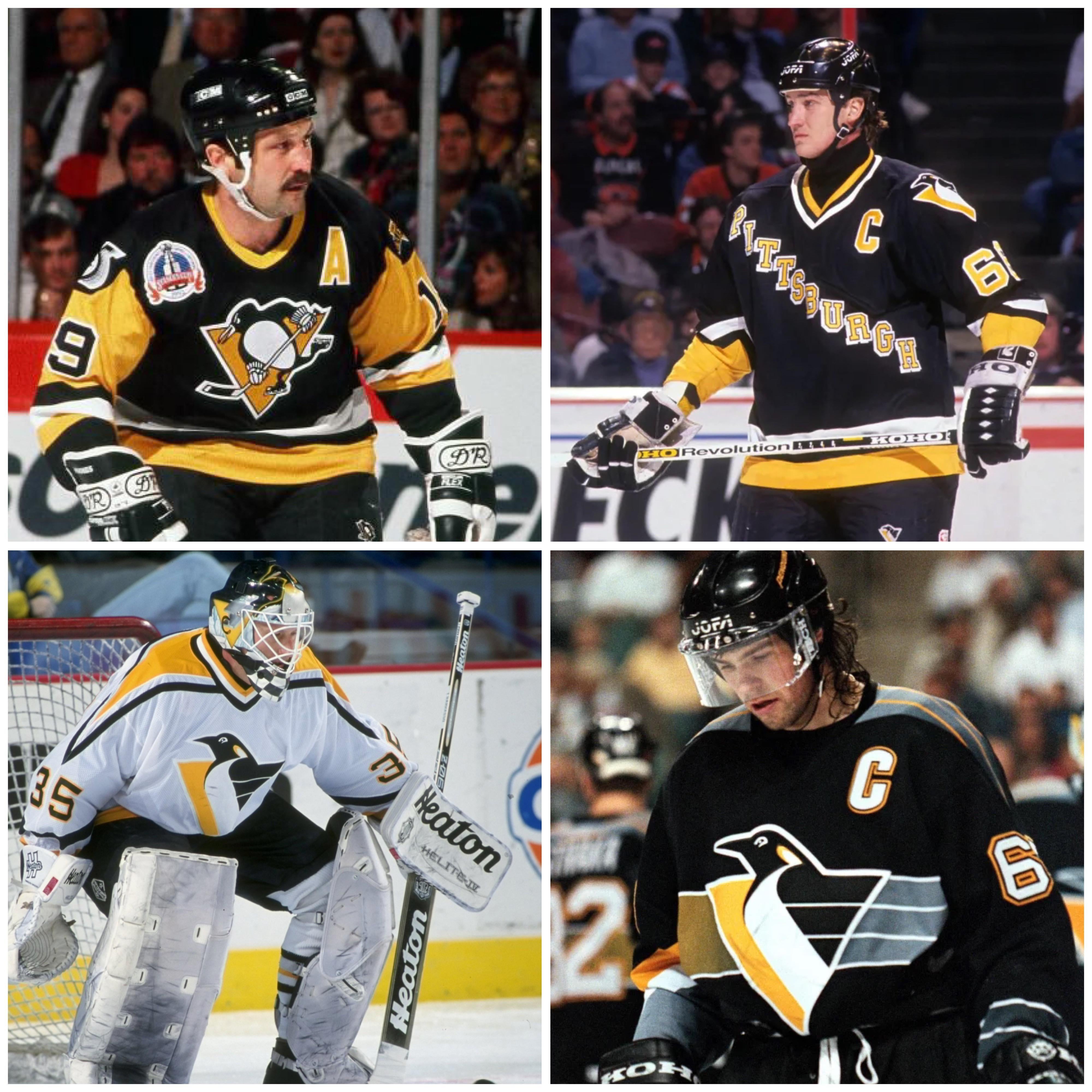
Probably the nostalgia factor for me because I was 7 when they were introduced and I thought they were the coolest things on the planet, but the OG 3rd jersey with the gradient will always reign supreme in my mind
Euphoric_Dig4624
I use to think the one with PGH on the diag was my favorite thanks to snoop, but I am longing for robo with wrap around color on jags here
gialloneri
Top left, every day of the week and twice on Sundays
Kineada11
Top left is the only correct answer.
New_Day9679
Top left IMO
chawk84
Always loved bottom right
1derfulPi
Top left. Forever
UNDERWATER_BOI
I have always loved the gradient Robopenguin. It is so nostalgic to me and has been one of the most divisive designs in Pens history. But utimately it was I grew up watching them wear,
djhepcat
Trottier
SHAOLIN_SILK
Top Left
DonPensfan
Top left are my absolute favorites, top right for the diagonal name are the second fav, mostly due to nostalgia for Mario and crew
CoachCDaddy
Has to be the first one. Theres just something about seeing a penguin playing hockey that just feels right
VirgilCane
Top left, a wide gap, then top right. Then a ten mile gap before hitting the bottom two.
LetsgoPenguins87
I like the top 2 the best…. Though might be influenced by the player wearing top right😀
fuzzo999
Love me the top left. I always enjoy the staking penguin.
Robo Pen is alright, not the best, but still a cool overall.
I might get hate, but I don’t care for the diagonal Pittsburgh. I do not care for the concept on any jersey that is just the team name or city. While I get it, not my style at all.
_burtmacklin44_
Trottier jersey. I call that the angry Pens logo. It was only used 2 years in 91 and 92. I just always preferred that design over the current one
dave6687
The 91-92 three patch is in contention for the best nhl jersey ever. The other three are nostalgic and lovely, but the gradient design has always been one of my favorites. The the wordmark is clean, the white robo is sharp.
zatchell
Robo Pen as it was my first jersey that my dad let me get at the Igloo. I love all of them though.
Walrus-Both
Top left is the best. Top right is cool for special occasions.
tvoltz
Top left.
gamesonthemark
My order of preference: Top Left, Top Right, Bottom Right, Bottom Left
toonman27
Top left, never change it. 2nd is bottom right, which is the only Robo Penguin version I like.
Budster78
Trots
buzzer3932
Top left, but I like the top right the most out of these four photos for some reason
millard_spillmore
Bottom right. Wish it could have been part of the RR series
JukePenguin
Imma a robo pen guy… Kill me
Dabbstar
I grew up in the 90s and when I was old enough to really understand the game of hockey and started playing in the later 90s, they were using the flying pigeon logo😂. So I’m partial to the bottom right for my own nostalgia, but overall I think the top left is best.
Problematique_
Top left. As far as I’m concerned they’re arranged in the correct order
1 2
3 4
tonyray
Top Right
Top Left
Bottom Left
Bottom Right
Love me some 90’s…so my 2 and 3 are very close
CranMalReign
Snoop Dogg
ContractCheap9221
Gin N Juice jersey
MostlyApe
The ones they won cups wearing…aka fuck robopigeon.
apersello34
Top right or bottom left
zestfullybe
Top left. The classic look is classic for a reason.
Second choice is the bottom right gradient RoboPen. I wish they’d make a return. I felt like it was a lost opportunity not doing a white version as one of their reverse retros.
rymas1
Not a popular opinion but the robopen is my favorite. I love the reverse retro I got last season. That is my childhood team.


35 Comments
Probably the nostalgia factor for me because I was 7 when they were introduced and I thought they were the coolest things on the planet, but the OG 3rd jersey with the gradient will always reign supreme in my mind
I use to think the one with PGH on the diag was my favorite thanks to snoop, but I am longing for robo with wrap around color on jags here
Top left, every day of the week and twice on Sundays
Top left is the only correct answer.
Top left IMO
Always loved bottom right
Top left. Forever
I have always loved the gradient Robopenguin. It is so nostalgic to me and has been one of the most divisive designs in Pens history. But utimately it was I grew up watching them wear,
Trottier
Top Left
Top left are my absolute favorites, top right for the diagonal name are the second fav, mostly due to nostalgia for Mario and crew
Has to be the first one. Theres just something about seeing a penguin playing hockey that just feels right
Top left, a wide gap, then top right. Then a ten mile gap before hitting the bottom two.
I like the top 2 the best…. Though might be influenced by the player wearing top right😀
Love me the top left. I always enjoy the staking penguin.
Robo Pen is alright, not the best, but still a cool overall.
I might get hate, but I don’t care for the diagonal Pittsburgh. I do not care for the concept on any jersey that is just the team name or city. While I get it, not my style at all.
Trottier jersey. I call that the angry Pens logo. It was only used 2 years in 91 and 92. I just always preferred that design over the current one
The 91-92 three patch is in contention for the best nhl jersey ever. The other three are nostalgic and lovely, but the gradient design has always been one of my favorites. The the wordmark is clean, the white robo is sharp.
Robo Pen as it was my first jersey that my dad let me get at the Igloo. I love all of them though.
Top left is the best. Top right is cool for special occasions.
Top left.
My order of preference: Top Left, Top Right, Bottom Right, Bottom Left
Top left, never change it. 2nd is bottom right, which is the only Robo Penguin version I like.
Trots
Top left, but I like the top right the most out of these four photos for some reason
Bottom right. Wish it could have been part of the RR series
Imma a robo pen guy… Kill me
I grew up in the 90s and when I was old enough to really understand the game of hockey and started playing in the later 90s, they were using the flying pigeon logo😂. So I’m partial to the bottom right for my own nostalgia, but overall I think the top left is best.
Top left. As far as I’m concerned they’re arranged in the correct order
1 2
3 4
Top Right
Top Left
Bottom Left
Bottom Right
Love me some 90’s…so my 2 and 3 are very close
Snoop Dogg
Gin N Juice jersey
The ones they won cups wearing…aka fuck robopigeon.
Top right or bottom left
Top left. The classic look is classic for a reason.
Second choice is the bottom right gradient RoboPen. I wish they’d make a return. I felt like it was a lost opportunity not doing a white version as one of their reverse retros.
Not a popular opinion but the robopen is my favorite. I love the reverse retro I got last season. That is my childhood team.