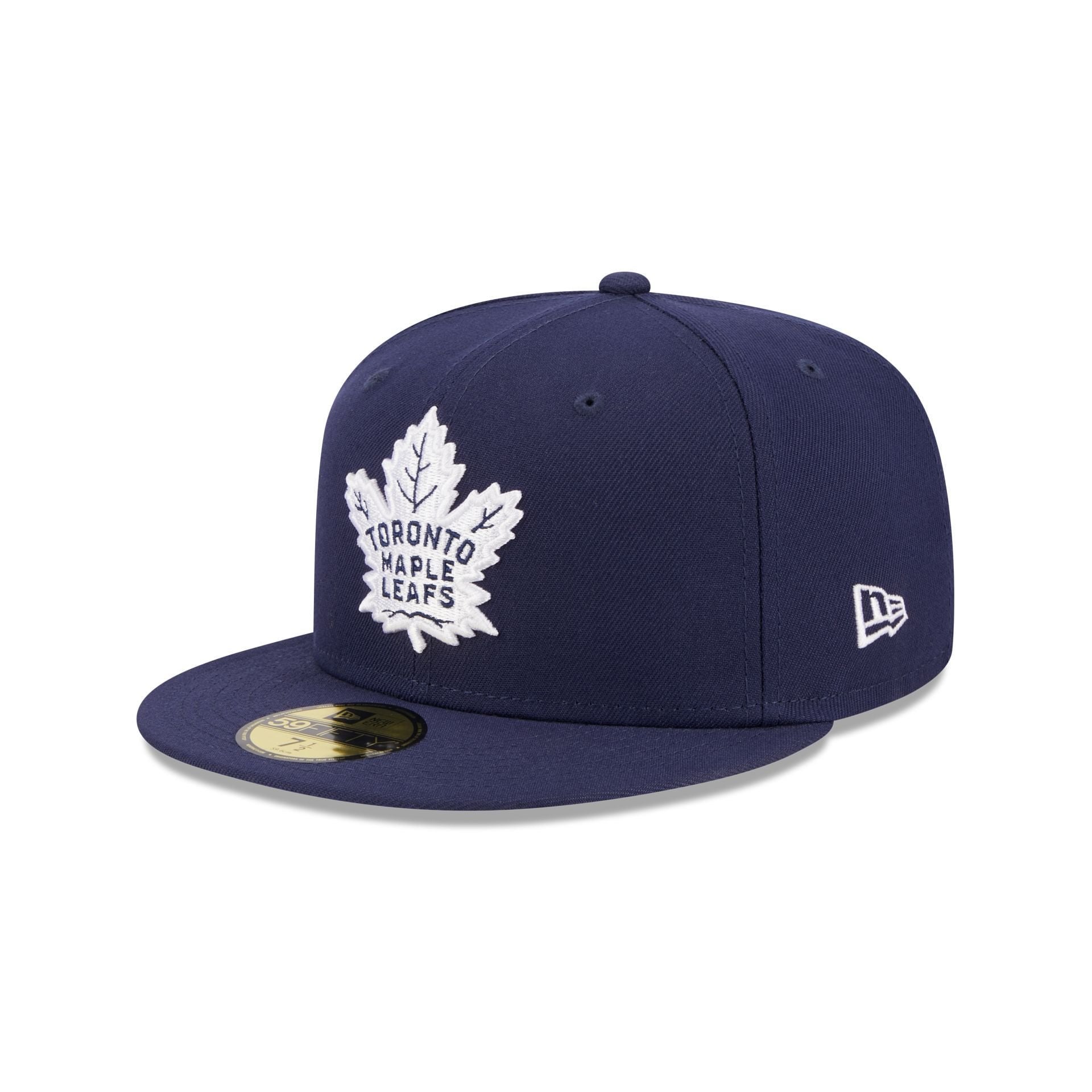
Toutes les autres équipes ont choisi les couleurs standard de l’équipe pour leurs casquettes pour la première vague de nouveaux chapeaux ajustés. On aurait pu penser que les Leafs auraient choisi le bleu royal puisque c’est la couleur standard de l’équipe. C’est ridicule qu’ils aient choisi l’alternative bleu marine à mon avis
https://www.neweracap.com/products/toronto-maple-leafs-59fifty-fitted
—
Cycle21


13 Comments
All my Leafs New Era hats have always been navy.
It’s a much nicer hat than the alternatives out there, embrace the contrast!
I’m a fan. The Navy Blue imo goes better with everything than royal.
Leafs hats have always been navy blue this isn’t some crazy thing
Thank god, fanatics hats are awful.
They look good, but I suppose it’s the offseason and people need a reason to whine.
Oh good, I was worried we might go one day without finding something to complain about.
Finally, I can’t wait until they make one that’s black.
But I’m not a fan that it says Maple Leafs on the back instead of the NHL logo, just like MLB, NBA and NFL use their logo.
Plainly…Navy just sells better
The font on the back of this hat is terrible.
I want a black Leafs snap back. Please new era, make a good one
Navy hats generally just look better and are more versatile than royal blue hats. Seems like an obvious choice. A blue ass hat isn’t going to look as stylish with most outfits
Why did they have to be 59Fifty and not 39Thirty.
New uniforms for more teams next season. Fanatics asked teams to keep things the same this season, if there wasn’t already a plan in the works like the Kings and Ducks, as they transitioned to becoming the leagues manufacturer of jerseys and overhauling store fronts worldwide.
Not saying this hints at a Leafs total rebrand but it’s possible. Realistically I wonder if the Beiber flip side alternate is going to see its final season upcoming. Then a new navy alternate for 25/26.