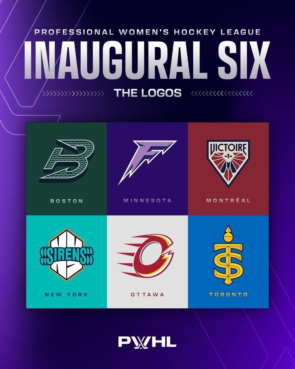
La Ligue professionnelle de hockey féminin a réintroduit ses six équipes inaugurales avec de nouveaux noms, logos, mots-symboles et couleurs.
—
fittos4310

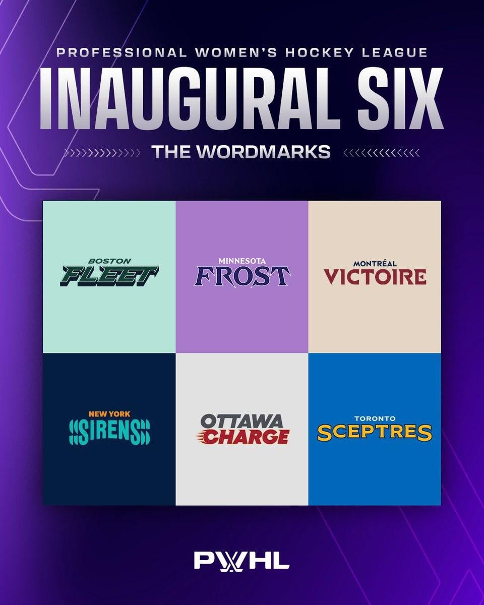
La Ligue professionnelle de hockey féminin a réintroduit ses six équipes inaugurales avec de nouveaux noms, logos, mots-symboles et couleurs.
—
fittos4310


49 Comments
Frost and Victoires are cool. The rest are pretty mid.
This type of thing is rarely done well, but I think they absolutely nailed it.
Yikes, all of these are so bad with the exception of Montreal. Did they take advice from Utah or something?
The Minnesota F’s to Pay Respects
Toronto might now have a championship hockey team.
Looks like they started with Montreal, put a lot of efforts in their logo, then switched to the 5 others and did them all in 1 day lol
The Boston B looks like the old W from Hartford Whalers turned on its side.
Montreal and New York are decent, the rest are yikes. Like you had over a year for this
These names suck ass. And Ottawa’s logo looks like someone just took the flames logo and tried to make it look as bad as possible
These names are pretty ass… especially Montreal lol
The Ottawa one looks like a flaming C … like … Calgary Flames…
I like them all except Ottawa’s. lol It looks like a kid tried drawing the Calgary Flames logo.
Oh boy….
imo toronto has the best name, montreal best logo. not really a fan of any of it though if im being honest
The Ottawa flames
The originals weren’t great but they somehow got worse. Congrats to everyone involved.
Montreal, Boston, Toronto are A+ logos.
The other three we will not discuss
They had a year to come up with names, and they still managed to fuck it up 😔🤦♂️
The Ottawa Cheetos! Awesome
Welp. I’m definitely a Montreal fan now. That is awesome.
Why does the new Sirens logo remind me so much of the Sirius XM logo? Is that a sponsorship?
NY desperately wants to be that “S” that we all use to draw in elementary school
Names are pretty terrible
Looks like Mangiapane designed Ottawa’s.
Dumb names overall.
Ottawa’s and Minnesota’s are both weak af. The rest are fine, easy to be critical I suppose.
Ottawa’s logo looks like a poorly done combo of Calgary Flames and Cleveland Cavaliers.
Mtl having winning in French as its name got me lmao not gonna lie
Very underwhelming. Sirens is a weird name for a team. The Ottawa logo looks like a bad attempt at a knockoff Calgary Flames logo.
The rest are not bad, but nothing more than that.
The good: Everything from Montreal. The best logo by a mile and a half. Cool name, though it’s weird it’s not Victoire de Montreal.
Toronto’s logo.
New York’s name. Sirens is awesome for a women’s team.
The ok: Boston’s logo, Toronto’s name, though I would have gone with Royals if you wanted that theming.
The bad: The rest. New York has a great name, but you would never guess that their logo belongs to it. It looks like a logo for a kids tv show. Absolutely nothing about it says New York or Sirens. Minnesota’s logo looks like it belongs on a Gatorade bottle. Fleet evokes large, clunky, slow moving objects, not exactly what you want for a sports team. Charge is hilariously bad. I cannot fathom who thought that was a good idea.
A very mixed bag overall I’d say.
That’s not it…
I wonder how much copyright concern went into this? Like you can’t pick Bears or Tigers or something simple because it’s all taken and the copyright work would be more difficult.
It’s like they went to the copyright office and asked “so what’s free??”
But when can we see the Boston Fleet play at the Fleet Center? (aka TD Garden)
But when can we see the Boston Fleet play at the Fleet Center? (aka TD Garden)
More importantly, where can they be watched?
I wanted New York Pizza Rats personally
Boston’s mascot can be a Fleet enema.
Honestly I like all of the new logos minus Ottawa, that one looks too similar to the flames.
The names? Eh I’ve seen worse. (Cough Yeti).
So, we’ve got:
Boston Whalers
Frosted Flakes
An Actually Okay Name and Logo
Sirius XM
Ottawa Flames Sponsored By Cheetos(TM)
A High School Football Team.
You would think the league taking their time with team names and designs could’ve came up with something a lot better than these….
To everyone trashing the logos and names, there are plenty of totally trash NHL names and logos. Let’s focus on SUPPORTING a hockey league that’s trying to get its skates under them.
Boston really copied the Trois-Rivières Estacades M18 AAA look it up
Those names are awful.
When you have a full league of 30+ teams, you can excuse a few bad names and logos. You guys managed to ruin 6 out of 6 right off the bat!
I do like Boston’s best (surprise), has an old Whalers vibe, Minnesota looks like a YouTube logo, Montreal looks like a Valorant eSports team, New York hurts my eyes, Ottawa looks like a cross between the Flames and the Cleveland Cavaliers drawn by a 5th grader and Toronto looks like it should be a soccer team lol
These are awesome!
Let’s hope it’s good
More hockey more better
Ottawa Carbon Neutral Flames?
Book me getting a Taylor Heise jersey
One year in the baking, oof.