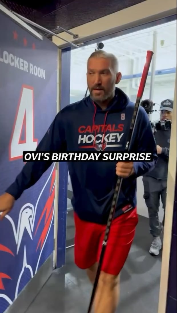
This has all the energy of two clueless boys thinking of a gift for mothers day.
« This guy has played 19 seasons in the NHL, what should we get him for his birthday? »
« I dunno, what about one of his own jerseys? »
BreakXTheXCycle
Brought to you by, Caesars sports betting!
vinegarstrokes420
Could certainly do without the betting ad that almost overlaps the « C ». The gigantic Fanatics logo on back could also be about 1/3 the size.
vanillasounds
I’ve gotten drunk in that locker room
HurricanePirate16
Woooow! A hockey jersey??? I’ve always wanted one of these! Thanks guys! You shouldn’t have!
Happy-Association754
Why wouldn’t they place the ad on the opposite side? The C is nearly touching it. I’m not as against the ads as some people but does that mean we can’t at least design them to work efficiently within the jersey space?
JustWannaChill82
Pens fan 4 life but Ovechkin is a treasure. Hope he beats Gretzky’s record in a few months
Pussycat-Papa
That “C” is practically centered. Fanatics logo is too large. Fanatics strikes again. Can they do anything right?
Jimbo_Imperador
There’s no way Ovie was under 29yo when he was drafted, dude looks 56
ILSmokeItAll
Between the ad practically overlapping the captain’s ‘C,’ and that obnoxious ass ‘F’ on the back…they completely fucked up what is an otherwise sharp looking jersey.
PositivePrimary8773
The ad right next to the Captain C is fuckin criminal
redditor5668
Americans favorite putin supporter. How wholesome
FLTBR
Fanatics logo ruins it
BBLouis8
Those jerseys are awesome.
MrFantastic74
This old school design, but with the modern red white and blue colours would be 🔥
MemoryBeautiful9129
He’s a great dude
The_Cozy_Burrito
Great jersey
Putin_inyoFace
Omg. I didn’t think it could get any worse, then they put the C in the MIDDLE of the sweater.
JFC. MAKE IT STOP. 🤦🏻♂️
dry-primate
I do haaate the ad, but just the C and A jerseys will make it look as bad as what you see. The F logo on back is not nearly as annoying as the click-here-to-lose-money-now front ad.
Yegpetphoto
I hope it’s Putin’s head on a platter!
ATS200
I thought it was going to be a joke gift with a Crosby item inside or something because of the black and gold wrapping
Sdwingnut
I was expecting a bunch of little nesting boxes with an AARP card in the smallest
MakeYourMind
He looks good.
legitimateaccount123
Why does this look like every beer league locker room ever made?
free_mustacherides
Fucking advertisements on jerseys is a travesty
maxxspeed57
I thought he was going to get trolled when I say the wrapping was black and gold.
shirtninja07
I’m so glad this guy got a cup. Definitely one of the greats.
joecan
Look at the cute video of Putin’s stooge.
TylerCowboys
I was hoping that there was a to-go container with chicken parm in the box as well…..


33 Comments
We love everything besides the ad and fanatics
Send him back to ruSSia.
That’s a nice jersey indeed
That F the same size as the name has gotta go
This has all the energy of two clueless boys thinking of a gift for mothers day.
« This guy has played 19 seasons in the NHL, what should we get him for his birthday? »
« I dunno, what about one of his own jerseys? »
Brought to you by, Caesars sports betting!
Could certainly do without the betting ad that almost overlaps the « C ». The gigantic Fanatics logo on back could also be about 1/3 the size.
I’ve gotten drunk in that locker room
Woooow! A hockey jersey??? I’ve always wanted one of these! Thanks guys! You shouldn’t have!
Why wouldn’t they place the ad on the opposite side? The C is nearly touching it. I’m not as against the ads as some people but does that mean we can’t at least design them to work efficiently within the jersey space?
Pens fan 4 life but Ovechkin is a treasure. Hope he beats Gretzky’s record in a few months
That “C” is practically centered. Fanatics logo is too large. Fanatics strikes again. Can they do anything right?
There’s no way Ovie was under 29yo when he was drafted, dude looks 56
Between the ad practically overlapping the captain’s ‘C,’ and that obnoxious ass ‘F’ on the back…they completely fucked up what is an otherwise sharp looking jersey.
The ad right next to the Captain C is fuckin criminal
Americans favorite putin supporter. How wholesome
Fanatics logo ruins it
Those jerseys are awesome.
This old school design, but with the modern red white and blue colours would be 🔥
He’s a great dude
Great jersey
Omg. I didn’t think it could get any worse, then they put the C in the MIDDLE of the sweater.
JFC. MAKE IT STOP. 🤦🏻♂️
I do haaate the ad, but just the C and A jerseys will make it look as bad as what you see. The F logo on back is not nearly as annoying as the click-here-to-lose-money-now front ad.
I hope it’s Putin’s head on a platter!
I thought it was going to be a joke gift with a Crosby item inside or something because of the black and gold wrapping
I was expecting a bunch of little nesting boxes with an AARP card in the smallest
He looks good.
Why does this look like every beer league locker room ever made?
Fucking advertisements on jerseys is a travesty
I thought he was going to get trolled when I say the wrapping was black and gold.
I’m so glad this guy got a cup. Definitely one of the greats.
Look at the cute video of Putin’s stooge.
I was hoping that there was a to-go container with chicken parm in the box as well…..