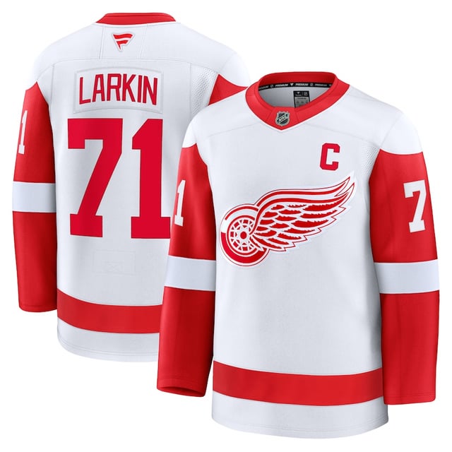
Have to make the C small so you can fit a damn advert on the jersey. Enough is enough already
Unstep-in-Time
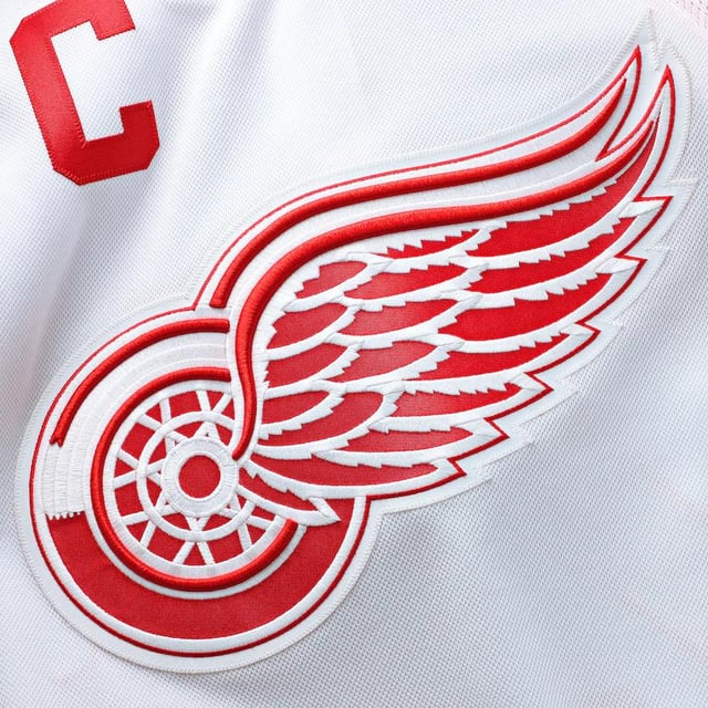
Dang, the Wings stitched logo is so beautiful.
AZphan
I really hope there is no visible name plate… god that would be hideous
CSquared5396
Ah yes, a name plate… Because the red wings are famous for them…
OkraNo8365
I’ll be taking my money to vintage Detroit for all sweater needs
TheAnalogKid18
Pic 1 is a mock up. From the factory Wings jerseys don’t come with a nameplate. It hasn’t been on the Breakaway jerseys for the entire duration of their existence, don’t think they’d start now.
The C on the opposite side is a new thing that the Wings started doing midway through last year. I’ll give them some leeway with this.
Either way, we all know to buy blanks and send to Vintage Detroit right?
Edit: Just saw the Authentic Pro. Holy fuck. They made the name font smaller and went with a nameplate. If I buy one of those, it will be stitched with previous specs.
Fucking FUCK this shit.
FrenzalRhomb1
Did they change the font for the names on the back?
ofwgtylor
C on both sides like chanel
ElAbidingDuderino
Aaaand I just bought an Adidas Kaner sweater on Vintage Detroit
davect01
Garbage Fanatics
moosebaloney
Didn’t matter where the C is if they come with nameplates.
Strawhaterza
On the red one there’s inconsistent spacing between the letters on the back of Larkin the LA are extremely close together while the rest of the letters have larger spaces between em.
Severe_Piccolo_5583
That fanatics logo on the back collar is so fucking ugly
spacecat17
I will continue to rock my Athanasiou sweater.
fullspeed8989
Such a shame. Our beloved jerseys are being exploited in an embarrassing way.
The league certainly doesn’t *need* to do it this way, they just *want* to and clearly don’t care what the fans think or want.
Balance47x
It’s likely a rendering error since they’re so used to it on the pre-Priority side.
Minute_Objective1680
Fanatics is trash
heavyshtetl
This sucks, plain and simple. To not have Nike, Adidas, or even Reebok making the jerseys of one of the four major sports leagues is a goddamn sin.
oceanic8675
The next jersey on my list is a Fedorov Nike jersey (which won’t happen for a while). After that, I’m good to wait until the next sponsor. Even if I have to wait for-e-*ver*
tendinosis
buying from fanatics is no better than pre orering digital downloads. please, just don’t.
Kkleinsorge
I’ll stick to lacer jersey style hoodies and 3rd party gear. I’ve given Fanatics 3 or 4 tries and it is all complete dog shit, I’ll never purchase anything from them again.
Wrath_Of_Aguirre
I hope the players jerseys don’t look as cheap as they did last year. Did anybody else notice the high number of threads sticking off the stitched letters, logos, and numbers? They looked like shit.
DaftPodunk
I knew the first thing they’d fuck up would be the individual slanting letters. That is a level of care and customization that Fanatics has never once shown an interest or competence in.
dr-stuff-ak-619
Im kinda glad they appear to suck as much as we feared – no fomo on getting one having just veen laid off. *rocks in corner *
brandojustbrando
I deeply regret selling my Yzerman jersey last year. These are pitiful.


27 Comments
[https://shop.nhl.com/detroit-red-wings/mens-detroit-red-wings-dylan-larkin-fanatics-white-away-premium-jersey/t-25826261+p-793355978732253+z-9-905723590](https://shop.nhl.com/detroit-red-wings/mens-detroit-red-wings-dylan-larkin-fanatics-white-away-premium-jersey/t-25826261+p-793355978732253+z-9-905723590)
Attention to detail already has me concerned
Have to make the C small so you can fit a damn advert on the jersey. Enough is enough already
Dang, the Wings stitched logo is so beautiful.
I really hope there is no visible name plate… god that would be hideous
Ah yes, a name plate… Because the red wings are famous for them…
I’ll be taking my money to vintage Detroit for all sweater needs
Pic 1 is a mock up. From the factory Wings jerseys don’t come with a nameplate. It hasn’t been on the Breakaway jerseys for the entire duration of their existence, don’t think they’d start now.
The C on the opposite side is a new thing that the Wings started doing midway through last year. I’ll give them some leeway with this.
Either way, we all know to buy blanks and send to Vintage Detroit right?
Edit: Just saw the Authentic Pro. Holy fuck. They made the name font smaller and went with a nameplate. If I buy one of those, it will be stitched with previous specs.
Fucking FUCK this shit.
Did they change the font for the names on the back?
C on both sides like chanel
Aaaand I just bought an Adidas Kaner sweater on Vintage Detroit
Garbage Fanatics
Didn’t matter where the C is if they come with nameplates.
On the red one there’s inconsistent spacing between the letters on the back of Larkin the LA are extremely close together while the rest of the letters have larger spaces between em.
That fanatics logo on the back collar is so fucking ugly
I will continue to rock my Athanasiou sweater.
Such a shame. Our beloved jerseys are being exploited in an embarrassing way.
The league certainly doesn’t *need* to do it this way, they just *want* to and clearly don’t care what the fans think or want.
It’s likely a rendering error since they’re so used to it on the pre-Priority side.
Fanatics is trash
This sucks, plain and simple. To not have Nike, Adidas, or even Reebok making the jerseys of one of the four major sports leagues is a goddamn sin.
The next jersey on my list is a Fedorov Nike jersey (which won’t happen for a while). After that, I’m good to wait until the next sponsor. Even if I have to wait for-e-*ver*
buying from fanatics is no better than pre orering digital downloads. please, just don’t.
I’ll stick to lacer jersey style hoodies and 3rd party gear. I’ve given Fanatics 3 or 4 tries and it is all complete dog shit, I’ll never purchase anything from them again.
I hope the players jerseys don’t look as cheap as they did last year. Did anybody else notice the high number of threads sticking off the stitched letters, logos, and numbers? They looked like shit.
I knew the first thing they’d fuck up would be the individual slanting letters. That is a level of care and customization that Fanatics has never once shown an interest or competence in.
Im kinda glad they appear to suck as much as we feared – no fomo on getting one having just veen laid off. *rocks in corner *
I deeply regret selling my Yzerman jersey last year. These are pitiful.
Why is the neckline bothering me🫠