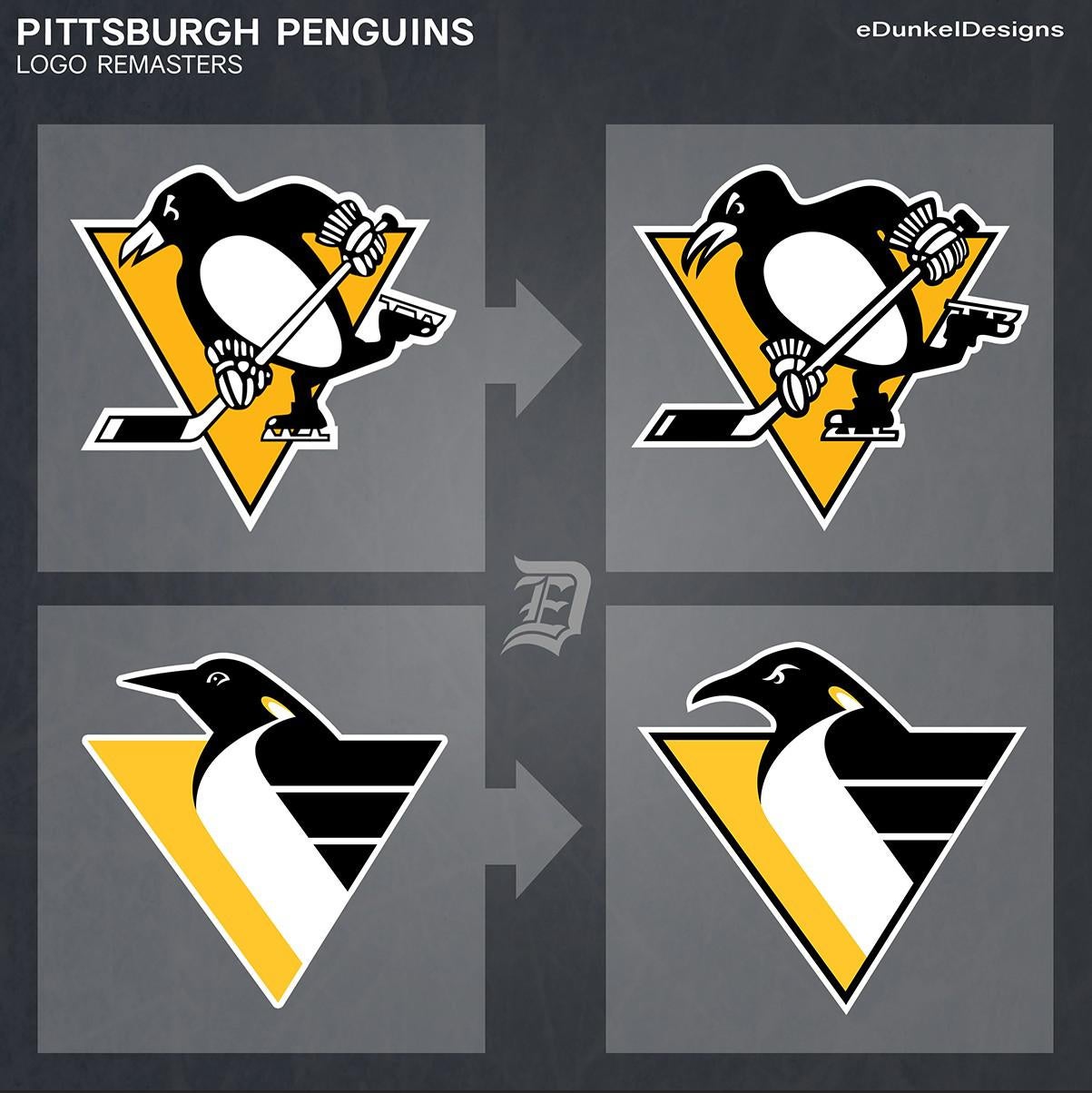
I’ve been a lifelong Pens fan, and have always found the current skating penguin lacking. I much preferred the original skating penguin logos. This particular skating penguin is an overhaul of the game issued jersey logo in the 80s.
The revised eye and beak create a more aggressive and intimidating logo, in my opinion. The most important detail was changing the penguin head to a more anatomically correct shape. The gloves and skates have also been cleaned up with more consistent linework.
OCDsuckz
The former logo was better.
Non-Vanilla_Zilla
I really like the second logo remaster.
pinkoilx97
The second remastered logo definitely looks a lot meaner.


4 Comments
I’ve been a lifelong Pens fan, and have always found the current skating penguin lacking. I much preferred the original skating penguin logos. This particular skating penguin is an overhaul of the game issued jersey logo in the 80s.
The revised eye and beak create a more aggressive and intimidating logo, in my opinion. The most important detail was changing the penguin head to a more anatomically correct shape. The gloves and skates have also been cleaned up with more consistent linework.
The former logo was better.
I really like the second logo remaster.
The second remastered logo definitely looks a lot meaner.