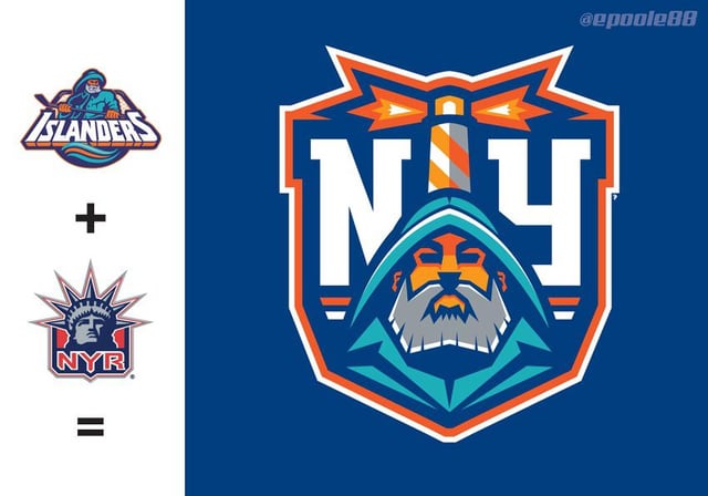
Most of these are really good. The Isles/Rangers one slaps but that’s a cursed image.
Vivid_Walk_1405
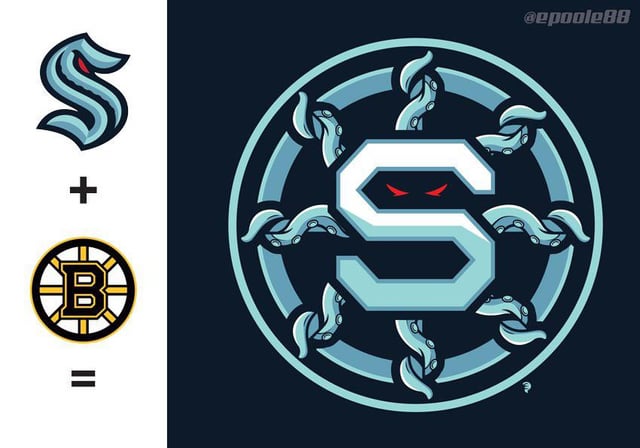
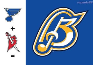
I’m liking the Boston Seattle one
alienbanter
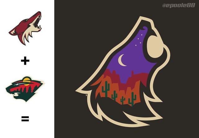
Besides the Seattle/Boston one, I love the Arizona/Wild design!
toldham11
That hybrid feels like a very real possibility, Yotes love droppin new logos
GreenertII
Wow these are high quality
Got-cancelled
Credit: @epoole88 on Twitter
alldying
Dude, these are sick!
Scrubosaurus13
Holy shit these are nice. Several of these should actually be used.
Antichristopher4
Arizona Wild for me, but all of them are really good. You (edit: or the artist) should be proud.
toldham11
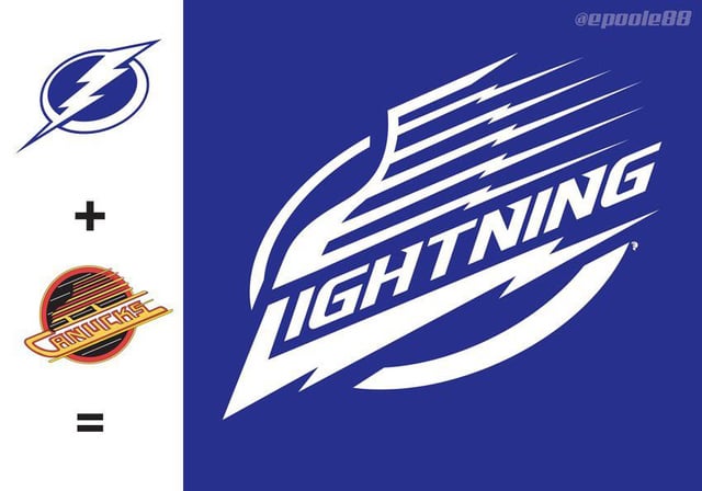
Lightning Skate is cleannnnn
Shootit_Rockets
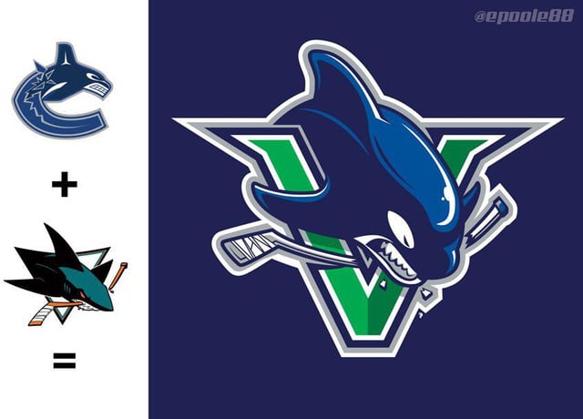
Canucks and Sharks
Bloodraven23
Wow these are great. I especially really like Hawks/Caps, Sharks/Nucks and Yotes/Wild .
AstrangerR
Most are really good.
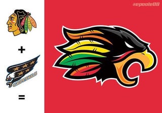
Hawks + Caps
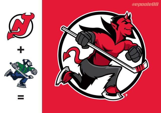
Devils one
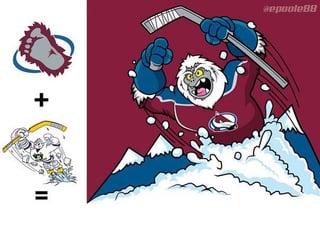
The avs + ducks one is hilarious and I’d want one.
shig-baq
the isles rangers one is literally just the isles lol
YooperInOregon
Arizona one is terrific and should be in consideration for a real brand. The Lightning skate looks like a junior team’s logo. The Yeti Wild Wing is ridiculous and can totally see it for an ECHL team.
CopsPushMongo
Lightning/Canucks and Arizona/Minnesota are legit. I think it would be cool if the NHL did crossovers like this irl, sort of like the reverse retros.
frdergf456yXDVT
They’re all sick but the Ava one looks a bit out of place imo
borkborkbork99
Great work, all the way through. Your mix of design and illustration skills are shining here.
BigREDafro
Shit, I would buy a Yotes jersey with that logo on it.
fantasyshop
I’m feeling the Buffalo Blues, big time. Awesome stuff. The wildyote is outstanding as well.
mikess101
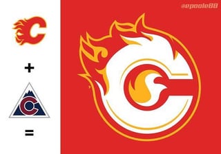
Gimme dat Colorado Flames, that’s lit (please accept me Gen Z)
dadadaCHIEFS
That Yotes one is just awesome.
dollerz
These are all fucking awesome. Love the Seattle/Boston and Vancouver/San Jose the most.
Jon_Snows_mother
Sharnuks and Arizona Wild are perfect.
FormalWare
I shall not soon forget the Spoked Kraken.
Professional-Cash485
Love the Devils!
yeetball-sub
The Tampouver Lightnucks logo is so much better than what the Lightning currently have. It’s a shame it will never be worn on a real sweater.
Apart-Patient-5237
So many clever ones, but the Coyotes/Wild one is fucking amazing.
Automatic-Aioli9416
Skating Devil for sure
Ubechyahescores
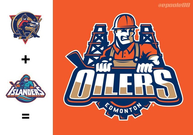
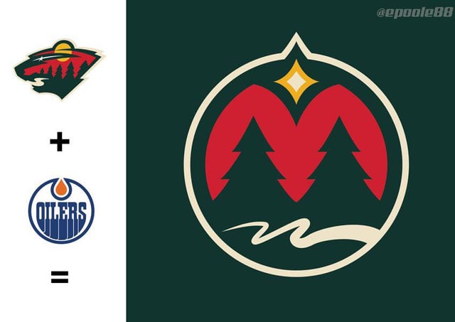
Minnesota Oilers is soo clean
Ghostpants_
I love the abominable snowman jumping out of cocaine.
M_is_for_Mancy
The devils one is cracking me up
jakeck
The Minnesota/Edmonton one should be Minnesota’s logo. The hidden M, the script W, and the North Star? Chef’s kiss!!!


35 Comments
I love Chicago-Washington
Most of these are really good. The Isles/Rangers one slaps but that’s a cursed image.
I’m liking the Boston Seattle one
Besides the Seattle/Boston one, I love the Arizona/Wild design!
That hybrid feels like a very real possibility, Yotes love droppin new logos
Wow these are high quality
Credit: @epoole88 on Twitter
Dude, these are sick!
Holy shit these are nice. Several of these should actually be used.
Arizona Wild for me, but all of them are really good. You (edit: or the artist) should be proud.
Lightning Skate is cleannnnn
Canucks and Sharks
Wow these are great. I especially really like Hawks/Caps, Sharks/Nucks and Yotes/Wild .
Most are really good.
Hawks + Caps
Devils one
The avs + ducks one is hilarious and I’d want one.
the isles rangers one is literally just the isles lol
Arizona one is terrific and should be in consideration for a real brand. The Lightning skate looks like a junior team’s logo. The Yeti Wild Wing is ridiculous and can totally see it for an ECHL team.
Lightning/Canucks and Arizona/Minnesota are legit. I think it would be cool if the NHL did crossovers like this irl, sort of like the reverse retros.
They’re all sick but the Ava one looks a bit out of place imo
Great work, all the way through. Your mix of design and illustration skills are shining here.
Shit, I would buy a Yotes jersey with that logo on it.
I’m feeling the Buffalo Blues, big time. Awesome stuff. The wildyote is outstanding as well.
Gimme dat Colorado Flames, that’s lit (please accept me Gen Z)
That Yotes one is just awesome.
These are all fucking awesome. Love the Seattle/Boston and Vancouver/San Jose the most.
Sharnuks and Arizona Wild are perfect.
I shall not soon forget the Spoked Kraken.
Love the Devils!
The Tampouver Lightnucks logo is so much better than what the Lightning currently have. It’s a shame it will never be worn on a real sweater.
So many clever ones, but the Coyotes/Wild one is fucking amazing.
Skating Devil for sure
Minnesota Oilers is soo clean
I love the abominable snowman jumping out of cocaine.
The devils one is cracking me up
The Minnesota/Edmonton one should be Minnesota’s logo. The hidden M, the script W, and the North Star? Chef’s kiss!!!
# WILD COYOTE