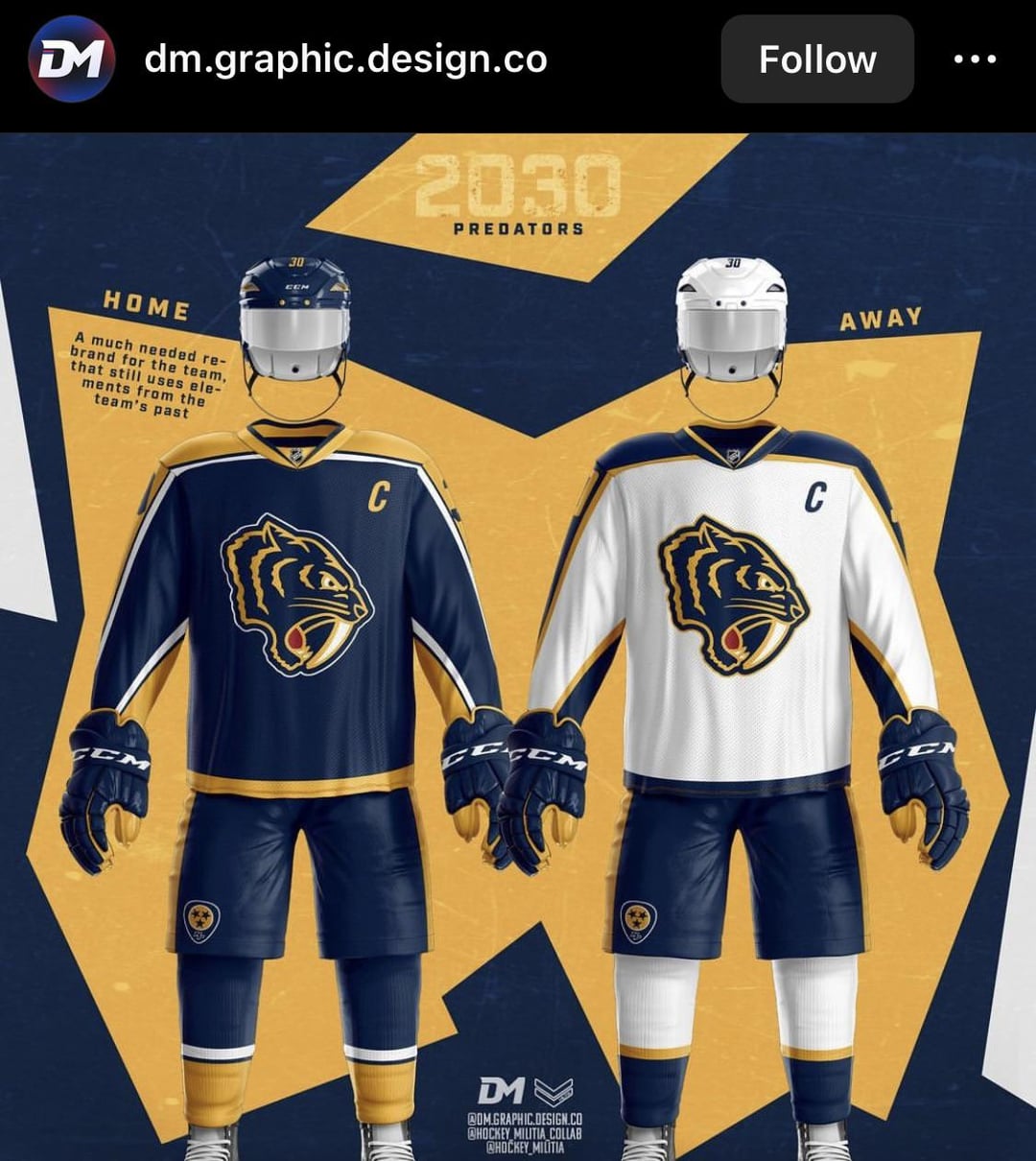
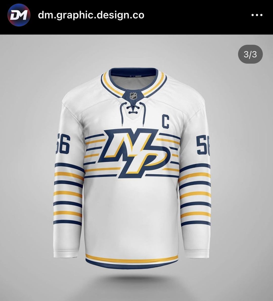
Dessins de maillots d’un artiste instagram. Qu’en pensez-vous ? Le compte de l’artiste est dans les images
—
Hockey_74JS

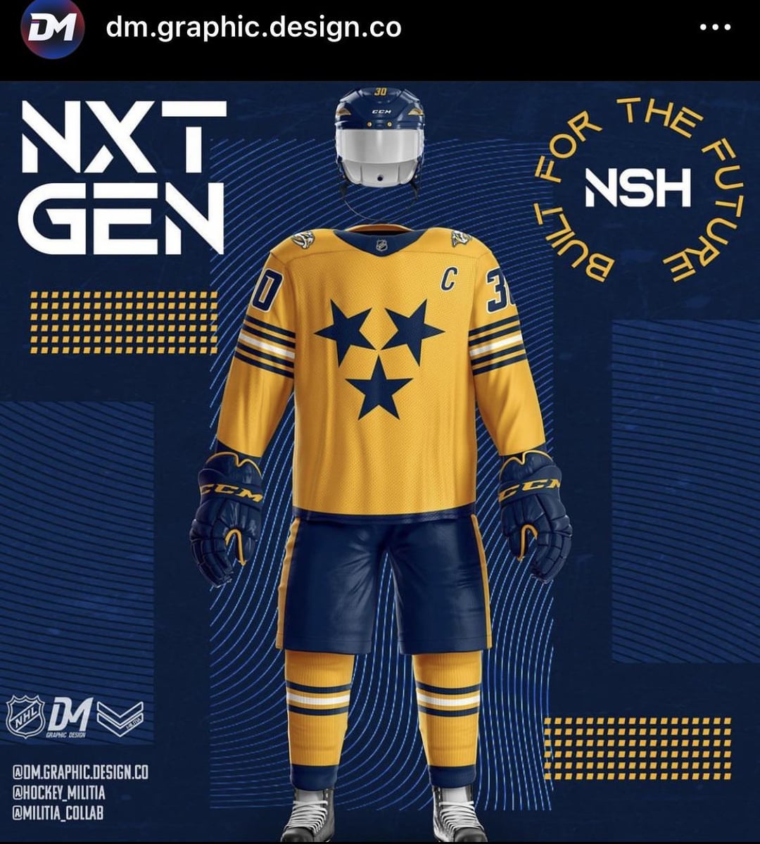
Dessins de maillots d’un artiste instagram. Qu’en pensez-vous ? Le compte de l’artiste est dans les images
—
Hockey_74JS


6 Comments
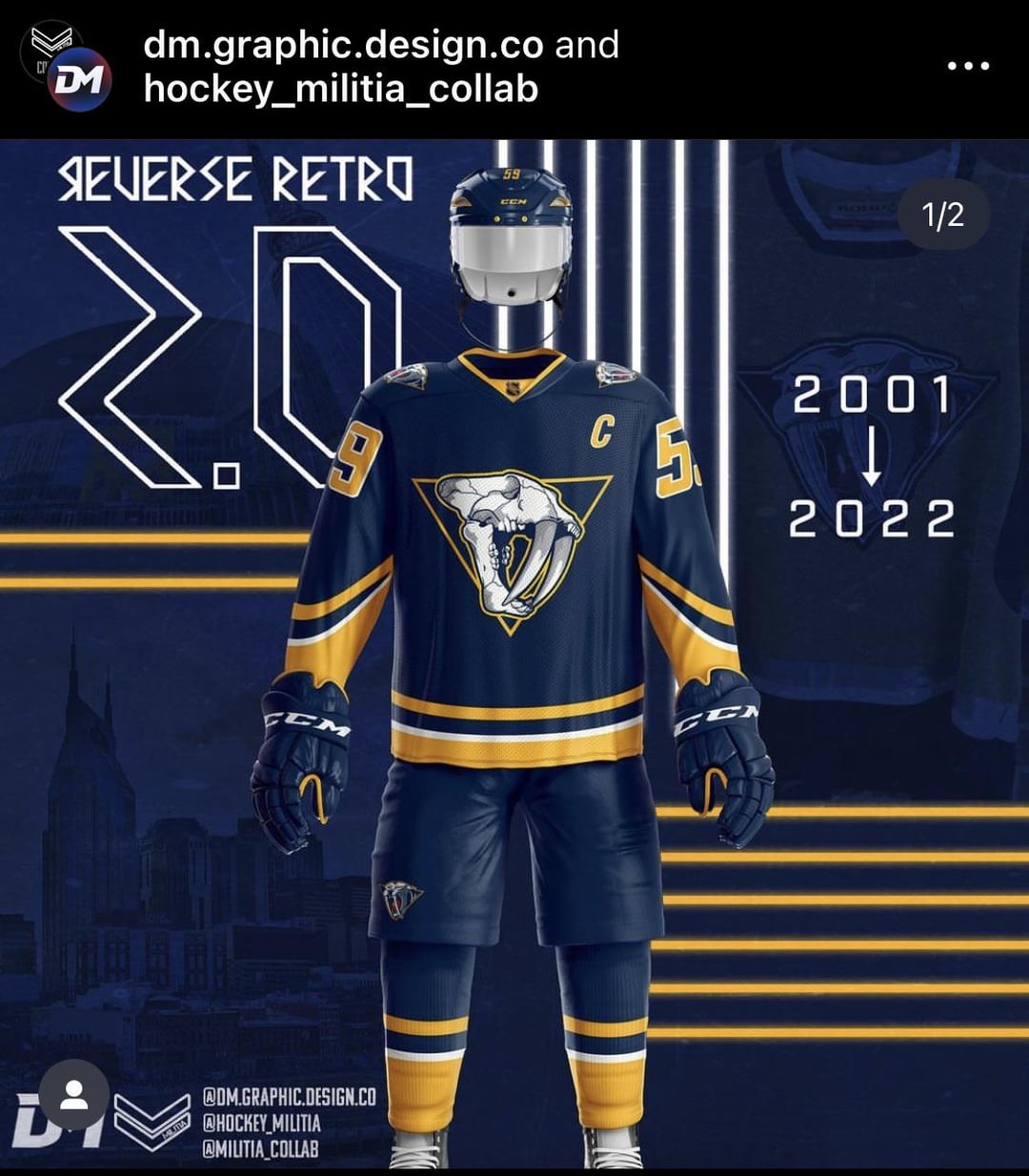
Beauties
Love the winter classic logo, but I’d invert the navy and gold on the home uniform, and go w/ the winter classic script on the away, maybe w/ a reduced size logo as a shoulder patch.
I would love nothing more than to have this winter classic logo on everything.
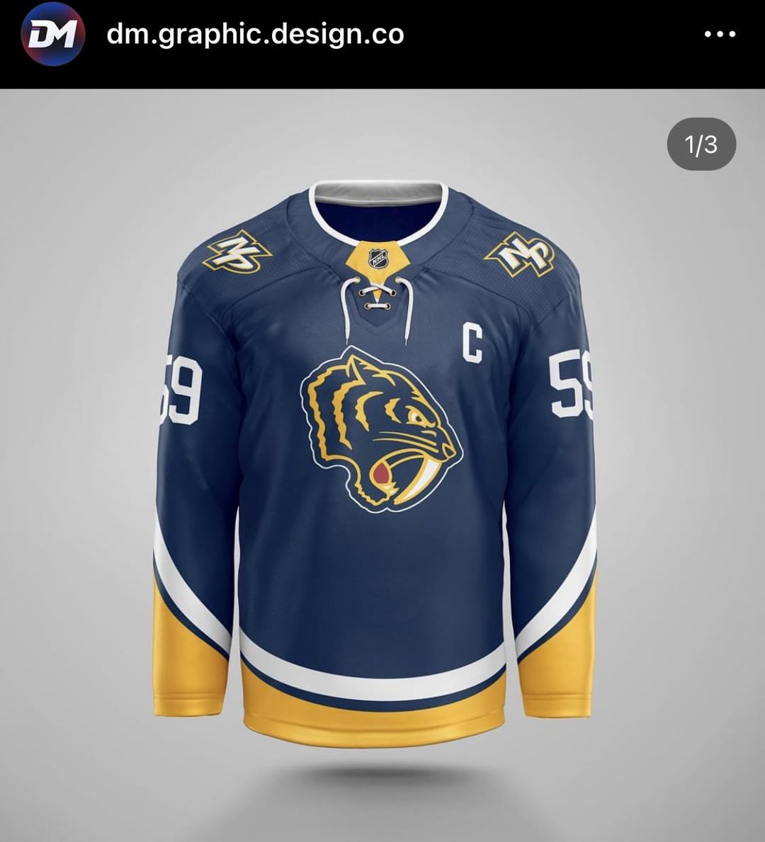
This logo with mustard cat yellow trim and silver accents.
Wouldn’t mind getting rid of the guitar pick though.
I really like the winter classic logo, and honestly wish it was the primary.
3 is my favorite, but I love the white Winter Classic too.
I think we should have a blue third/alternate jersey, no question. It’s our history, and we spent 12 years or so playing in predominantly blue.
I hate the tri-star and I’m tired of looking at it. It’s so cliche, overused (seriously, the Sounds and Titans use it too) and the Preds tend to draw fans from other Southern states (Northern AL, former Thrashers’ fans in GA, KY) so I don’t like that being a big part of our identity.
The skull logo kit demands the yellow gloves. They’d work so well with the sleeves.