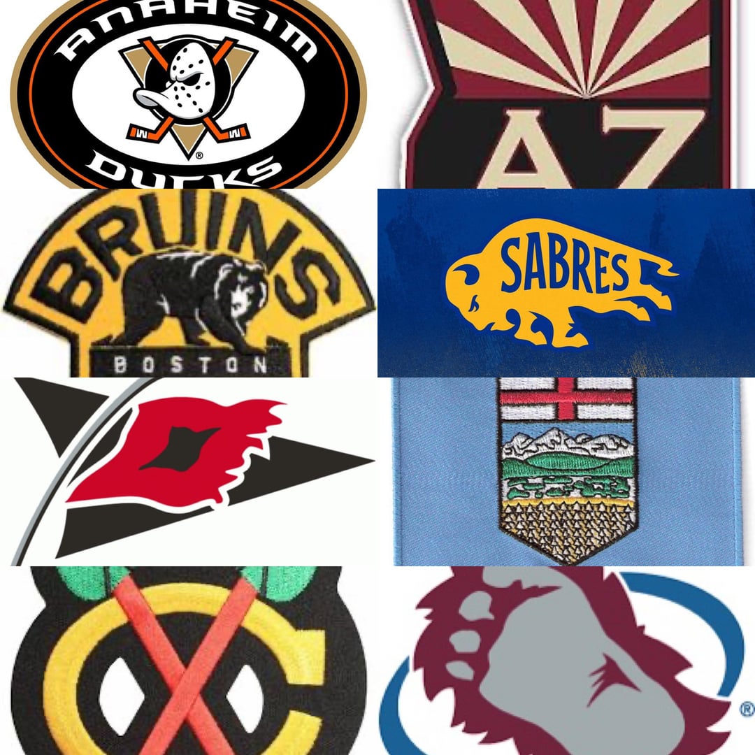
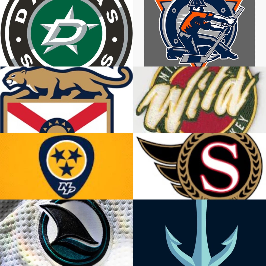
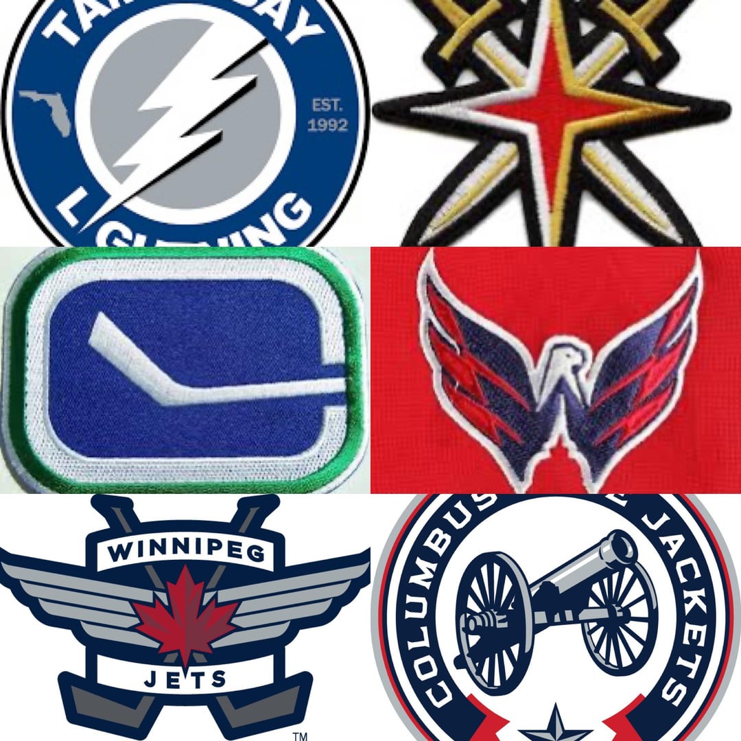
J’ai remarqué que certaines équipes n’ont pas d’écussons d’épaule ou que leur écusson est depuis devenu un maillot alternatif actuel. Équipes exclues : Detroit LA Montréal New Jersey NY Rangers NY Islanders Philadelphie Pittsburgh St. Louis Toronto
—
Kapeter


33 Comments
Capitals.
I wouldn’t mind a Lightning jersey with the shoulder patch as the main logo.
Seattle, AZ and Vegas are top 3 imo
Seattle’s anchor is clean as hell, but I gotta vote for Anaheim’s Wild Wing. I’m a firm believer that they need to go back to that logo for their main crest
Sharks and Capitals
Canes, Caps, Kraken, and Sharks are all really good. Clean straightforward designs that aren’t busy
The Nashville Dragon Ball may not be the « best » but I am partial to it.
I have no particular feelings about the Avalanche these days, but I can’t help but love the silliness of the foot.
I like Chicago’s and San Jose’s and Vancouver’s.
Chicago
Some of these are outdated tbf. That said I’m partial to Nashville’s, San Jose’s, Seattle’s, Vegas’ and Washington’s (which should be their main)
Nashville, San Jose, and Caps. Will say I do really like the Jets and Jackets as well.
They fall into a few categories for me as far as the ones I like
Wish they were the chest logo over the shoulder: Washington, Anaheim (if you remove the logo from the oval), Carolina, Columbus, Vancouver
Really like it specifically as a shoulder logo: Vegas, Winnipeg, Florida, Nashville, San Jose, Ottawa, Seattle, Arizona, Boston, Buffalo, Chicago
They’re fine: the rest of them
Dallas and Tampa I don’t like because it’s just a slightly modified version of their regular logo and that’s just unnecessary
Seattle, jets, Florida, and sharks. What’s that blue one that looks European?
Columbus and Anaheim need to make these their regular logos.
Chicago is by far the best. Senators. Avalanche and Golden Knights are pretty great too
Seattle obviously. Avs, Ducks, and the Dragonball are all sick too
That Columbus patch is representative of one of the best jerseys in the league.
Sharks logo is clean, simple, yet has definition the puts it on top for me with those colors.
Or maybe it’s because jaws is my favorite movie and the dorsal fin just gets me hyped
I miss the Yeti Foot as our Shoulder Patch.
1) Golden knights
2) hawks
3) kraken
I miss the hockey stick and palm tree for Florida.
Incorporating the Welcome to Las Vegas star into the Vegas Swords is fantastic marketing. It really helps tie the team to the city.
Edmonton hasn’t used that shoulder patch since 2007 lol
Kraken, Sharks, and Caps. The Space Needle anchor is crisp.
I don’t know about best, but I’m 100% certain Calgary has the worst one.
1) existing design
2) there’s another team in the province
Seattle’s being the Space Needle as well as an anchor is a really nice touch. I also like the negative space being the Capitol building for Washington’s.
Fucking Washington. Hate them, but that’s a slick logo
Chicago, Carolina, Columbus, Seattle
Boston, Edmonton, and Columbus are my favorites outside my Kraken bias
Columbus and Chicago are close but for me it’s Colorado
Caps, easily
Canes, Blackhawks, Sharks, Kraken, Caps — keep it clean, simple, sleek