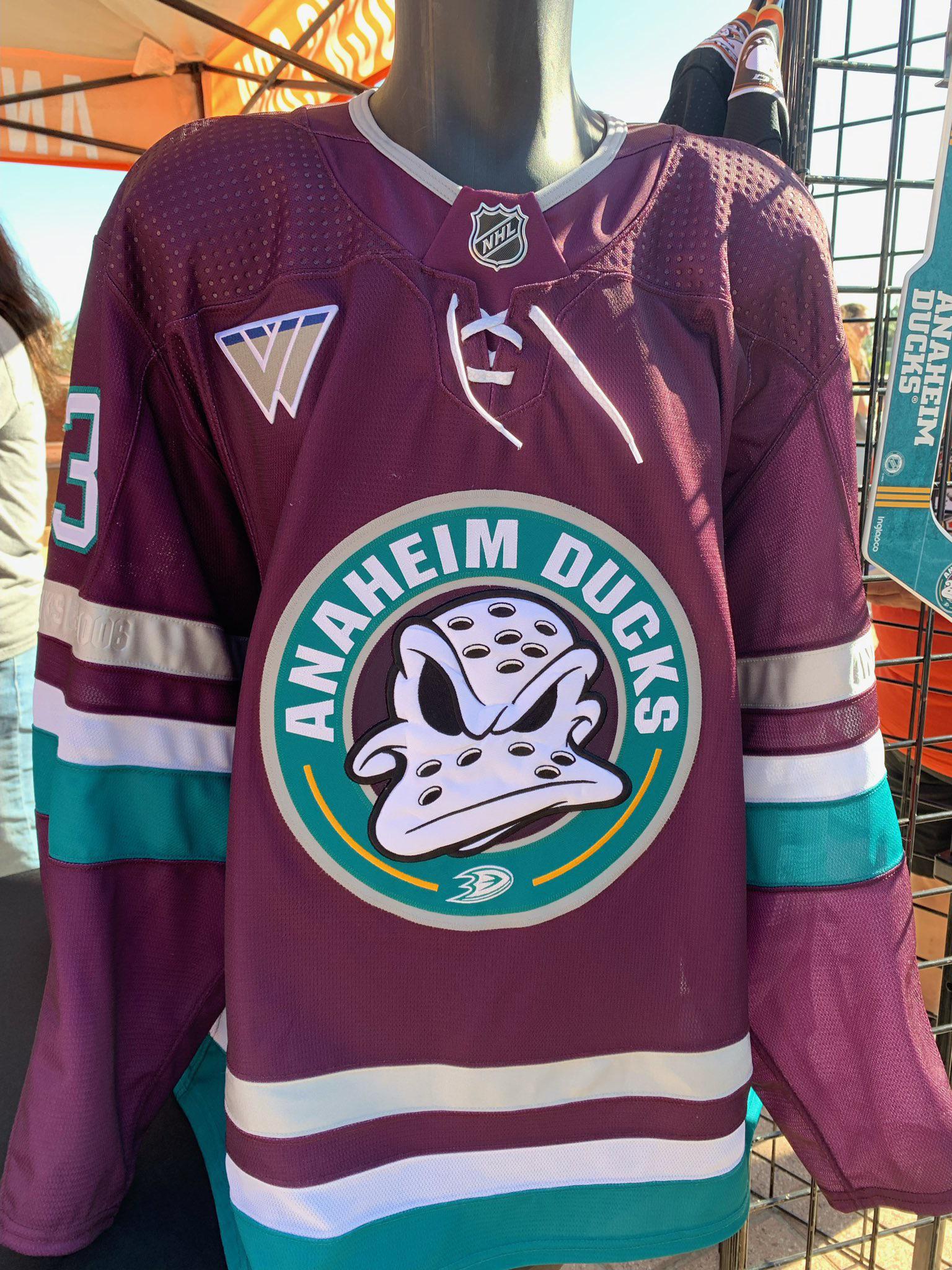
I am sad that I do not live in SoCal, and I am not a ducks fan, because if I was a ducks fan, I would be going crazy with joy that they finally brought back the old brand.
leese216
It looks more Donald than mighty.
mysteresc
Thath deththpicable!
FormerCollegeDJ
Not a fan.
Mind you, I never thought the original “Mighty Ducks” look was great and having eggplant as a color was ridiculous IMO. But these jerseys are a lot worse than Anaheim’s original jerseys to my eyes.
BTW, what’s with the Wonder Woman-like logo in the upper left?
UserNameTaken714
There was nothing funnier than watching Stu Grimson brutally murder people while wearing that cutesy Disney sweater
natty_mh
Bring back the Mighty Ducks of Anaheim! Bring back the teal and the purple!
Fancy_Nutz
Mighty?
redbadger1848
If they were gonna bring back the old logo and colors, they should have just done it 100%, not pussyfoot around like this.
stinkfingerdude
I dig it. Wayyy better than flyers jerseys
VexdOne
Kind of a let down imo
Smittysgreasymullet
That is the single best jersey I’ve ever seen I’m my life. The logo awakened something inside of me, getting all kinds of fowl thoughts.
Apprehensive_Bug3329
Looks sweet
JabroniDM
Looks like they slapped the duck over the Starbucks logo.
PapaGuhl
Anaheim Daffy Ducks
StraightDiscussion83
Liked
Seeteuf3l
They should keep that logo
JonTheWizard
Brother, what a way to run a railroad. If you’re going to use the 90’s colors, why not use the 90’s mask logo?
DependentHalf5498
Haha, guess it was a unique combination! 😄
tofulo
How could they mess this up?!
AceConspirator
It’s awful, but not surprised that some of you are pretending it’s amazing.
roofratMI
Not
SunshneThWerewolf
They were so close – the colors, the concept… but not the original logo. Why?
Maleficent_Soil_2612
Wait… nobody else thinks this is sick? Wtf.
OdaDdaT
I honestly like the new spin on the logo
archasaurus
It’s better than what they have now but how do you not use the original logo? It’s what everyone wanted. Why is the silver shinny? I like the embossed wording on the stripe though. That’s sick.
MurrayInBocaRaton
Heh. I dig it.
karlou1984
Not as great as original but definitely an improvement from the current ones.
ViolentEdWhoopWhoop
AAAAAND they fucked it up. Why can’t it just be good
Bomdegety
Every other part of the jersey is gorgeous. Absolutely they should use that color scheme permanently. But that crest is laughably garbage
jkman61494
I honestly find this more disturbing than the black jerseys. This seems like a knock off of the original that some 3rd party company tries to skirt around trademarks.
Just go the whole way and bring the old jersey back. The Flames did it. The Sabers did it. The Islanders. etc etc etc.


34 Comments
ick
Wild wing!
I am sad that I do not live in SoCal, and I am not a ducks fan, because if I was a ducks fan, I would be going crazy with joy that they finally brought back the old brand.
It looks more Donald than mighty.
Thath deththpicable!
Not a fan.
Mind you, I never thought the original “Mighty Ducks” look was great and having eggplant as a color was ridiculous IMO. But these jerseys are a lot worse than Anaheim’s original jerseys to my eyes.
BTW, what’s with the Wonder Woman-like logo in the upper left?
There was nothing funnier than watching Stu Grimson brutally murder people while wearing that cutesy Disney sweater
Bring back the Mighty Ducks of Anaheim! Bring back the teal and the purple!
Mighty?
If they were gonna bring back the old logo and colors, they should have just done it 100%, not pussyfoot around like this.
I dig it. Wayyy better than flyers jerseys
Kind of a let down imo
That is the single best jersey I’ve ever seen I’m my life. The logo awakened something inside of me, getting all kinds of fowl thoughts.
Looks sweet
Looks like they slapped the duck over the Starbucks logo.
Anaheim Daffy Ducks
Liked
They should keep that logo
Brother, what a way to run a railroad. If you’re going to use the 90’s colors, why not use the 90’s mask logo?
Haha, guess it was a unique combination! 😄
How could they mess this up?!
It’s awful, but not surprised that some of you are pretending it’s amazing.
Not
They were so close – the colors, the concept… but not the original logo. Why?
Wait… nobody else thinks this is sick? Wtf.
I honestly like the new spin on the logo
It’s better than what they have now but how do you not use the original logo? It’s what everyone wanted. Why is the silver shinny? I like the embossed wording on the stripe though. That’s sick.
Heh. I dig it.
Not as great as original but definitely an improvement from the current ones.
AAAAAND they fucked it up. Why can’t it just be good
Every other part of the jersey is gorgeous. Absolutely they should use that color scheme permanently. But that crest is laughably garbage
I honestly find this more disturbing than the black jerseys. This seems like a knock off of the original that some 3rd party company tries to skirt around trademarks.
Just go the whole way and bring the old jersey back. The Flames did it. The Sabers did it. The Islanders. etc etc etc.
Do better Anaheim
I dig it
Let’s get dangerous…