Never understood why they changed it. Was it synonymous with losing? Big deal. Look at the Leafs.
Porkchopp33
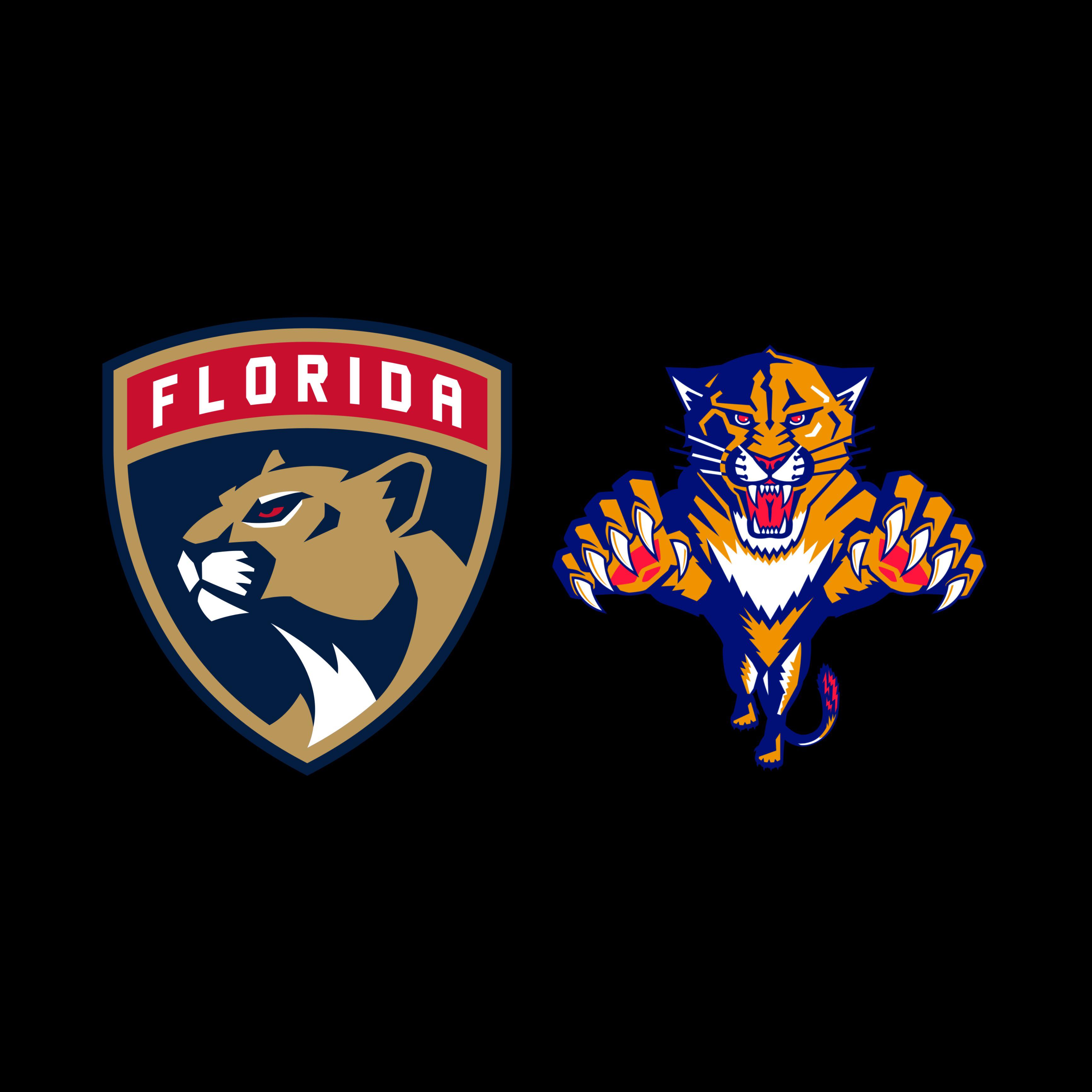
I like both but the only one is better by a fair margin
dbag3o1
The one on the right was a piece of art.
[deleted]
Right, second worst logo change since Anaheim traded Wild Wing for the duck foot
GroundbreakingCow775
I would like to see the old logo with the new colors and jerseys.
That said I always liked the original jerseys in Red
smith4498
For hockey or soccer?
Emotional_Match8169
The original!
I still wear my old Jerseys because I prefer the old logo.
sumofabit
I’d love to see the leafs logo in this 3d attack pose.
dalej42
On the right. And they had the best 3rd jerseys with the blue and leaping panther
BoysenberrySuperb442
The right one
dman7guy
Really don’t understand the hate for the new logo. Think it looks a lot sharper. Maybe it’s the colours of the old one but just looks too cartoony for me
Milestailsprowe
Left, it looks great and professional.
that-bro-dad
They’re both pretty great TBH
Kurt1sD3an
The new one looks much better imo. The Ducks on the other hand… That’s another story
Grouchy-Bug5223
I like both honestly. I’d probably pick then one on the right I guess? Although I can’t help but find the « leaping » effect just makes it seem like a panther with tiny legs lol
cnrowe2002
I think you’ll find 95% of the time people will choose the older logo. Probably some combination of nostalgia and people liking things from the era they grew up in.
LarryD217
Shield
wickedweather
I like the shield logo, and I never noticed that their home logo is not the same as their away logo.
asuckow12
Right by a mile. I don’t know why a hockey team wanted to look like a soccer club by changing to what they have now.
Shiny_Mew76
I’ll be honest, for some reason I just like the one on the left more. I don’t know who, I generally don’t like oversimplified logos, but it just looks cleaner in this case.
Rushjordan
I remember someone saying the new one looks like an investment company logo.
CrankyCzar
Left one, right is too cartoonish
gambleroad
Honestly, probably the left. The right is way too detailed. It looks like a highschool team’s logo.
seanofkelley
The old logo ruled. The new one looks like it belongs to a lower tier European soccer team.
Dr_Will_Kirby
Right one.. im a 90s babby tho
Kryptekah
Left is better.
People are blinded by nostalgia.
If the left one get replaced, in 20 years people will unanimously say it was a masterpiece.
Key-Surprise-9206
I think the old one looks better up close but on a jersey from afar I like the new one
Pussycat-Papa
What about the one where the cat is breaking the stick?
I’m aware the sharks do this too, but always thought it was cliche to have the sports equipment in the logo
It’s something much more common in hockey than the other top 3 sports, at least in North America
SnooDogs9048
Both are great
Roguemutantbrain
I get why people think the old one is cool and nostalgic and all, but it literally looks like a community college sports team logo. The jerseys that go with the new logo are pretty nice too
Better-Mud-6023
Hey, the logo may not have caused winning, but a fierce-looking panther surely would’ve scared opponents away!
JonTheWizard
Both good, but I think I prefer the left.
LP_24
Old logo is better, new jerseys are better
odiethethird
You’ve just alerted every high school within a 10 mile radius
whelp32
New logo is steak and fine wine. Old one is fish sticks and undercooked fries.
ThoseBigPeople
New one is far and away better. Old one is busy and pretty disjointed
awe2D2
Seems like I’m in the minority here, but I prefer the shield. I think it’s cleaner, and more grown up looking, like an old soccer team logo. Maybe they could make the panther look more vicious on it, but it seems like a professional team logo
Lonely-Ad3750
i’m definitely the odd one out but i like the left one. the best option would be that current simplified jumping panther one. a mix of both identities
DreamerTheat
I like the new one (nothing against the older one).


 invité par Flyers/Torts à assister à la séance de patinage matinale")
42 Comments
Leaper, of course.
Original.
Never understood why they changed it. Was it synonymous with losing? Big deal. Look at the Leafs.
I like both but the only one is better by a fair margin
The one on the right was a piece of art.
Right, second worst logo change since Anaheim traded Wild Wing for the duck foot
I would like to see the old logo with the new colors and jerseys.
That said I always liked the original jerseys in Red
For hockey or soccer?
The original!
I still wear my old Jerseys because I prefer the old logo.
I’d love to see the leafs logo in this 3d attack pose.
On the right. And they had the best 3rd jerseys with the blue and leaping panther
The right one
Really don’t understand the hate for the new logo. Think it looks a lot sharper. Maybe it’s the colours of the old one but just looks too cartoony for me
Left, it looks great and professional.
They’re both pretty great TBH
The new one looks much better imo. The Ducks on the other hand… That’s another story
I like both honestly. I’d probably pick then one on the right I guess? Although I can’t help but find the « leaping » effect just makes it seem like a panther with tiny legs lol
I think you’ll find 95% of the time people will choose the older logo. Probably some combination of nostalgia and people liking things from the era they grew up in.
Shield
I like the shield logo, and I never noticed that their home logo is not the same as their away logo.
Right by a mile. I don’t know why a hockey team wanted to look like a soccer club by changing to what they have now.
I’ll be honest, for some reason I just like the one on the left more. I don’t know who, I generally don’t like oversimplified logos, but it just looks cleaner in this case.
I remember someone saying the new one looks like an investment company logo.
Left one, right is too cartoonish
Honestly, probably the left. The right is way too detailed. It looks like a highschool team’s logo.
The old logo ruled. The new one looks like it belongs to a lower tier European soccer team.
Right one.. im a 90s babby tho
Left is better.
People are blinded by nostalgia.
If the left one get replaced, in 20 years people will unanimously say it was a masterpiece.
I think the old one looks better up close but on a jersey from afar I like the new one
What about the one where the cat is breaking the stick?
https://content.sportslogos.net/logos/1/13/full/5610_florida_panthers-jersey-2004.png
I’m aware the sharks do this too, but always thought it was cliche to have the sports equipment in the logo
It’s something much more common in hockey than the other top 3 sports, at least in North America
Both are great
I get why people think the old one is cool and nostalgic and all, but it literally looks like a community college sports team logo. The jerseys that go with the new logo are pretty nice too
Hey, the logo may not have caused winning, but a fierce-looking panther surely would’ve scared opponents away!
Both good, but I think I prefer the left.
Old logo is better, new jerseys are better
You’ve just alerted every high school within a 10 mile radius
New logo is steak and fine wine. Old one is fish sticks and undercooked fries.
New one is far and away better. Old one is busy and pretty disjointed
Seems like I’m in the minority here, but I prefer the shield. I think it’s cleaner, and more grown up looking, like an old soccer team logo. Maybe they could make the panther look more vicious on it, but it seems like a professional team logo
i’m definitely the odd one out but i like the left one. the best option would be that current simplified jumping panther one. a mix of both identities
I like the new one (nothing against the older one).
New