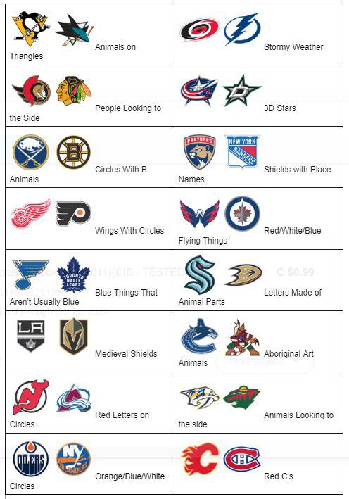
Well I’ve always been an Animals on Triangles fan but lately I’ve been into Shields with Place Names after their impressive cup runs last season. I think for this year’s playoffs we’ll see Stormy Weather and Circles with B Animals for sure, and maybe a team or two from Blue Things That Aren’t Usually Blue.
ArnieAndTheWaves
But if these pairs all combined to make teams, which would be the best? Stormy weather I guess, or one of the shield teams.
VilniusBlues
Tbf « blue note » is an actual thing in music 👀
o-kon-el
Gimme wings with circles any day
Whataboutizm
This is very impressive work. Did you show your teacher?
TheFoundation_
Got any original design ideas or you just here to complain about nothing
peepeeonmydoodoo
I feel like the Blues could also go in wings with circles.
Glasterz
Animals on
Triangles
-meyer
Got a kick out of this. Thanks
TheRitalinCommando
This is literally one of the worst posts I’ve ever seen on this subreddit
-cyg-nus-
There is no circle in the Avs logo. That is very obviously not round.
every1pees
The amount of stoned time you wasted figuring this out is impressive.
prp4241
Panthers is my favorite place to go on vacation.
AnonymousBromosapien
What in the actual fuck am I looking at here?
thisisATHENS
Aboriginal art animals got me
imathrowyaaway
quality shitpost 👌
CodAdministrative563
I’ll take my flightless bird on a triangle
chimpsimulator
Come on over to r/hockey, we got:
Wings with circles
Blue things that aren’t usually blue
Aboriginal art animals
And lots more cool stuff
thatc0braguy
10/10
No notes
Caviar_Fertilizer69
What do you mean the Blues aren’t usually blue? It’s in the name!
Ancient_A
If only if the jackets made the cannon logo the primary.
d_zzz
Ok…
VanillaIce315
🤯
VanillaIce315
I enjoyed this
superfastguy
Great post. Everything fits perfectly
captaintinnitus
I wish Gilbert Godfried was here to break this down for us
Pandrai
Let’s go stormy weather!
HolyBonobos
New divisions just dropped.
foshizi
This is the user created content we need.
Frags08
Wait people think the Minnesota logo is something looking to the side?
Okaywhy10
Ottawa and Chicago are in a stare down
hackmastergeneral
This is brilliant
T-MinusGiraffe
The Lightning should have been categorized as « blue things that aren’t usually blue. »
kjc32190
That worked out into nice little pairs, intentional or not.
SignGuy77
Blues logo is metaphorical, y’all. Blue notes – meaning the team always played at a different pitch from the standard, and that’s why they always lost.
Makinbets
Anytime I’m disappointed in my team I will be referring to them as the logo above
UptightSinclair
Objects that don’t usually fly, flying west: Detroit, STL
Letters crowding out other letters: Montreal, New York Islanders
Extremely literal coats-of-arms: New York Rangers, Los Angeles
Your uncle’s coin collection: Ottawa, Buffalo, Boston
There’s a leaf on our national flag, so why not: Toronto, Winnipeg
There’s a star on our national flag, so why not: Columbus, Dallas
Cute animals upset that their body proportions got all weird: Vancouver, Pittsburgh
Scary animals rendered to be strangely adorable: Florida, San Jose
Disembodied heads at various stages of acceptance: Nashville, Minnesota, Chicago
Apathetic wildlife: Washington, Arizona
Is that fire/ice, or does the letter just have weird body hair?: Colorado, Calgary
Pardon me, do you have any Grey Poupon?: Anaheim, Vegas
I must have done something to upset that letter: Seattle, Philadelphia
I think those letters have the hots for me: Edmonton, New Jersey
But you’ve got a point with the stormy weather.
i-Poker
So « people looking to the side » have wing things on them, and « wings with circles » are looking to the side. And we can all objectively agree that this category of logos is S tier and every other logo category is mid at best and all their fans are jealous, and this is underlined by the fact that the Penguins logo went to shit when it stopped looking to the side and dropped the wings, and also by the fact that the Blues logo is looking to the side with wings and also S tier. Soooo… the key to a good logo is looking to the side + wings?
MDXHawaii
Wow… so today I learned at 35 that the Minnesota Wild logo is supposed to be an animal. Huh.
pikadoof87
OP was definitely smelling burnt toast while making this


")

42 Comments
Did you make this in word
Well I’ve always been an Animals on Triangles fan but lately I’ve been into Shields with Place Names after their impressive cup runs last season. I think for this year’s playoffs we’ll see Stormy Weather and Circles with B Animals for sure, and maybe a team or two from Blue Things That Aren’t Usually Blue.
But if these pairs all combined to make teams, which would be the best? Stormy weather I guess, or one of the shield teams.
Tbf « blue note » is an actual thing in music 👀
Gimme wings with circles any day
This is very impressive work. Did you show your teacher?
Got any original design ideas or you just here to complain about nothing
I feel like the Blues could also go in wings with circles.
Animals on
Triangles
Got a kick out of this. Thanks
This is literally one of the worst posts I’ve ever seen on this subreddit
There is no circle in the Avs logo. That is very obviously not round.
The amount of stoned time you wasted figuring this out is impressive.
Panthers is my favorite place to go on vacation.
What in the actual fuck am I looking at here?
Aboriginal art animals got me
quality shitpost 👌
I’ll take my flightless bird on a triangle
Come on over to r/hockey, we got:
Wings with circles
Blue things that aren’t usually blue
Aboriginal art animals
And lots more cool stuff
10/10
No notes
What do you mean the Blues aren’t usually blue? It’s in the name!
If only if the jackets made the cannon logo the primary.
Ok…
🤯
I enjoyed this
Great post. Everything fits perfectly
I wish Gilbert Godfried was here to break this down for us
Let’s go stormy weather!
New divisions just dropped.
This is the user created content we need.
Wait people think the Minnesota logo is something looking to the side?
Ottawa and Chicago are in a stare down
This is brilliant
The Lightning should have been categorized as « blue things that aren’t usually blue. »
That worked out into nice little pairs, intentional or not.
Blues logo is metaphorical, y’all. Blue notes – meaning the team always played at a different pitch from the standard, and that’s why they always lost.
Anytime I’m disappointed in my team I will be referring to them as the logo above
Objects that don’t usually fly, flying west: Detroit, STL
Letters crowding out other letters: Montreal, New York Islanders
Extremely literal coats-of-arms: New York Rangers, Los Angeles
Your uncle’s coin collection: Ottawa, Buffalo, Boston
There’s a leaf on our national flag, so why not: Toronto, Winnipeg
There’s a star on our national flag, so why not: Columbus, Dallas
Cute animals upset that their body proportions got all weird: Vancouver, Pittsburgh
Scary animals rendered to be strangely adorable: Florida, San Jose
Disembodied heads at various stages of acceptance: Nashville, Minnesota, Chicago
Apathetic wildlife: Washington, Arizona
Is that fire/ice, or does the letter just have weird body hair?: Colorado, Calgary
Pardon me, do you have any Grey Poupon?: Anaheim, Vegas
I must have done something to upset that letter: Seattle, Philadelphia
I think those letters have the hots for me: Edmonton, New Jersey
But you’ve got a point with the stormy weather.
So « people looking to the side » have wing things on them, and « wings with circles » are looking to the side. And we can all objectively agree that this category of logos is S tier and every other logo category is mid at best and all their fans are jealous, and this is underlined by the fact that the Penguins logo went to shit when it stopped looking to the side and dropped the wings, and also by the fact that the Blues logo is looking to the side with wings and also S tier. Soooo… the key to a good logo is looking to the side + wings?
Wow… so today I learned at 35 that the Minnesota Wild logo is supposed to be an animal. Huh.
OP was definitely smelling burnt toast while making this
Weird energy between Ottawa and Chicago now..