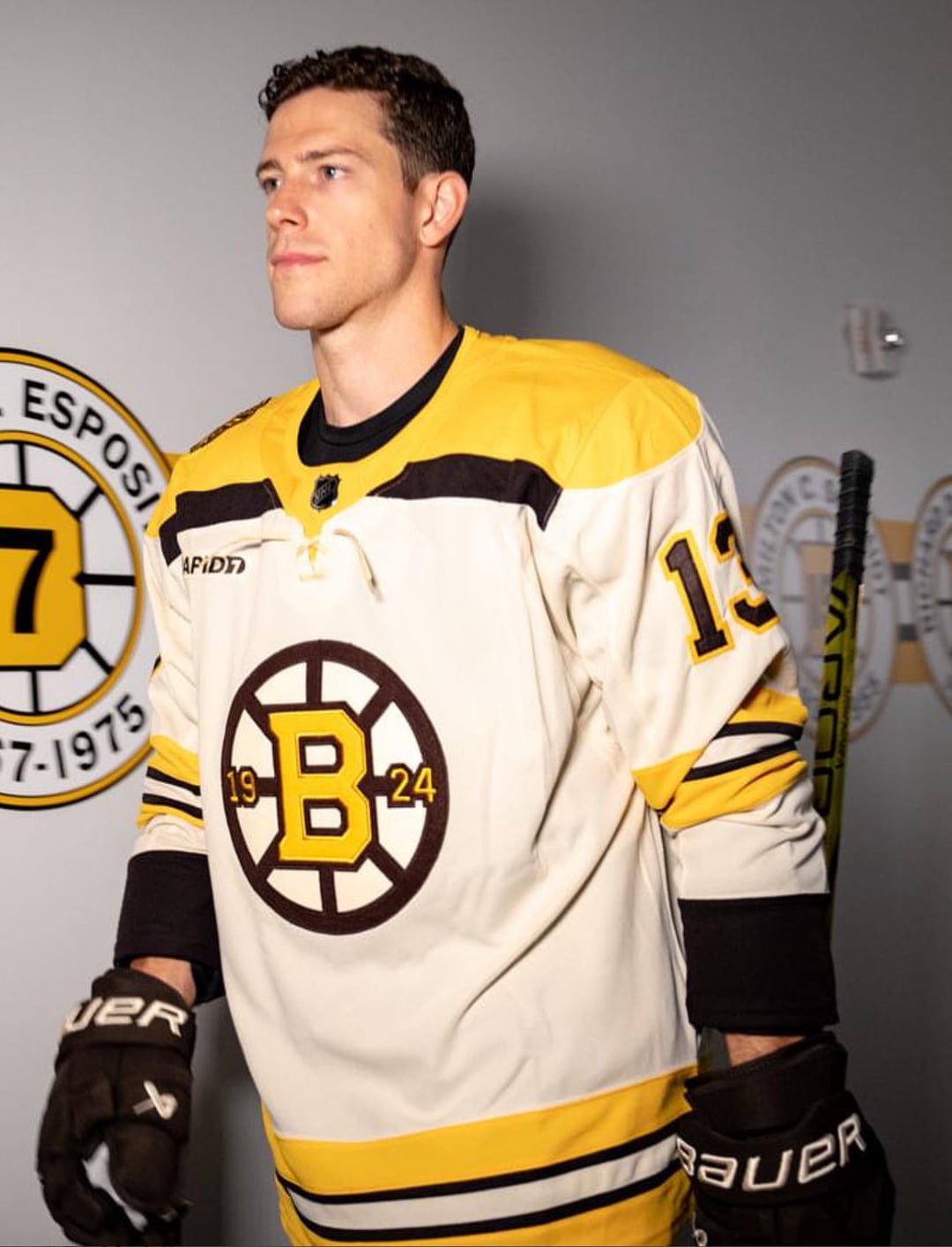
Love them, especially the white ones and the 3rd. The pictures didn’t do them justice, looks great on the playera
throwawayuser488
Daddy like
Dice7
I love them. Just wish both shoulders had a patch.
Two meth bear patches would have made it a 10/10. Move the 100 year patch to the inner collar.
Not really a fan of their third. It’s okay, just don’t like the text on the logo.
comacove
Very clean! Good job!
Anishinabeg
Boring. Their old ones were a lot better.
Porkchopp33
Look good ads always look trashy
Particular_Tutor_46
They’re alright a few too many stripes on the sleeves
Sammybeaver88
These look incredible! Overall a great design, and tbh I can’t wait to see this on the ice. Bit of a shame for the ad on there but at least it’s pretty small and blends in quite well with the Jersey so could be worse.
Independent-Blood833
I’m not even a Boston fan… but those are some clean sweaters.
Reasonable_Net3244
The double stripes on the arms for the home/away doesn’t make sense to me. Move one of those stripes down to the cuff
ThisGuyRight__Here
Don’t like that year on the logo. But the black ones are cool and remind of Adam Sandler in Happy Gilmore.
Olipod2002
They look better when worn by players
trippingtrips13
Not a fan of the 1924, it almost seems like an afterthought adding it in
good_guy112
Little bit of glimmer on those gold stripes.
JuicerBoost
Those are great unis….. also…… fuck the bruins
Bubbafett33
Breaking it into 19….24 makes it look like a memorial patch for two players who wore those numbers.
MattTown
I fucking hate the Bruins. But these are some slick sweaters 🤌🏻
Whataboutizm
Very cool looking.
Thonch
Woah, hottt
Unfunky-UAP
Is that their projected record in January?
Yankeedoodleman
everyone is so torn on this its seems like you either love these or find them disgusting
Gaj85
They would look great if they took that dumb ass sponsor patch off of it.
Hutch25
I like them. Nice respect to the classic Bruins jerseys with a clean modern look.


")

27 Comments
They look clean, I’m not gonna lie.
I like the 3rd one, the other ones are eh
Yes sir
10/10
Love them, especially the white ones and the 3rd. The pictures didn’t do them justice, looks great on the playera
Daddy like
I love them. Just wish both shoulders had a patch.
Two meth bear patches would have made it a 10/10. Move the 100 year patch to the inner collar.
Not really a fan of their third. It’s okay, just don’t like the text on the logo.
Very clean! Good job!
Boring. Their old ones were a lot better.
Look good ads always look trashy
They’re alright a few too many stripes on the sleeves
These look incredible! Overall a great design, and tbh I can’t wait to see this on the ice. Bit of a shame for the ad on there but at least it’s pretty small and blends in quite well with the Jersey so could be worse.
I’m not even a Boston fan… but those are some clean sweaters.
The double stripes on the arms for the home/away doesn’t make sense to me. Move one of those stripes down to the cuff
Don’t like that year on the logo. But the black ones are cool and remind of Adam Sandler in Happy Gilmore.
They look better when worn by players
Not a fan of the 1924, it almost seems like an afterthought adding it in
Little bit of glimmer on those gold stripes.
Those are great unis….. also…… fuck the bruins
Breaking it into 19….24 makes it look like a memorial patch for two players who wore those numbers.
I fucking hate the Bruins. But these are some slick sweaters 🤌🏻
Very cool looking.
Woah, hottt
Is that their projected record in January?
everyone is so torn on this its seems like you either love these or find them disgusting
They would look great if they took that dumb ass sponsor patch off of it.
I like them. Nice respect to the classic Bruins jerseys with a clean modern look.