I actually really like that, Oilers really went the extra risky route,
unitednihilists
That’s hot
LarryD217
Very cool
TotalReflection
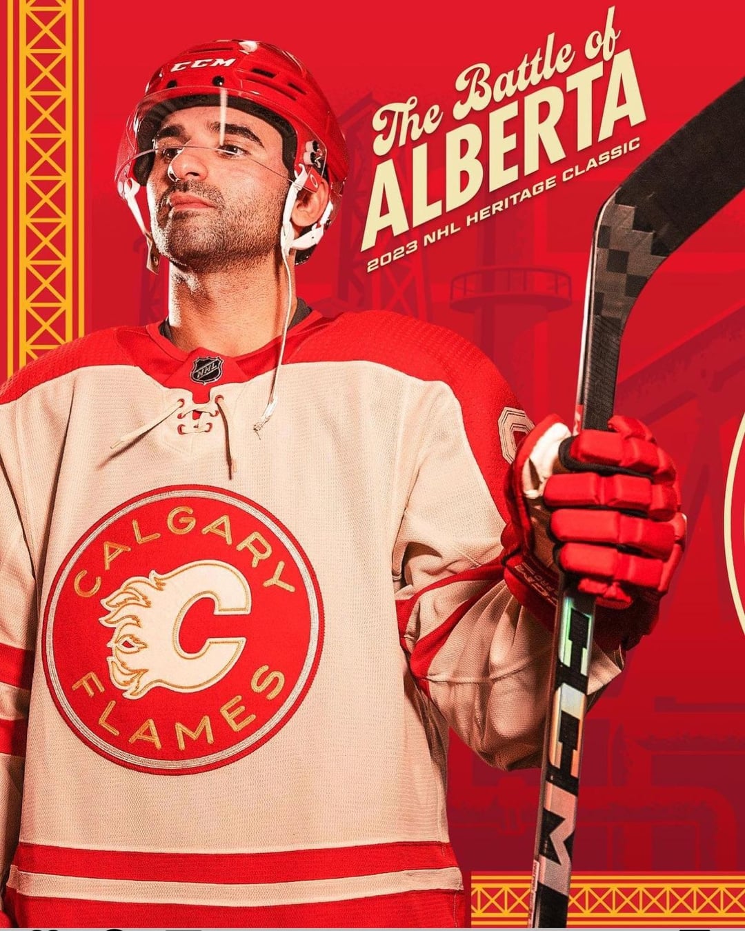
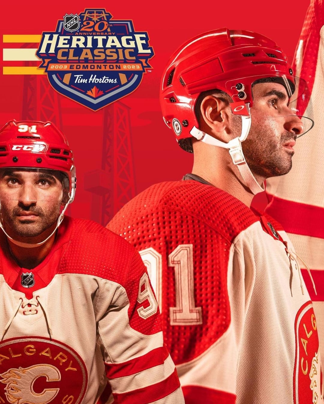
Can’t believe Kadri is the face of the Flames
CurlingTrousers
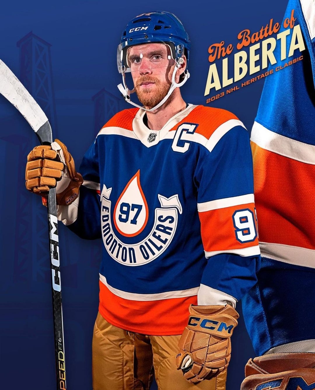
Well. There’s hits and misses in jersey design. Everyone has their own tastes – but in my worthless opinion, this is way too much trying way too hard with way too many things. Both of them are strange and it’s hard to see what the overall concept of this style scramble is.
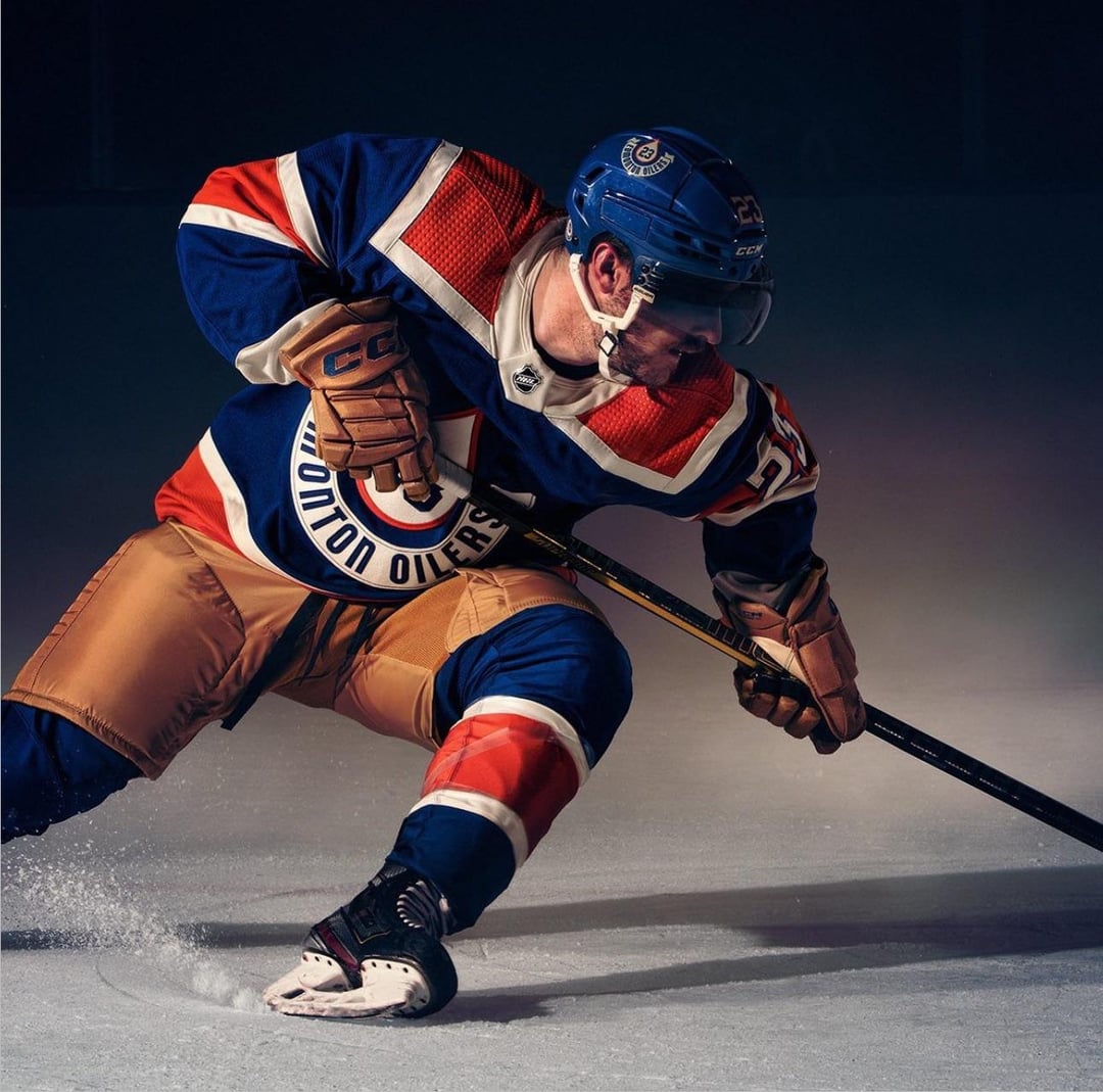
Primary Blue, Orange and Tan – where have we seen that color palette before? Oh, right nowhere. Maybe they’re going for “Last Minute Thrift Store Uniform” vibe.
416Mike
Why doesn’t the Oilers’ equipment match their colours?
Flames match.
ReadingActive9011
Ah, brown pants and gloves. A nod to a simpler time, in the early 1900s… before anyone that ever had anything to do with the Oilers was born.
dadass84
That Oilers jersey is ooooooooooooooglay…..
DieselSkate88
The Oilers jerseys are fly, but I’m not feeling the diarrhea colored shells.
DarkUnderbelly
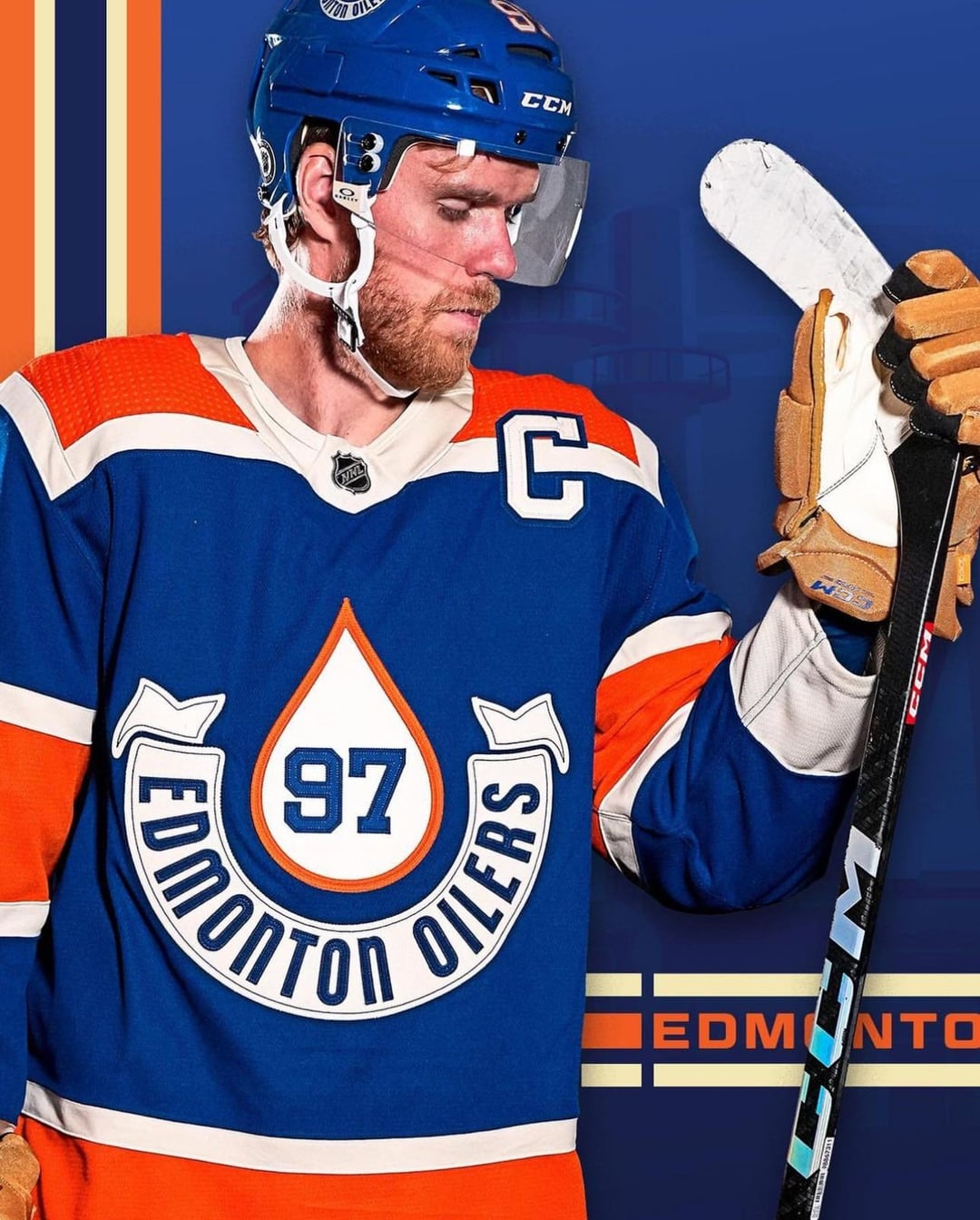
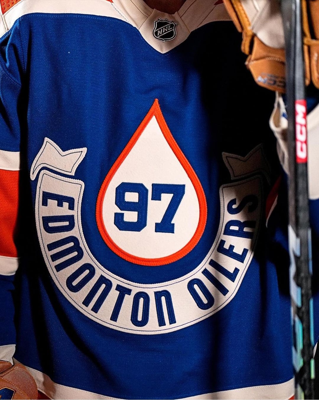
Can’t say I’m a fan of the number being in the middle. Also why is the letter so high on the jersey?
Klutzy_One_462
Nice
Warm_Gur8832
Looks like some art deco shit and I love it
flipou83
Of course it’s not leather, fake ass plastic. Because we need more petrol products 😂
HardOyler
Not an Oilers fan but I dig these with the pants and all. Only thing I don’t like is how the C looks on McDavids jersey. Might be a placement thing that’s bothering me
M1ch0acano
Oilers with the cum stain
wickedweather
I like the colour scheme for the Oilers, they should have used the old orange text logo from the WHA days.
garyblahblah
We’re getting some 🔥🔥 jersey designs lately, too bad Fanatics will be making them.
rhunter99
Edmonton looks like it’s wearing butcher paper for pants
lostharbor
These are solid throwbacks. I really love the design. Some of the teams have been so lame lately
outonthetiles66
I like the Flames jersey.
smash2477
Bush league
korkkis
Calgary is very good
AceConspirator
I’m sorry but these are terrible.
BuddhaBarkov
i hate words on logos. if the logo is good you dont need words. I say this as a FLA fan whose team has FLORIDA or PANTHERS inside their crest logo for home and away.
these would be sick if it was just a big oil drop with #s inside.


29 Comments
Back to the drawing board! :s
Oilers threads are unreal
I actually really like that, Oilers really went the extra risky route,
That’s hot
Very cool
Can’t believe Kadri is the face of the Flames
Well. There’s hits and misses in jersey design. Everyone has their own tastes – but in my worthless opinion, this is way too much trying way too hard with way too many things. Both of them are strange and it’s hard to see what the overall concept of this style scramble is.
Primary Blue, Orange and Tan – where have we seen that color palette before? Oh, right nowhere. Maybe they’re going for “Last Minute Thrift Store Uniform” vibe.
Why doesn’t the Oilers’ equipment match their colours?
Flames match.
Ah, brown pants and gloves. A nod to a simpler time, in the early 1900s… before anyone that ever had anything to do with the Oilers was born.
That Oilers jersey is ooooooooooooooglay…..
The Oilers jerseys are fly, but I’m not feeling the diarrhea colored shells.
Can’t say I’m a fan of the number being in the middle. Also why is the letter so high on the jersey?
Nice
Looks like some art deco shit and I love it
Of course it’s not leather, fake ass plastic. Because we need more petrol products 😂
Not an Oilers fan but I dig these with the pants and all. Only thing I don’t like is how the C looks on McDavids jersey. Might be a placement thing that’s bothering me
Oilers with the cum stain
I like the colour scheme for the Oilers, they should have used the old orange text logo from the WHA days.
We’re getting some 🔥🔥 jersey designs lately, too bad Fanatics will be making them.
Edmonton looks like it’s wearing butcher paper for pants
These are solid throwbacks. I really love the design. Some of the teams have been so lame lately
I like the Flames jersey.
Bush league
Calgary is very good
I’m sorry but these are terrible.
i hate words on logos. if the logo is good you dont need words. I say this as a FLA fan whose team has FLORIDA or PANTHERS inside their crest logo for home and away.
these would be sick if it was just a big oil drop with #s inside.
Wow, these are really good!
10/10 for both holy shit!
Looks dope I like the colour schemes