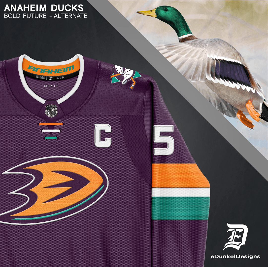
This is the first of my jersey edit series where I’ll be taking my favorite jersey from each of my Bold Future Jersey Sets and editing full kits onto players.
Even after going through all 32 teams, this is still one of my favorites from the series. I’ve never been the biggest fan of the duck foot logo, but I think it works really well when presented in bold colors and less jersey clutter. There’s not enough purple in the NHL!
The colors are inspired by a mallard duck as seen on the final slide. The ever popular Mighty Ducks colors return, as well as a pop of orange to represent Orange County and the current team’s history. The Mighty Ducks logo is displayed on the shoulders, as well as the pants. A heather pattern in the sleeves is reminiscent of water and speed.
I appreciate all feedback; so please, let me know your thoughts! Hope you enjoy
unfit_spartan_baby
I love it, but I’m not a ducks fan, so my opinion is meaningless
Give-Me-The-Bat
St Patrick’s Day vibes
The-G-89
It’s meh. Don’t mind the Orange but still hate the Webbed foot D.
Yung_Corneliois
The edit is great but nothing will make the Duck foot logo word unfortunately. It looks like an EA create-a-team logo.
gooch_norris_
I dig it
comacove
Nope
PoopSlinger23
That’s gotta be the worst logo in the NHL
Havoc_XXI
Take the stupid ass duck foot off, I’ve always hated that. Makes the sweater look like shit.
But, the colors are on point and the rest of the set up is very clean and simple
First_Butterfly_6462
Use the old logo and you’re on to something
Androidkittyschit
Quack attack dudes! Flying V guys!! Let’s go!! Hope Emilio Esteves does a good job coaching this year!! Hahahahhahahahahahaha
ilikebigbutts442
The mighty ducks jersey will always be the best alternate
VisibleAd3180
Quack quack quack Mr.Duckworth
Hutch25
Awesome colours, but that logo absolutely does not serve that jersey well.
DrexlSpivey84
For Christ sake, just put the mask logo thats on the breezers on the jersey it is a million times cooler. Do that and it’s a cool uniform. Ditch that damn D foot, it sucks and is pretty much universally disliked. Damn ownership just won’t let it go.
-Trans-Rights-
Is op the same person who made this exact jersey the other day or is it just stolen?
InternationalBand494
Nice visual presentation. If you’re the same guy that was posting jersey art for all the teams, I think you have a serious shot at getting work from one if not more of the teams.
FreakingDoubt
Their original logo looked so cool. They should just go back to that
EmbarrassedAd8262
Who is that
mvperri
Id probably get rid of the webbed foot logo for the alt but thats just me


")

20 Comments
This is the first of my jersey edit series where I’ll be taking my favorite jersey from each of my Bold Future Jersey Sets and editing full kits onto players.
Even after going through all 32 teams, this is still one of my favorites from the series. I’ve never been the biggest fan of the duck foot logo, but I think it works really well when presented in bold colors and less jersey clutter. There’s not enough purple in the NHL!
The colors are inspired by a mallard duck as seen on the final slide. The ever popular Mighty Ducks colors return, as well as a pop of orange to represent Orange County and the current team’s history. The Mighty Ducks logo is displayed on the shoulders, as well as the pants. A heather pattern in the sleeves is reminiscent of water and speed.
I appreciate all feedback; so please, let me know your thoughts! Hope you enjoy
I love it, but I’m not a ducks fan, so my opinion is meaningless
St Patrick’s Day vibes
It’s meh. Don’t mind the Orange but still hate the Webbed foot D.
The edit is great but nothing will make the Duck foot logo word unfortunately. It looks like an EA create-a-team logo.
I dig it
Nope
That’s gotta be the worst logo in the NHL
Take the stupid ass duck foot off, I’ve always hated that. Makes the sweater look like shit.
But, the colors are on point and the rest of the set up is very clean and simple
Use the old logo and you’re on to something
Quack attack dudes! Flying V guys!! Let’s go!! Hope Emilio Esteves does a good job coaching this year!! Hahahahhahahahahahaha
The mighty ducks jersey will always be the best alternate
Quack quack quack Mr.Duckworth
Awesome colours, but that logo absolutely does not serve that jersey well.
For Christ sake, just put the mask logo thats on the breezers on the jersey it is a million times cooler. Do that and it’s a cool uniform. Ditch that damn D foot, it sucks and is pretty much universally disliked. Damn ownership just won’t let it go.
Is op the same person who made this exact jersey the other day or is it just stolen?
Nice visual presentation. If you’re the same guy that was posting jersey art for all the teams, I think you have a serious shot at getting work from one if not more of the teams.
Their original logo looked so cool. They should just go back to that
Who is that
Id probably get rid of the webbed foot logo for the alt but thats just me