I’m a graphic and sports designer and I created a series of new / revised jersey sets for each NHL team. Now that I’ve gone through each team, I’m choosing my favorite from each set and editing them on to players. If you’re interested in seeing the rest of the designs, they can be found on my Reddit and Instagram pages. I appreciate all feedback, so let me know what you think! Hope you enjoy it.
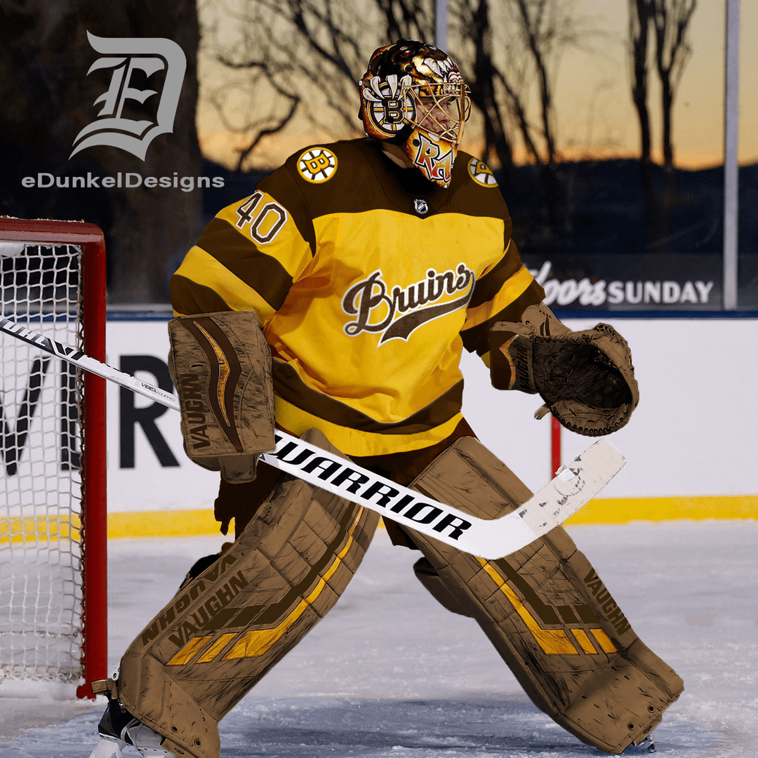
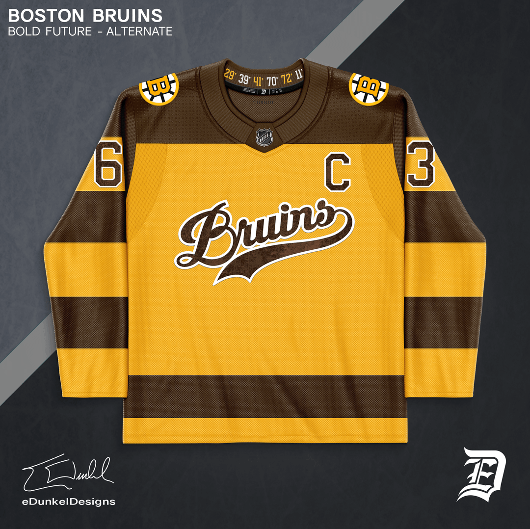
I love creating new throwback uniforms especially. The Bruins original gold and brown color scheme is fantastic. I really wish the club would utilize brown a little more often, but regardless, Boston’s uniforms across their history have been some of the most iconic.
This particular throwback uniform takes inspiration from the Bruins’ first ever alternate jersey from 1940. The team name in a script is featured on the chest. A classic, rich brown replaces black, with iconic bumblebee striped sleeves. The logo and numbers feature a subtle distressed leather texture.
This version of the alternate has some differences from my original design. The collar is now a classic sweater knit style. The number positioning and stipes have been simplified for visibility and legibility. The shoulder logos have been updated to the current primary logo.
KungFuGarbage
Love the colors, dislike the Baseball logo but that’s a preference thing. Make it brown spoked B and I’m in
jcorduroy
Not a huge fan of text logos, but I love literally everything else on it.
saulgoodman445
I like straight text but besides that it’s cool
ThePencilRain
Tuuuuuuuuuuuuukka
harajukukei
Poopoo peepee
CaptainWollaston
This looks nice but I don’t like it without a spoked B. Letters just don’t work.
Jak-the-Bruin
It would take a lot to get me to stop wearing this jersey
johnnybananas123
Nah im good
ObiWanLamora
This looks awesome! Great job on this and the others you’ve done for other teams. They all look fantastic.
Sir_Jacobson
Absolutely digging that first one – awesome job! Really cool seeing the transition between the two on the second pic
darthduder666
Not a fan of the spoked B on the shoulder. Swap that out with Meth bear and you really got something
Caughtbyu
I like it.
Old_Beyond3256
They look very College-y and I like!
ArturosDad
I quite like the brown ones.
redsox17_
Ugly
unmutual6669
Looks like it reads « BRUIRS » on the front. Cursive ‘N’s do not look like that. Just sayin.


19 Comments
I’m a graphic and sports designer and I created a series of new / revised jersey sets for each NHL team. Now that I’ve gone through each team, I’m choosing my favorite from each set and editing them on to players. If you’re interested in seeing the rest of the designs, they can be found on my Reddit and Instagram pages. I appreciate all feedback, so let me know what you think! Hope you enjoy it.
I love creating new throwback uniforms especially. The Bruins original gold and brown color scheme is fantastic. I really wish the club would utilize brown a little more often, but regardless, Boston’s uniforms across their history have been some of the most iconic.
This particular throwback uniform takes inspiration from the Bruins’ first ever alternate jersey from 1940. The team name in a script is featured on the chest. A classic, rich brown replaces black, with iconic bumblebee striped sleeves. The logo and numbers feature a subtle distressed leather texture.
This version of the alternate has some differences from my original design. The collar is now a classic sweater knit style. The number positioning and stipes have been simplified for visibility and legibility. The shoulder logos have been updated to the current primary logo.
Love the colors, dislike the Baseball logo but that’s a preference thing. Make it brown spoked B and I’m in
Not a huge fan of text logos, but I love literally everything else on it.
I like straight text but besides that it’s cool
Tuuuuuuuuuuuuukka
Poopoo peepee
This looks nice but I don’t like it without a spoked B. Letters just don’t work.
It would take a lot to get me to stop wearing this jersey
Nah im good
This looks awesome! Great job on this and the others you’ve done for other teams. They all look fantastic.
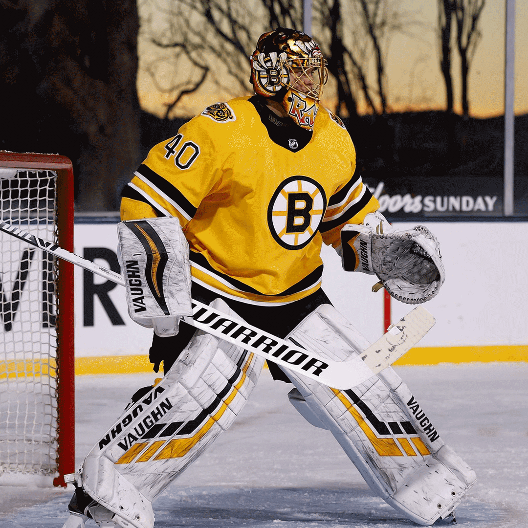
Absolutely digging that first one – awesome job! Really cool seeing the transition between the two on the second pic
Not a fan of the spoked B on the shoulder. Swap that out with Meth bear and you really got something
I like it.
They look very College-y and I like!
I quite like the brown ones.
Ugly
Looks like it reads « BRUIRS » on the front. Cursive ‘N’s do not look like that. Just sayin.
Damn that night game on Tahoe looked beautiful
Save on, Rask