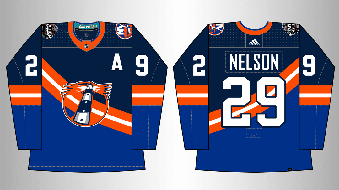
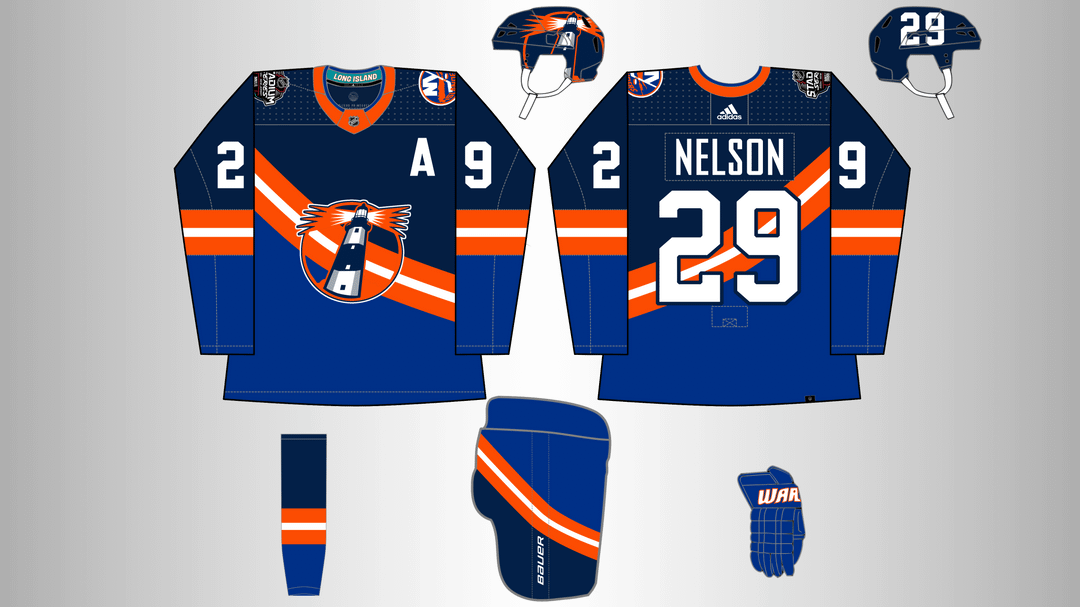
Avec la publication hier du logo de l’événement Stadium Series, j’ai enfin pu finaliser le concept d’uniforme des Islanders que j’ai mis en place. À la manière des Stadium Series, les choses deviennent un peu bizarres.
—
doughbayer

Avec la publication hier du logo de l’événement Stadium Series, j’ai enfin pu finaliser le concept d’uniforme des Islanders que j’ai mis en place. À la manière des Stadium Series, les choses deviennent un peu bizarres.
—
doughbayer


10 Comments
I love it but in the same way that I love it I don’t. Good concept!!
I love the helmet. I don’t love the full stripe through the numbers. I feel like if you went with the wave from the original fisherman it would work very very well.
I agree on “we want the lighthouse”
When was the logo released? How did I miss this
That’s actually pretty nice. I’d kinda like to see a “four cups” nod somewhere, but this is a pretty solid design
Plot twist using the platform here.
It’s god awful like every other stadium series jersey in the adidas era, so it hits one check mark.
Now to continue on in truly hideous fashion, keeping the secondary fisherman logo as the main crest here, we add the reverse retro name and number kit, make it an orange base (or gradient from dark blue to orange), using gray, teal, white, and royal blue in a 4 wave striped pattern that can actually connect.
God awful and hideous, it’s going to be so glorious that I’m glad I’m already looking into a preorder.
Not big on the stripe going through the logo. That’s my only gripe
I genuinely love the lighthouse logo on the helmet
I don’t care for the sash looking stripe. But I’m all for the lighthouse concept
Keener Jerseys posted this beer league (?) jersey the other day that would actually make a pretty great concept
https://www.instagram.com/p/CzEuMcdAX5d/?igshid=MzRlODBiNWFlZA==
It’s something new. We’ve never had the lighthouse as a main logo. I’d love to see that happen. Only thing is I like to be the road designation with this template, as I prefer white on blue over blue on darker blue. Over all though, Great work. Awesome concept.