
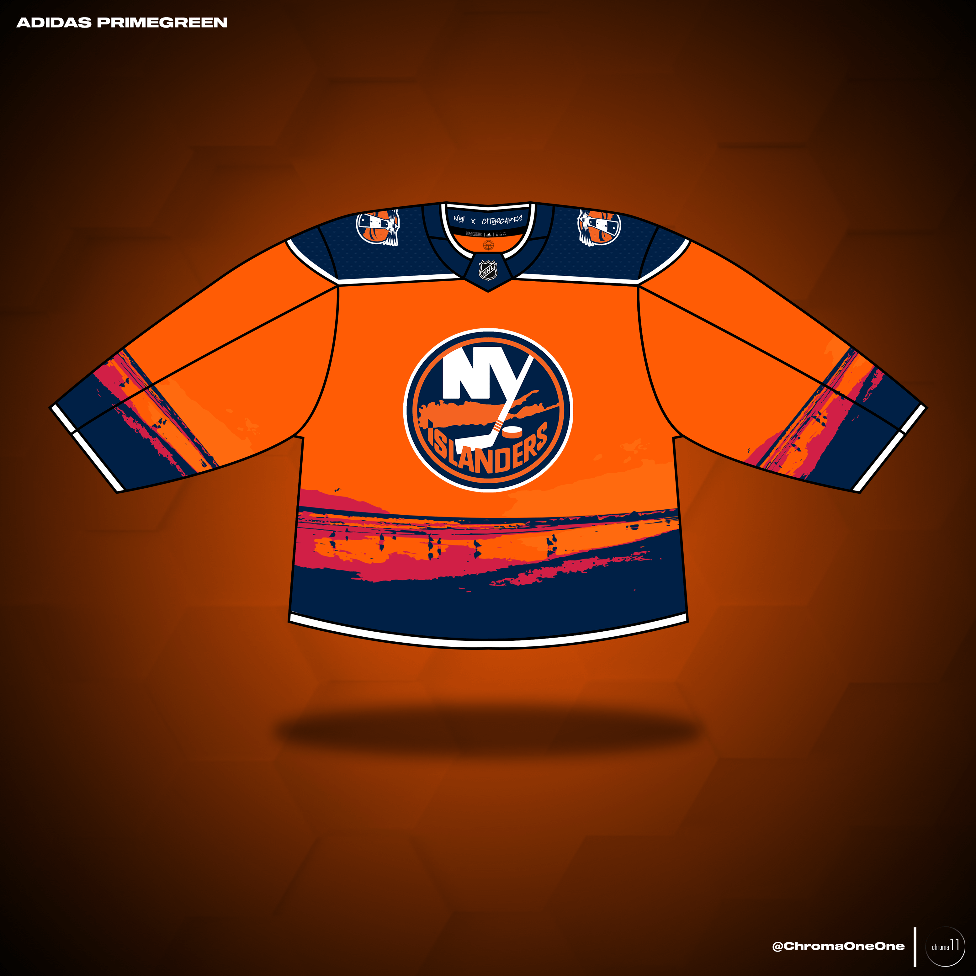
Salut à tous, fan des Panthers, venez en paix. Au cours des dernières semaines, j’ai créé des concepts de maillots expérimentaux pour les 32 équipes, avec des motifs sublimés qui rendent hommage à la ville ou à la région respective de chaque équipe. Voici mon concept des îles :
—
spaghettios32


9 Comments
That’s pretty cool. Nice job.
And do you know most islanders fans take no issue with you guys. You are always welcome. It’s the bolts we detest 😆
Really cool! Did you try using the lighthouse logo as the main crest over the coast line?
Edit: also, I always wondered why the lighthouse doesn’t have 4 stripes around the middle.
That is a very fine jersey 🙂
I like it for the most part but what is going on at the cuffs and bottom lol
Are the blood stains supposed to symbolize what road rage does to people out here?
(jokes aside, that looks nice!)
No
I don’t particularly like this but would love to see what else you came up with for the other teams.
I appreciate you and your effort.
Change the subliminal pattern to « failure to clear the puck out of the defensive zone » and you’re spot on!
Love the effort. Tough to make out it’s a beach scene unless you look up close. I like solid colors and a maybe a twist on the logo. An “NY” with the Y that is a hockey stick but maybe the blade part is a wave? Something like that. Detailed jersey’s never kill. Big, bold, simple usually kills. I thought the Isles and Rangers winter classic jerseys were both simple and great.