It’s the Mets colors jersey for me I don’t like the number placement on the jerseys
RepresentativeOfnone
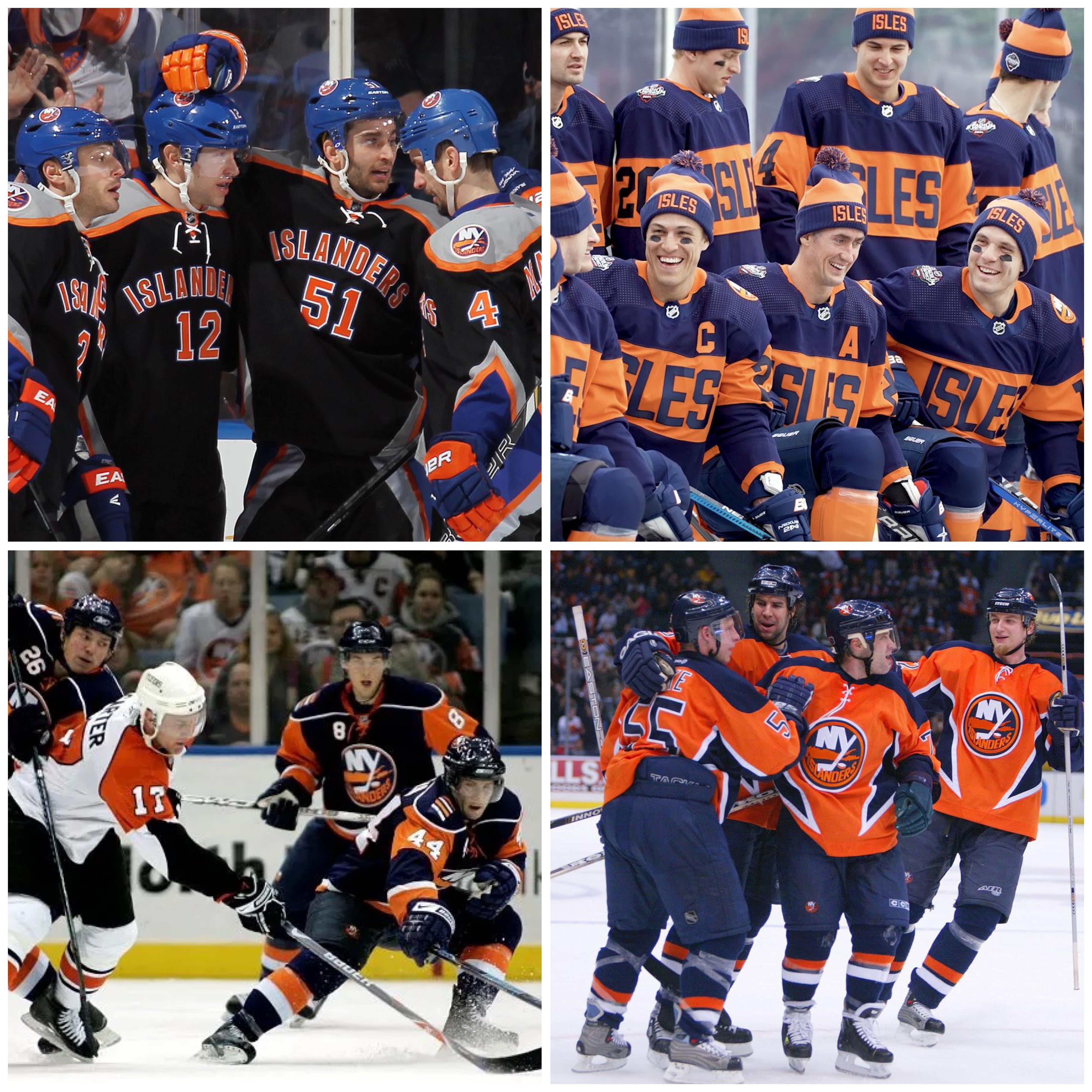
Fisherman followed by RR fisherman, followed by normal crest on the sweaters with teal and then those black islanders ones then the last stadium series
Thrice-Thrice-Thrice
Orange alternatives were fire get them out of this discussion.
In my opinion the black jerseys are ugliest by far. Stadium series is fine for a stadium series jersey lol. Bottom left is also fine too, not my fav but they’re fine. Orange is fire
JBR409
1. Halloween
2. Orange
3. Bottom Left
4. 2024 Stadium Series
5. 2021 Reverse Retro
shockwave-315
Black. Every time Black. This will never change. 🤢🤮
olah711
Top left, too much black without doing anything interesting with thr space other than horizontal letters
HidingWithBigFoot
The first one
Brawl-legends
top left
Jace214291
Fisherman, no question
Kzx45uH3nz
– The black one is so ugly that I kind of have to like it.
– The orange one is also fairly ugly but at least it was trying something new.
– The bottom left ones are just eh but honestly I don’t hate the dark blue especially because it reminds me of the earlier 2000-04 jerseys I grew up on.
– The ISLES jerseys are honestly nice. The colors seem to look a lot better in some photos than others.
davidkuchar
fisherman without question
tomek142
Top left 🤮🤢
poopdick72
Top left and top right are equally as horrible
EfficiencyHuge1946
The Fisherman. Anyone who lives through that era understands there’s no other answer. Anyone young enough not to have endured those years of misery just doesn’t get it fully.
Nicks-Dad
I still hate the Fisherman.
ramen_sukidesu
Capt Highliner jersey was the worst. Players specifically asked the NYI to be on their no trade list because of those jersey’s
E51838
How is the fisherman not in this photo? That’s the answer and it’s not close.
FigSideG
Top left closely followed by bottom left
yankfan2426
Top left, even Dipietro on his radio show says how the players hated it and whenever they saw it in the lockers they knew they were gonna lose that night


20 Comments
Top left and it’s not even close
It’s the Mets colors jersey for me I don’t like the number placement on the jerseys
Fisherman followed by RR fisherman, followed by normal crest on the sweaters with teal and then those black islanders ones then the last stadium series
Orange alternatives were fire get them out of this discussion.
In my opinion the black jerseys are ugliest by far. Stadium series is fine for a stadium series jersey lol. Bottom left is also fine too, not my fav but they’re fine. Orange is fire
1. Halloween
2. Orange
3. Bottom Left
4. 2024 Stadium Series
5. 2021 Reverse Retro
Black. Every time Black. This will never change. 🤢🤮
Top left, too much black without doing anything interesting with thr space other than horizontal letters
The first one
top left
Fisherman, no question
– The black one is so ugly that I kind of have to like it.
– The orange one is also fairly ugly but at least it was trying something new.
– The bottom left ones are just eh but honestly I don’t hate the dark blue especially because it reminds me of the earlier 2000-04 jerseys I grew up on.
– The ISLES jerseys are honestly nice. The colors seem to look a lot better in some photos than others.
fisherman without question
Top left 🤮🤢
Top left and top right are equally as horrible
The Fisherman. Anyone who lives through that era understands there’s no other answer. Anyone young enough not to have endured those years of misery just doesn’t get it fully.
I still hate the Fisherman.
Capt Highliner jersey was the worst. Players specifically asked the NYI to be on their no trade list because of those jersey’s
How is the fisherman not in this photo? That’s the answer and it’s not close.
Top left closely followed by bottom left
Top left, even Dipietro on his radio show says how the players hated it and whenever they saw it in the lockers they knew they were gonna lose that night