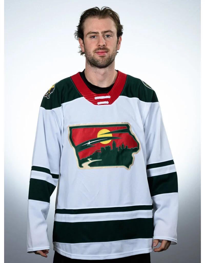
I, uh, want to have a strong negative opinion about this, but I do not. The logo colors are right. The white is crisp. The stripes and yoke look balanced. The red collar with the straight lacing is sharp. And they play in Iowa, let Iowa have this.
HolyNovie
I think the collar is my biggest ick
CitizenStrife
Even the model is like: « Why the fuck am I wearing this? »
THE-MURSE
Looks like the North Dakota Wild
willieyobslayer
Oof. I hate that.
rocker2014
Thanks, I hate it.
WhoaNickie

holm0246
Yikes, that is legitimately one of the worst looking jerseys that I have ever seen. I mean everything other than the shoulder birds is just gross looking.
raremud_
that’s fucking awesome idk what y’all are on about. des moine skyline, has the river, repurposed the aspects of the wild logo into something fitting for the city. i’d argue the wild jerseys haven’t been that great since 2017. and the north stars alternates are trash and that rumor it was going to change to that full time made me sick to my tummy. alternate should be red.
scorching hot take i know.
hoseking
Wasn’t that one of the Kaiju in Pacific Rim?
whudaht
As a Wild fan that does not care for the Wild logo, this is so much worse. It’s like the Wild logo was crapped out of the Kool Aid man
iamtheflamingoqueen
oh that is… that’s an attempt at something more related to iowa. it’s not a good attempt, but an attempt was made, i guess.
Iguana_Iglesias
It’s an eye catching crest, most certainly, but not sure if that’s a good thing in this instance
kpmurphy_
Lmao holy shit is that bad
girlsandwolves
just slapping the aesthetic on the frankly unappealing state shape makes it lose all its charm…….. thats so sad. some states’ shapes just are not flattering by themselves for a logo shape, even if what’s within is pretty decent
CarPlaneBoatRocket
Is this real? Jesus Christ. Why
doubie28
H8
cisforcookie2112
Would’ve looked fine if they fit the mn Wild logo inside of the state but this looks squished.
mrbojangles951
There’s nothing “better” about this look…
hockeybag7
Oofda
lemmy5x5
Well that’s a dumpster sandwich
axman54
That’s one of the dustiest jerseys I’ve ever laid eyes on
Aqua-Bear
Didn’t they have this last year or am I Nostradamus?
Oyadonchano
Look, some states have cool shapes and Iowa just is not one of them. Who thought this was ok?
bucksellsrocks
PLEASE NO!!!! NOOOOOOOOO!!!!!
jordynbebus8
the concept is great but it’s definitely missing “something”


32 Comments
Wow that is an abomination
someone stepped on the bear’s head 🙁
I, uh, want to have a strong negative opinion about this, but I do not. The logo colors are right. The white is crisp. The stripes and yoke look balanced. The red collar with the straight lacing is sharp. And they play in Iowa, let Iowa have this.
I think the collar is my biggest ick
Even the model is like: « Why the fuck am I wearing this? »
Looks like the North Dakota Wild
Oof. I hate that.
Thanks, I hate it.

Yikes, that is legitimately one of the worst looking jerseys that I have ever seen. I mean everything other than the shoulder birds is just gross looking.
that’s fucking awesome idk what y’all are on about. des moine skyline, has the river, repurposed the aspects of the wild logo into something fitting for the city. i’d argue the wild jerseys haven’t been that great since 2017. and the north stars alternates are trash and that rumor it was going to change to that full time made me sick to my tummy. alternate should be red.
scorching hot take i know.
Wasn’t that one of the Kaiju in Pacific Rim?
As a Wild fan that does not care for the Wild logo, this is so much worse. It’s like the Wild logo was crapped out of the Kool Aid man
oh that is… that’s an attempt at something more related to iowa. it’s not a good attempt, but an attempt was made, i guess.
It’s an eye catching crest, most certainly, but not sure if that’s a good thing in this instance
Lmao holy shit is that bad
just slapping the aesthetic on the frankly unappealing state shape makes it lose all its charm…….. thats so sad. some states’ shapes just are not flattering by themselves for a logo shape, even if what’s within is pretty decent
Is this real? Jesus Christ. Why
H8
Would’ve looked fine if they fit the mn Wild logo inside of the state but this looks squished.
There’s nothing “better” about this look…
Oofda
Well that’s a dumpster sandwich
That’s one of the dustiest jerseys I’ve ever laid eyes on
Didn’t they have this last year or am I Nostradamus?
Look, some states have cool shapes and Iowa just is not one of them. Who thought this was ok?
PLEASE NO!!!! NOOOOOOOOO!!!!!
the concept is great but it’s definitely missing “something”
Is this a cronenberg homage?

My god that is horrendous
https://preview.redd.it/gxi1mi6iyftd1.jpeg?width=678&format=pjpg&auto=webp&s=86ce752b59752dbbe1021fa5b76d8a24dbdd1494
Shoulder patch
Maybe on a hat? But this is……fuckig terrible