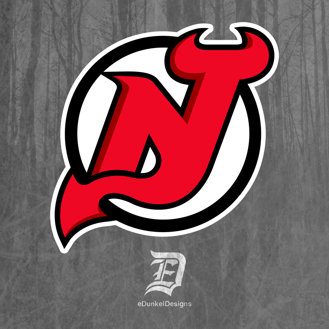
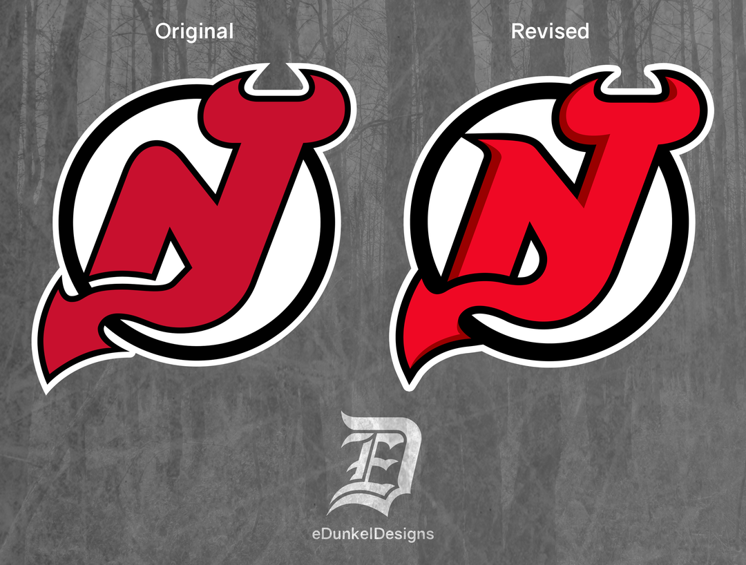
I’m a graphic designer who specializes in sports uniforms and logos. I’ve always been a huge fan of the Devil’s logo and jersey history. In my opinion, it’s one of the better logos in sports. However, I do believe it’s time for the logo to be updated with some minor tweaks.
I appreciate all feedback. I’d love to hear opinions from the fans. Thanks, and hope you enjoy it!
AGOODHARDSQUANCHIN
That looks way sharper well done
Ok_Stick_2086
Not fan of the brighter red and red shadowing, looks like a corporate focus group design. Everything else I dig.
hailmary_sleetjesus
I like the sharper features, especially the serif on the N, though I noticed the white outline stroke had its corners rounded. Any reason those didn’t stay pointed as well? Other than that, I think this looks like a great refresh!
47rohin
I like it! Brings out the N more. I honestly didn’t notice that it was an NJ the first time I saw the original logo.
Though I’m not sure how it’d look on a new New Jersey jersey
treple13
I like. Keeps the classic, but makes it pop
specifichero101
You know what, I actually like it. Subtle enough but definitely freshens it up without trying to mess with an already great logo.
FilmNerdasaurus
I like the shadowing a lot. The n bothers me with the point but it’s honestly a really well done modern twist on a classic logo
frost_biten
Maybe if the Devils were an expansion team, but idk how I’d feel about it if I were a purist
hebbocrates
looks really good. classic but modernized, love it
Arkiak
The original is perfection imo
Duffman66CMU
Can you explain the choice to cast a shadow on the top left and also the bottom right?
BlueHarvestJ
The shading on the red give it a cartoony feel. Dunno if that is good or bad
Would love to see the Avs revamp / modernize the A
Yakitack
Solid work, it looks pretty good, very clean.
That being said, since I know Devils employees look here, do not touch the fucking logo you jackasses. Your stupid Jersey Jersey sucks and whatever marketing campaign contest you just won is probably a long con that will turn out to be like the Razzies.
MutedHornet87
Yes please
ForeverJung
If you’re looking for feedback, here’s what stands out:
Mixed shadow placement. Could pick a different lighting angle for more effect.
Where the right leg of the n turns into the tail is too thick. Simultaneously, where the tail crosses the left leg of the n is too thin.
Could benefit from separation of the tail from the surrounding circle.
Rmpg
Downgrade from original, shadows make look like logo from 90’s, original is much cleaner


22 Comments
I’m a graphic designer who specializes in sports uniforms and logos. I’ve always been a huge fan of the Devil’s logo and jersey history. In my opinion, it’s one of the better logos in sports. However, I do believe it’s time for the logo to be updated with some minor tweaks.
I appreciate all feedback. I’d love to hear opinions from the fans. Thanks, and hope you enjoy it!
That looks way sharper well done
Not fan of the brighter red and red shadowing, looks like a corporate focus group design. Everything else I dig.
I like the sharper features, especially the serif on the N, though I noticed the white outline stroke had its corners rounded. Any reason those didn’t stay pointed as well? Other than that, I think this looks like a great refresh!
I like it! Brings out the N more. I honestly didn’t notice that it was an NJ the first time I saw the original logo.
Though I’m not sure how it’d look on a new New Jersey jersey
I like. Keeps the classic, but makes it pop
You know what, I actually like it. Subtle enough but definitely freshens it up without trying to mess with an already great logo.
I like the shadowing a lot. The n bothers me with the point but it’s honestly a really well done modern twist on a classic logo
Maybe if the Devils were an expansion team, but idk how I’d feel about it if I were a purist
looks really good. classic but modernized, love it
The original is perfection imo
Can you explain the choice to cast a shadow on the top left and also the bottom right?
The shading on the red give it a cartoony feel. Dunno if that is good or bad
I think it looks better but I would also like to see them not continue to use the Satanic version of the devil for their namesake considering their actual namesake is the [Jersey Devil.](https://cdn.dribbble.com/users/290361/screenshots/14444120/media/cdcb42ab169337e02a08775550a7cab2.jpg?compress=1&resize=400×300)
A little too bubble-lettery for my taste.
How have they not already done this lol
I really like it!
Are you going to do other teams as well ?
Love it!
Would love to see the Avs revamp / modernize the A
Solid work, it looks pretty good, very clean.
That being said, since I know Devils employees look here, do not touch the fucking logo you jackasses. Your stupid Jersey Jersey sucks and whatever marketing campaign contest you just won is probably a long con that will turn out to be like the Razzies.
Yes please
If you’re looking for feedback, here’s what stands out:
Mixed shadow placement. Could pick a different lighting angle for more effect.
Where the right leg of the n turns into the tail is too thick. Simultaneously, where the tail crosses the left leg of the n is too thin.
Could benefit from separation of the tail from the surrounding circle.
Downgrade from original, shadows make look like logo from 90’s, original is much cleaner